The network for creativity
Join 1.25M professional creatives like you
Connect with clients, get discovered, and run your business 100% commission-free
Creatives on Contra have earned over $150M and we are just getting started
Back to feedPost

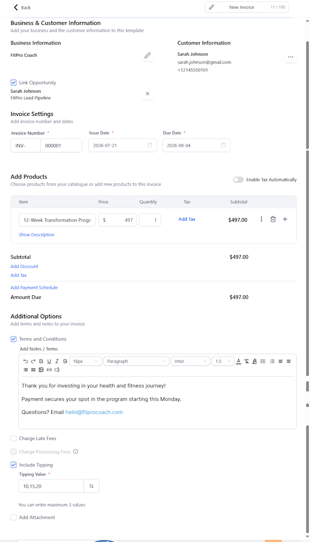
Demo payment automation showing how fitness and wellness businesses can send invoice reminders and follow up with clients more consistently.

The network for creativity
Join 1.25M professional creatives like you
Connect with clients, get discovered, and run your business 100% commission-free
Creatives on Contra have earned over $150M and we are just getting started







Related posts

Title:
VAULT — Personal Finance & Wallet iOS UI
VAULT is a modern personal finance & wallet app designed for iOS, focused on making everyday money management simple, clear, and intuitive.
The complete UI includes:
• Overview / Home
• Transactions
• Transaction Details
• Budgets
• Analytics
• Profile & Settings
Designed in Figma with an iOS-first approach, clean layouts, clear financial data visualization, and a consistent mobile experience.
📱 iOS UI Design
🎨 Figma
💰 Personal Finance App

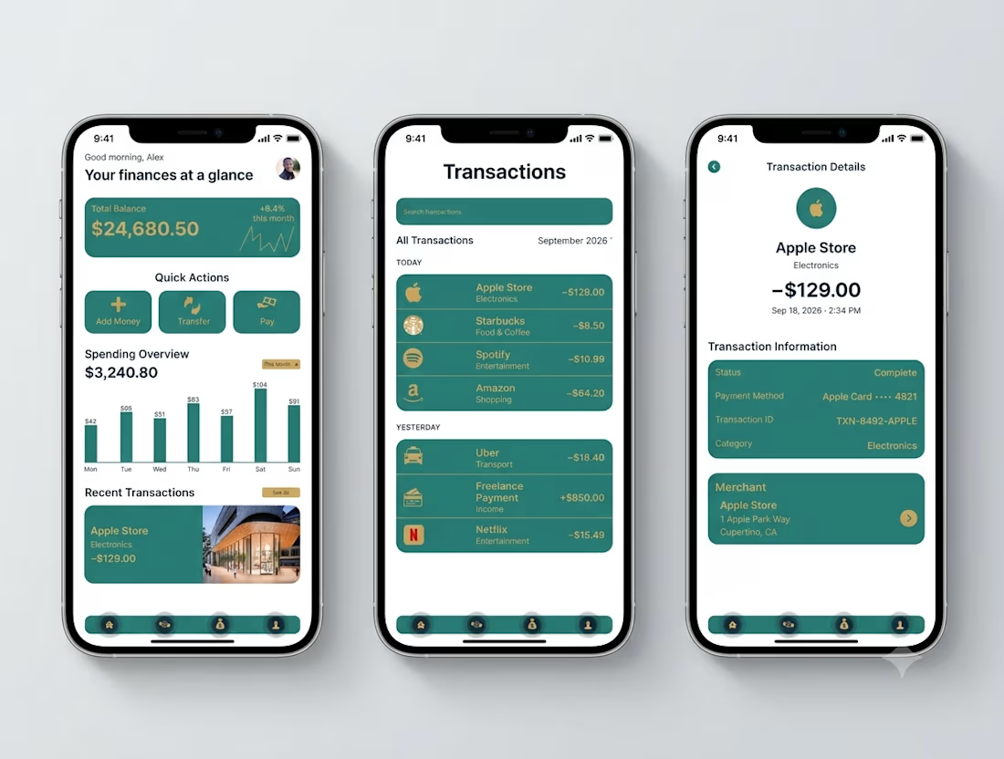

Transaction Details splits the payment record from the merchant card - status, card, transaction ID in one block, the store address in another. That separation is what makes a dispute resolvable.

Which color direction feels right for this digital payment app?
While designing a full digital payment app experience, from bills overview to payment confirmation, I explored two different color systems for the entire flow. Same screens, same functionality, just a different accent palette and personality.
Option 1 - Neon Green. Bold, high-energy, and gives a sharp, fintech-forward feel throughout the journey.
Option 2 - Cyan/Blue. Cool, modern, and leans more premium and trustworthy across the whole app.
Would love your honest UX/UI take, which direction feels more trustworthy, engaging, and appropriate for a digital payment app, and why? 👇
3 voted
38%
5 voted
62%
8 votes
Closed

Cyan/Blue


AI-Powered Personal Finance Mobile App


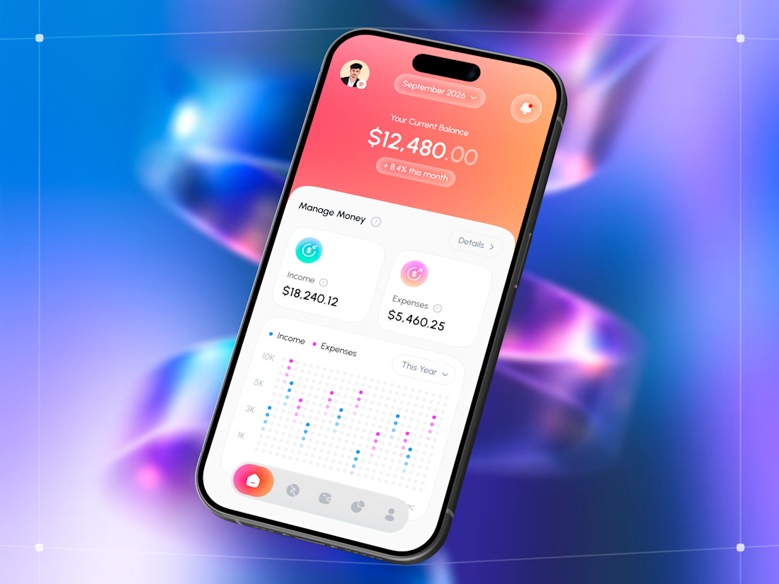

The AI layer feels useful without overwhelming the core finance flow.