The network for creativity
Join 1.25M professional creatives like you
Connect with clients, get discovered, and run your business 100% commission-free
Creatives on Contra have earned over $150M and we are just getting started
Back to feedPost

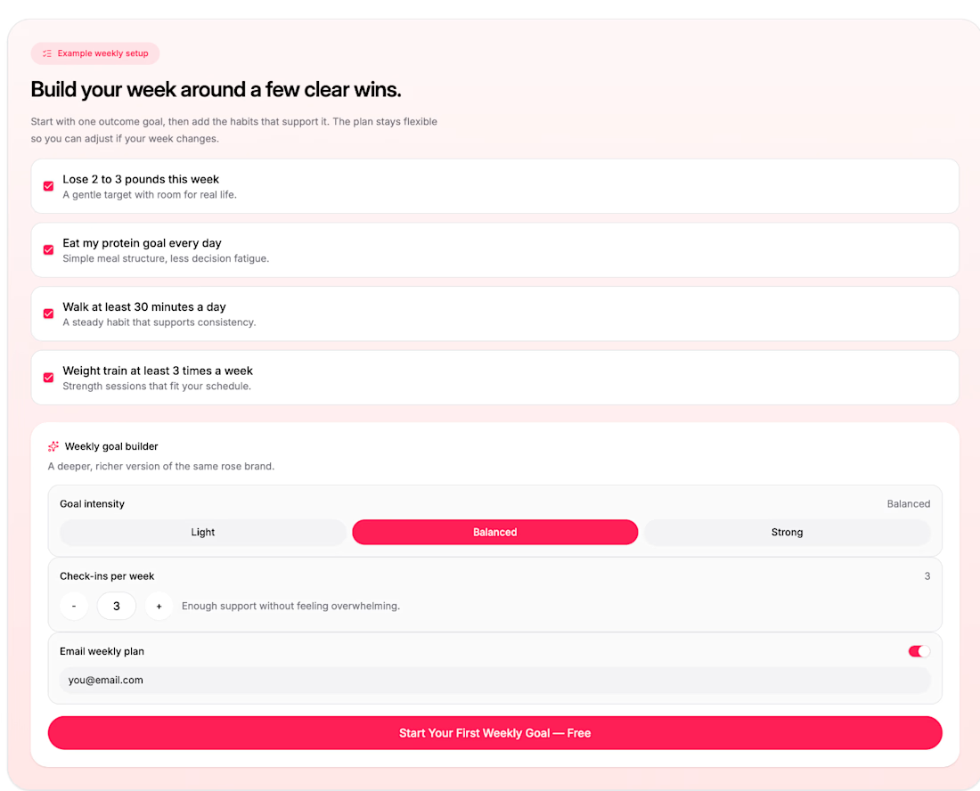
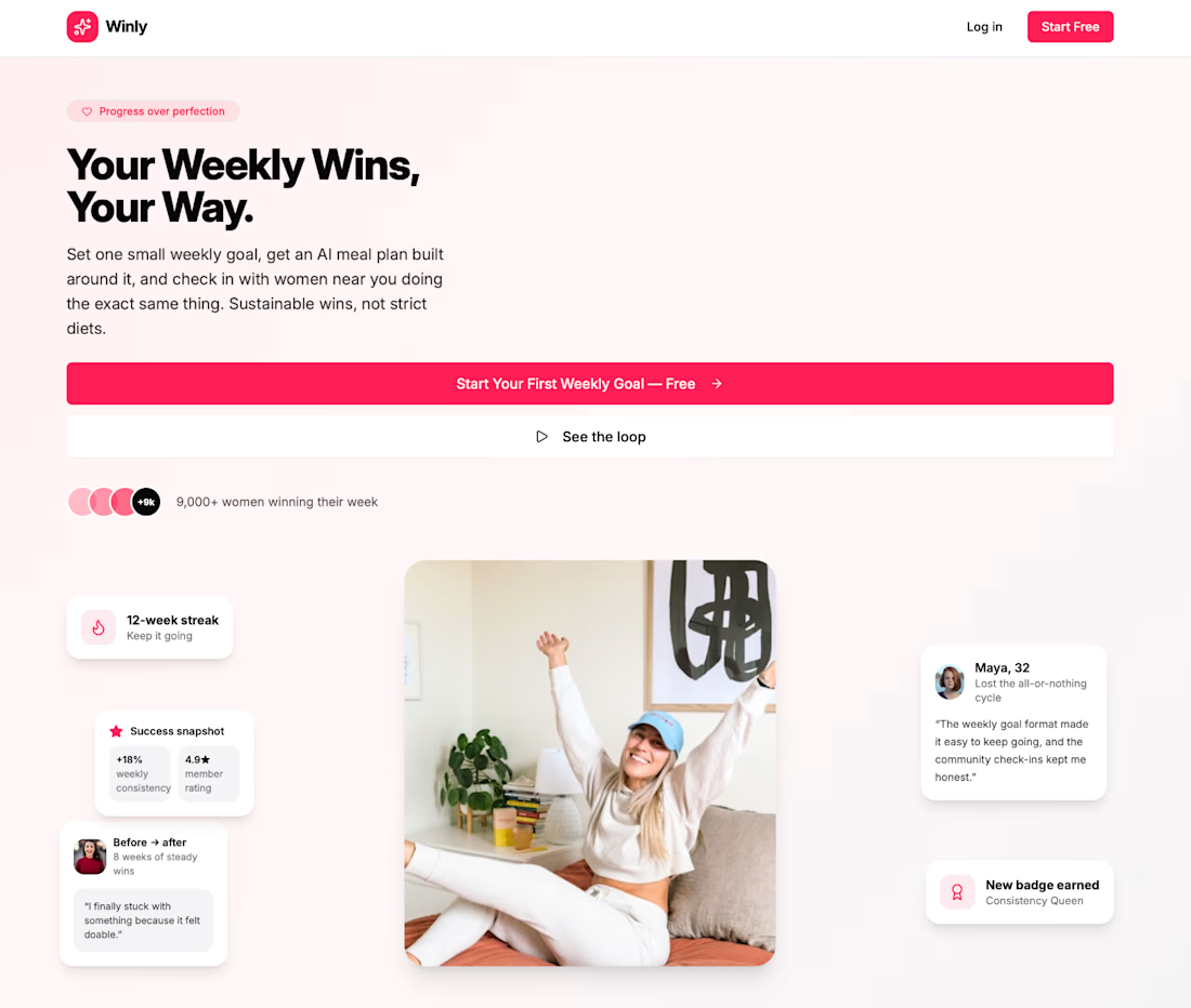
Weekly Wins is a mobile app that helps women build sustainable habits one week at a time instead of chasing a single 'after' photo. Each week you set one goal like 'cook 4 dinners at home' and the app builds an AI meal plan around it, tracked with a simple progress ring instead of a scale. The Community screen surfaces other women near you working on similar goals, each with a quick snapshot of their streak and what they're focused on, and tapping into a profile opens a real chat thread so you can actually coordinate a walk, trade a recipe, or just check in.
I built it because most goal-tracking apps are either bare habit trackers with no support system, or diet apps obsessed with a number I wanted something that treats consistency and community as the actual metric of progress.
#Flowstep Challenge

The network for creativity
Join 1.25M professional creatives like you
Connect with clients, get discovered, and run your business 100% commission-free
Creatives on Contra have earned over $150M and we are just getting started



Related posts

What if sending money felt a little more like giving a gift?
For Nova, I explored a banking app that brings payments, cards, and a bit of personality together. You can check your balance, browse recent transactions, send or request money, top up, and pay bills.
My favorite part is the digital postcard feature. Before sending a transfer, you can add a little illustrated card—a heart, a birthday greeting, or a playful character. A simple way to make birthday money or a thank-you feel more personal.
I carried that same 3D character into onboarding, pairing it with bold red gradients and large, clear payment details. There’s room for play, while the recipient and amount stay easy to check.
Would you add a postcard to a transfer? I’d love to know what occasion you’d use it for.






AI-Powered Physiotherapy Clinic Dashboard | Smart Appointment Scheduling
A modern AI-powered dashboard concept designed for physiotherapy clinics to simplify appointment scheduling, therapist management, and daily operations. The interface focuses on improving workflow efficiency with an intuitive calendar, smart booking experience, patient scheduling, and a clean visual system.
The design features an elegant and minimal UI, helping healthcare professionals manage appointments, therapists, and patient availability with ease. Every screen is crafted to deliver a fast, accessible, and user-friendly experience while maintaining a premium SaaS aesthetic.


so nice work

Designed an AI research workspace where the agent plans the work and fills a sheet with cited sources as it goes.
Same screen, two modes. Which one would you work in all day? 👀

13 voted
72%
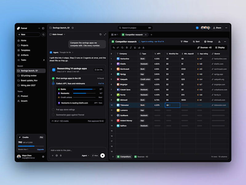
5 voted
28%
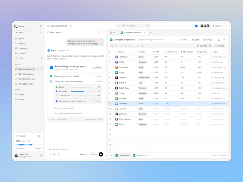
18 votes
Closed

Keeping the research plan and cited results side by side is a useful way to make the agent’s work easier to inspect. I’d lean toward light mode for reading the table in daylight. How do you distinguish a verified source from one that still needs review?