The network for creativity
Join 1.25M professional creatives like you
Connect with clients, get discovered, and run your business 100% commission-free
Creatives on Contra have earned over $150M and we are just getting started
Back to feedPost
Had a fun weekend building Lumina ⚡
Designed with Google Stitch.
I'm a developer who's been putting off rebuilding my portfolio for months. My question going into this challenge: could Stitch help me ship a real product — not just a mockup — in a single sitting?
So I built Lumina. Paste your GitHub URL, watch a fully animated portfolio stream onto the canvas in 60 seconds. Real repos, real data, live and shareable immediately.
How Stitch fit in:
I designed all five screens in Stitch before touching any code. The streaming canvas generation was the moment that changed everything — watching the portfolio build itself section by section made me realise: that's exactly what I want users to feel. The feature inspired the feature.
From there I worked almost entirely through in-place edits. Clicked the project cards, typed "stronger 3D hover with a glow matching the language color." Clicked the hero, typed "mesh gradient with a grid pattern." Changes in seconds. No re-prompting from scratch.
The motion work was where Stitch surprised me most — particle backgrounds, animated skill rings, 3D card hovers, all authored inside Stitch. Then one push to Netlify.
Features I used:
Streaming canvas generation
In-place AI edits via prompts + point-and-click
Import from existing website (used Vercel.com as style reference)
Native motion and hover states on HTML canvas
Netlify export
Feedback:
The streaming canvas collapses the describe → wait → judge → re-prompt loop into something that actually feels like designing. In-place editing is where I spent most of my time — clicking and describing beats tweaking properties in a panel every time.
Stitch didn't feel like a tool I was prompting. It felt like a canvas that understood what I meant.
Check it out:
Live site → https://grand-pixie-01f370.netlify.app
GitHub → https://github.com/AbdullahTariq74/Lumina-Stitch


Really like the idea of turning a GitHub profile into a live portfolio in seconds. Also interesting that the streaming canvas ended up influencing the core experience you built.
This was my take on the challenge:
https://on.contra.com/pnfJBQ
Curious what stands out to you.

on.contra.com
Introducing Voya: Revolutionize Your Travel Planning Experience
Connect with next-gen talent and tools to get work underway. Hire more independents. Start more projects. Get more creative.

Peak creativity right here in this piece.

Thanks for the appreciation!
The network for creativity
Join 1.25M professional creatives like you
Connect with clients, get discovered, and run your business 100% commission-free
Creatives on Contra have earned over $150M and we are just getting started





Related posts

Which hero visual feels right for this brand?
While working on the homepage for Halfspace, a website design and SEO agency, I explored two different hero visuals for the same headline and layout. Same message, same structure, just a different visual metaphor and mood.
Option 1 - Rocket Launch. Bold, literal, and energetic, visually reinforcing the "launch your business" message with motion and fire.
Option 2 - Glass Cube. Abstract, sleek, and premium, giving a more refined, tech-forward feel without relying on a literal metaphor.
Would love your honest UX/UI take, which direction feels more impactful, memorable, and aligned with a web design/SEO brand, and why?
11 voted
41%
16 voted
59%
27 votes
Closed

Both design are great; it's hard to choose one


New case study: motion product film for a mobile streaming app. Some shots filmed on camera, some AI generated, the rest built in After Effects
Check it out


This is only high end


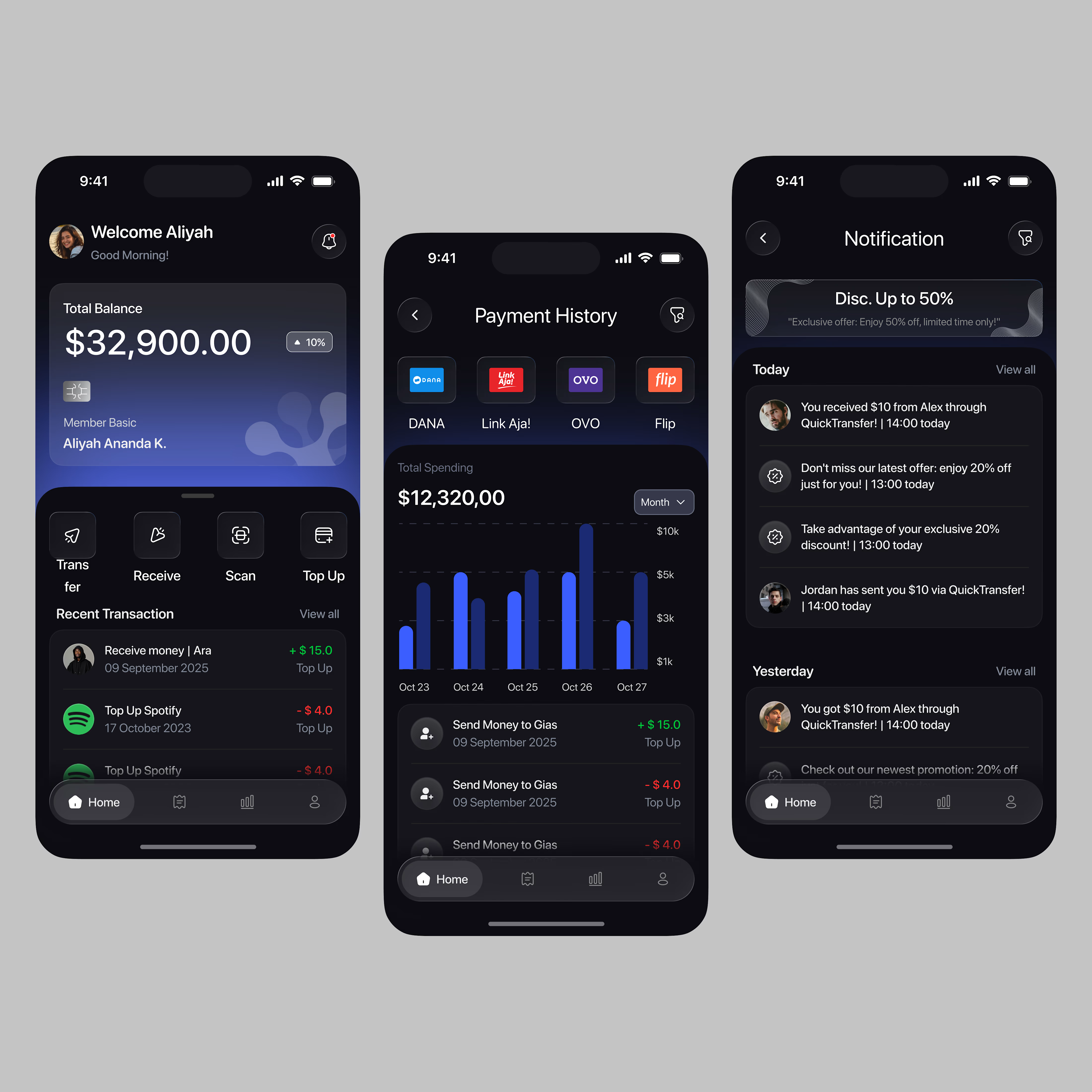

A little sneak peek at what I’ve been working on!