The network for creativity
Join 1.25M professional creatives like you
Connect with clients, get discovered, and run your business 100% commission-free
Creatives on Contra have earned over $150M and we are just getting started
Back to feedPost

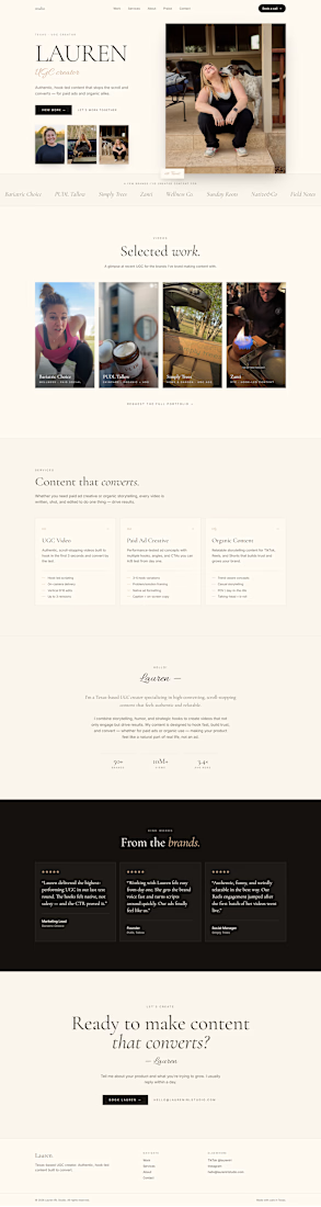
I came across a UGC creator's portfolio and saw an opportunity to improve the overall presentation and conversion flow.
Without being asked, I created a custom portfolio homepage demo and reached out with the concept.
The response? She loved the design, the layout, and the direction of the website. While we're not starting immediately, she's interested in working together in the near future.
This is a reminder that sometimes the best way to pitch your skills isn't with a long message—it's by showing what's possible.
Building before getting paid is a risk, but a well-executed demo can open doors that cold emails alone can't.
Demo attached.
If you're a creator, freelancer, or business owner looking for a clean, modern, conversion-focused website like this, feel free to send me a message. I'd be happy to explore ideas for your project.
#WebDesign #PortfolioDesign #FrontendDevelopment #Freelance #UGCCreator #ContraCreator #PersonalBrand #BusinessWebsite
The network for creativity
Join 1.25M professional creatives like you
Connect with clients, get discovered, and run your business 100% commission-free
Creatives on Contra have earned over $150M and we are just getting started








Related posts


A few pieces of the website we recently created for Kodilion. Com check the complete website at https://kodilion.hr/


I designed and developed this landing page for Stereo Fest: Eclipse, the upcoming youth event for @caminodevida.
The visual concept comes from a simple truth: the moon has no light of its own, it only reflects the light of the sun.
In the same way, we weren’t made to generate our own light, but to reflect Jesus.
The cool part: as you scroll, you control the movement of the moon. Right at the core phrase, the eclipse happens, showing that in the darkness, the Glory of God is revealed.
Check it out here: stereofest.com


That's really special it feels like space war game landing page great job Misael🔥🔥🔥

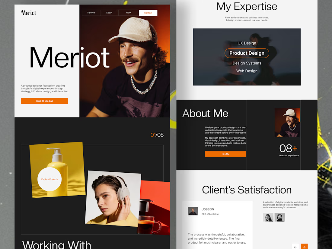
Product Designer Portfolio Website
Client focused solutions
The goal was to create a digital experience that presents a designer’s expertise, showcases selected projects, and guides potential clients toward taking action.
From the split-screen hero section to the interactive-looking project showcase, expertise section, and client testimonials, every section is designed to balance visual impact with usability.
From the split-screen hero section to the interactive-looking project showcase, expertise section, and client testimonials, every section is designed to balance visual impact with usability.
Design highlights:
Modern, editorial-inspired visual direction
Bold typography and clear visual hierarchy
Engaging project presentation
Structured expertise and about sections
Client-focused layout with clear calls to action
Minimal, high-contrast design with vibrant orange accents
Looking for a portfolio website or a landing page that makes your brand stand out? I design thoughtful digital experiences that combine aesthetics, usability, and business goals.
Have a project in mind? Let's connect and bring your vision to life.

Outstanding approach.