The network for creativity
Join 1.25M professional creatives like you
Connect with clients, get discovered, and run your business 100% commission-free
Creatives on Contra have earned over $150M and we are just getting started
Back to feedPost



The network for creativity
Join 1.25M professional creatives like you
Connect with clients, get discovered, and run your business 100% commission-free
Creatives on Contra have earned over $150M and we are just getting started







Related posts

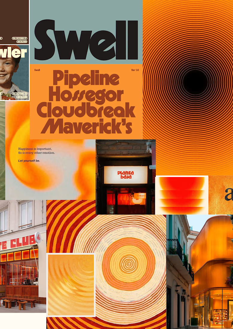
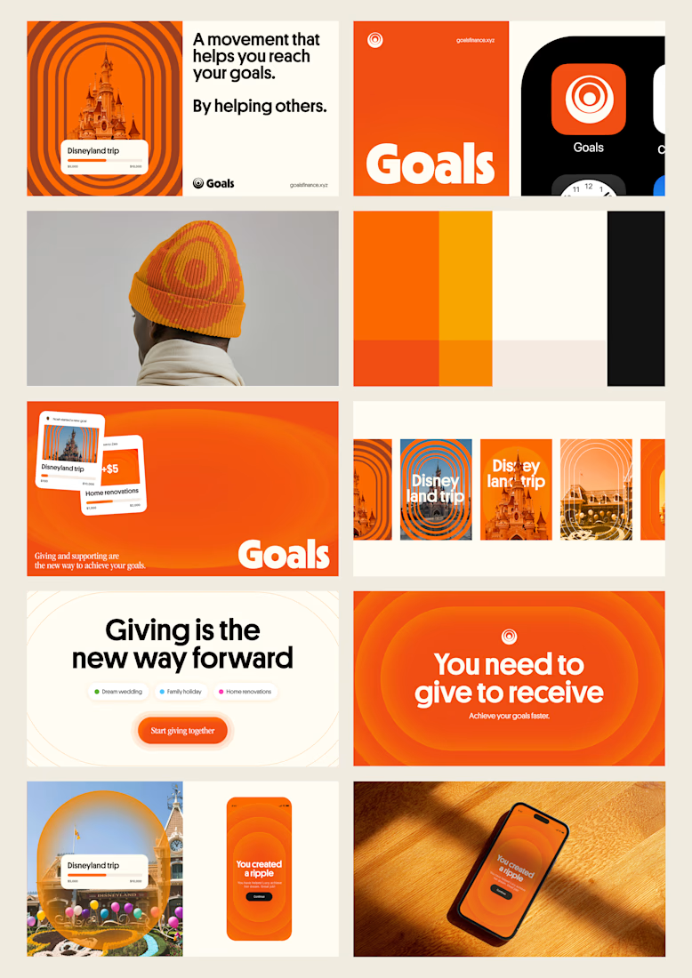
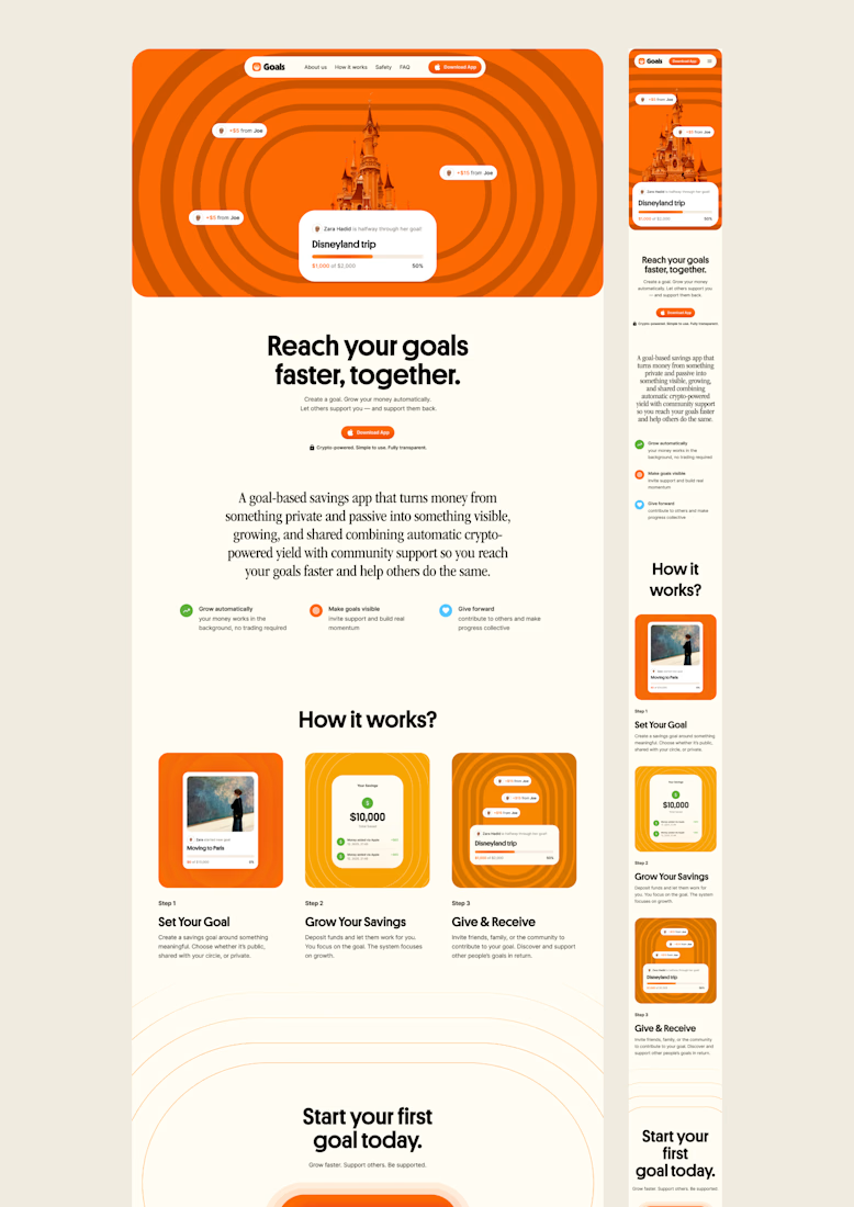
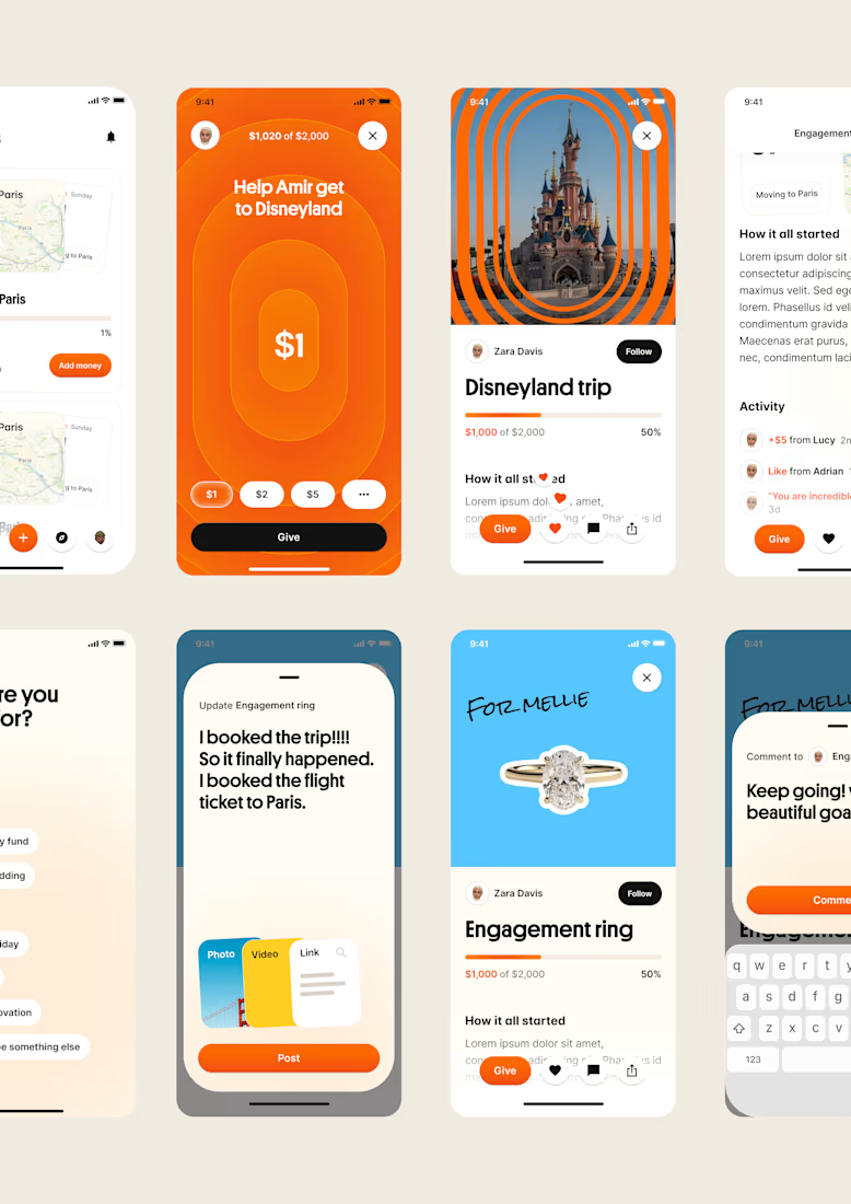
one of my favourite things about running a one-person studio is that nothing gets lost in translation.
the idea behind the brand is the same idea that shapes the website and the product.
no handovers, no starting from scratch, no trying to explain the vision to someone new.
a little look at how that came together for goals, from the first moodboard to the app ↓

Love it!

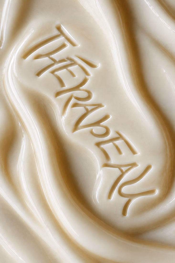
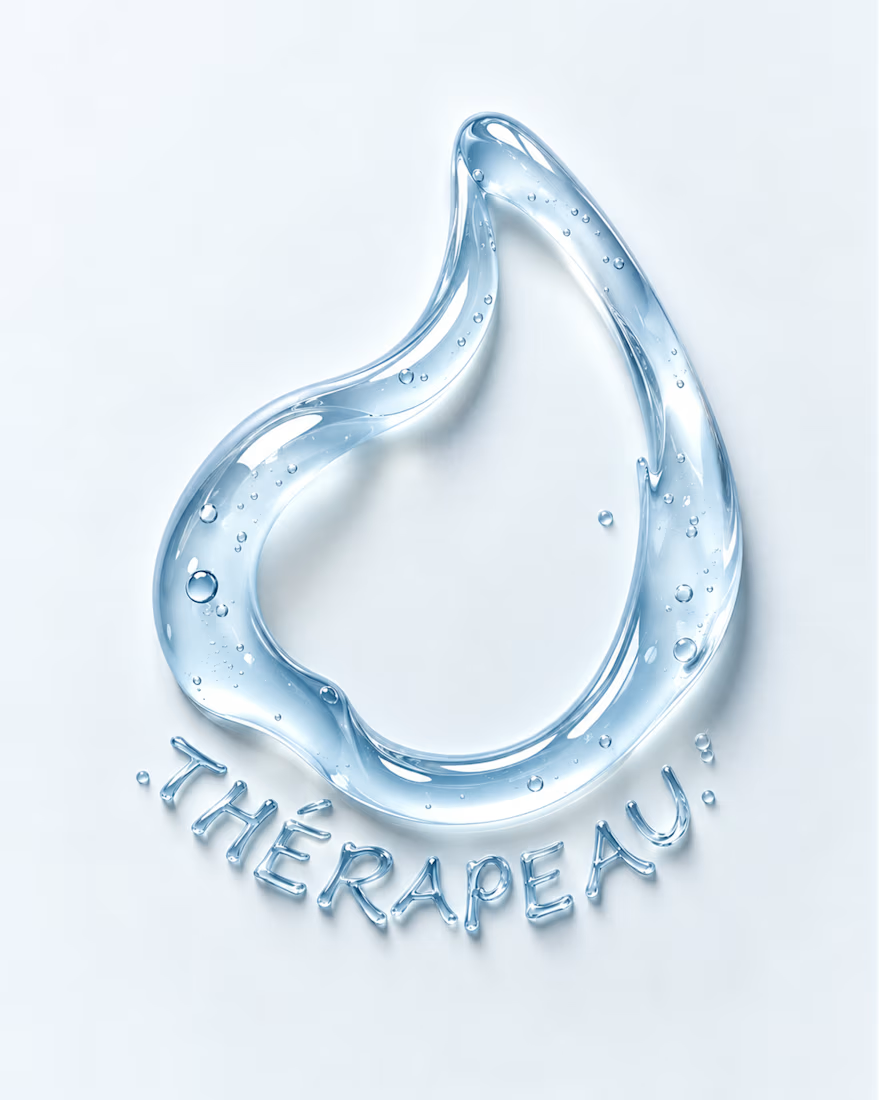
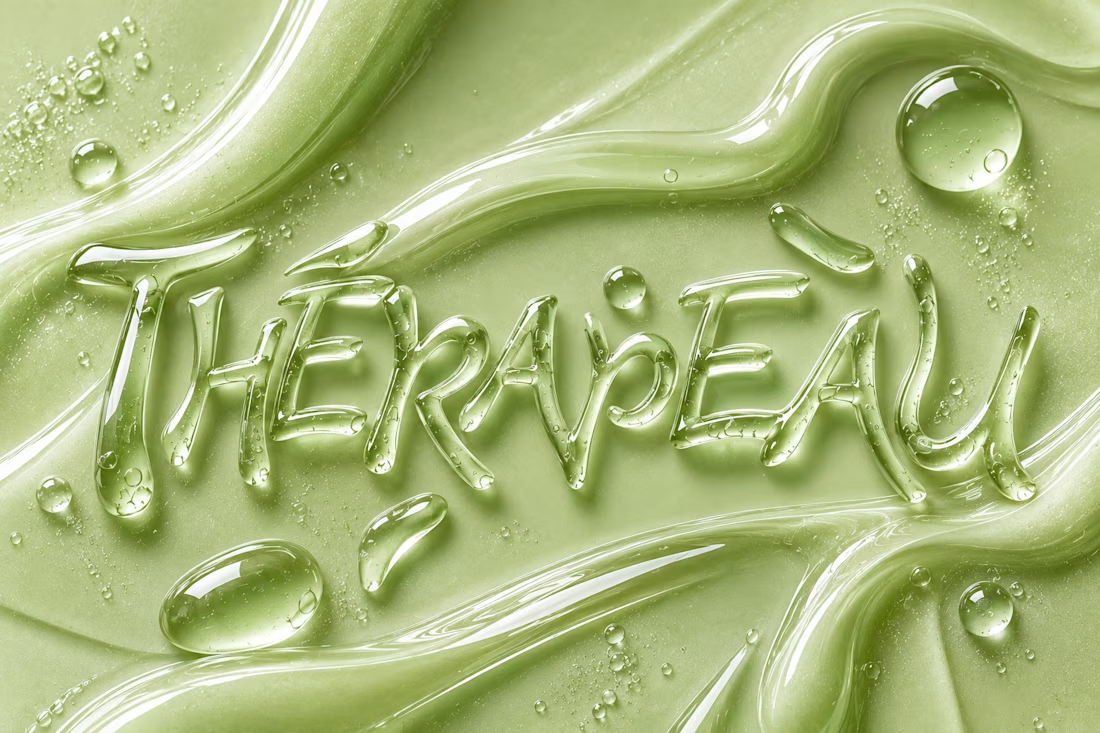
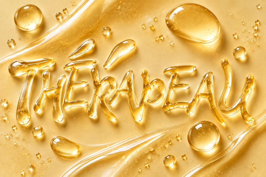
Exploring imagination through texture, typography and skincare. ✨
For THÉRAPEAU, I wanted to push the visual identity beyond packaging and explore how serum, gel and cream could become part of the brand language itself.
Using the core wordmark as a starting point, I experimented with different materials, colours and tactile expressions — turning skincare textures into typography and visual studies.
These explorations were created together with ChatGPT as part of the creative process, helping me test ideas quickly while keeping the final brand direction grounded in my own identity system and design decisions.
A small study in how texture can become communication. 💧
#ChatGPT #AIinDesign #Branding #VisualIdentity #SkincareBranding


Letting the wordmark turn into the material itself is a strong idea. Did you set a limit for how far a texture can distort the letters before it stops reading as THÉRAPEAU?


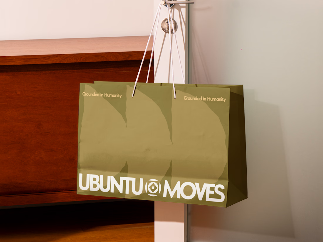
Grounded in humanity, made for movement.
Packaging and custom Framer website design for Ubuntu Moves, a wellness brand inspired by the belief that “I am because we are.”
Earthy colors, expressive patterns, and bold typography bring its sense of connection into the physical and digital experience.
Thanks @Can Girgin for the Framer development💫


The olive shopping bag with the wordmark split around that circular emblem looks great in the warm light, and the big tonal arches printed behind it add movement without shouting.