The network for creativity
Join 1.25M professional creatives like you
Connect with clients, get discovered, and run your business 100% commission-free
Creatives on Contra have earned over $150M and we are just getting started
Back to feedPost

Rishikesh Sonawane — Design & Development Portfolio
Editorial portfolio showcasing 6 design-concept projects. Custom cursor, page loader, scroll reveals, magnetic buttons, noise overlay. Pure HTML/CSS/JS.
## Overview
The portfolio is the seventh project in the collection. It's not just a container for the other six, it's a project in its own right, with its own design language, its own interactions, and its own personality.
Where the six concept projects are products, the portfolio is a person. Warm, editorial, unhurried. It doesn't compete with the work. It frames it.
## Design Decisions
### Why Warm Editorial?
The six projects span quiet luxury, bohemian, technical, skeuomorphic, dark atmospheric, and Material Design. The portfolio needed to be "none of these", a neutral but warm frame that lets each project's personality shine through.
Terracotta on cream. Fraunces serif. Generous whitespace. The aesthetic of a well-designed magazine, thick paper, confident typography, no rush.
### Why Fraunces?
Fraunces is a variable font with an optical size axis, it gets more refined at larger sizes. At display sizes, it has the weight and personality of a classic serif. At body sizes, it's clean and readable. One font, two roles.
### Why Vanilla JS?
The portfolio is plain HTML/CSS/JS, no build step, no framework. Open `index.html` and it works. This is intentional: the portfolio should be as accessible as possible. No Node.js required. No `npm install`. Just the web.
## Impact
- Zero dependencies, pure HTML/CSS/JS
- 12 premium interactive features
- 6 case studies with unique accent colors
- Fully responsive with `prefers-reduced-motion` support
- Contact form with Formspree integration
## What I Learned
1. The portfolio is a project, not a container. It deserves the same care as the work it showcases.
2. Warm editorial works for portfolios. Terracotta on cream, serif headings, plenty of whitespace, it feels human.
3. Custom cursors are polarizing. The `pointer: coarse` check is essential.
4. Page loaders are vanity for static HTML, but they look cool.
5. Scroll reveal animations are the single most impactful feature for a portfolio.


The network for creativity
Join 1.25M professional creatives like you
Connect with clients, get discovered, and run your business 100% commission-free
Creatives on Contra have earned over $150M and we are just getting started











Related posts

Behind the scenes of the Treal Studio brand film.
Built in one week, from creative direction to sound design.


Love the overall feel, looks amazing 👌🏼

Santa Monica Tile & Stone E-Commerce Design, 2025.
Buying tile online is mostly guesswork, so I designed a concept store where every page answers one buyer question. Shoppable rooms show how it looks, a coverage calculator tells you how much you need, and free samples let you see it first. Deep green, warm gold, and an AI tile scan that turns inspiration photos into products. Open for e-commerce and web design projects.
Full case study on my Contra Profile

TOP!!

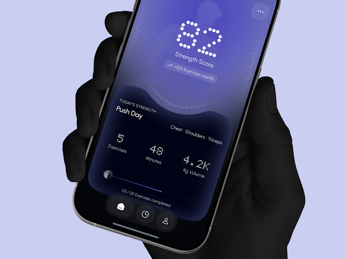
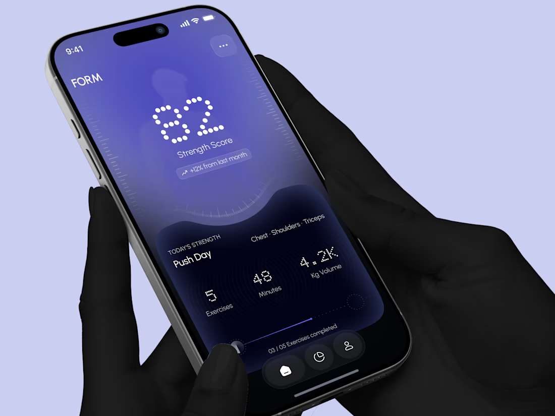
Designed a modern Strength Training Mobile App.
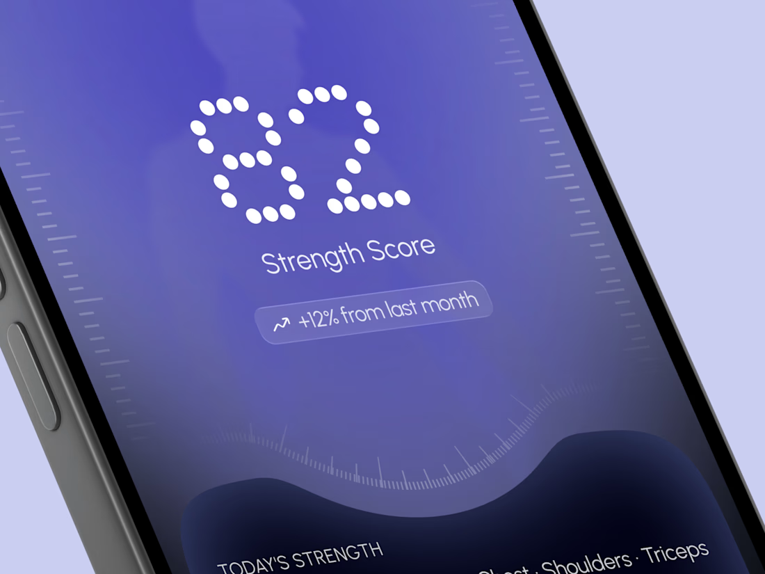
A deep indigo and violet gradient with a soft body silhouette and dotted display numbers for a bold and focused first impression.
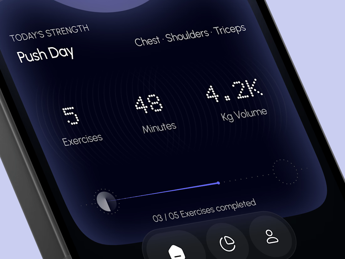
A glowing strength score, a clear workout card with exercises, minutes, and volume, plus a simple progress bar make every training session easy to follow. A curved dark panel, fine tick marks, and a floating tab bar keep the whole app sleek, modern, and easy to use.


High end execution