The network for creativity
Join 1.25M professional creatives like you
Connect with clients, get discovered, and run your business 100% commission-free
Creatives on Contra have earned over $150M and we are just getting started
Back to feedPost
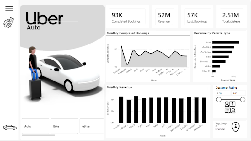
I built an interactive Power BI dashboard to analyze Uber ride bookings, revenue, vehicle performance, and customer ratings.
-The dashboard provides a clear view of:
93K completed bookings
52M revenue
Revenue performance by vehicle type
Monthly booking and revenue trends
Customer ratings
Top drop-off locations
Tools: Power BI, Power Query, DAX, Excel
The goal was to turn raw ride-booking data into an interactive business dashboard that makes performance trends easier to understand and analyze.
Open to freelance data analytics, reporting, and Power BI dashboard projects.



Thank you for the valuable feedback! I really appreciate the insights and will definitely consider adding these metrics in future improvements.
The network for creativity
Join 1.25M professional creatives like you
Connect with clients, get discovered, and run your business 100% commission-free
Creatives on Contra have earned over $150M and we are just getting started
Challenges
View all


Related posts


clean


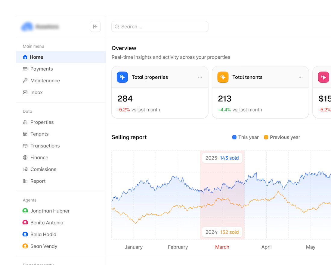
Hyper-modern real-estate dashboard.

:Built an interactive hotel dashboard in Power BI to turn raw booking and revenue data into clear, at-a-glance insights for hotel management.