The network for creativity
Join 1.25M professional creatives like you
Connect with clients, get discovered, and run your business 100% commission-free
Creatives on Contra have earned over $150M and we are just getting started
Back to feedPost

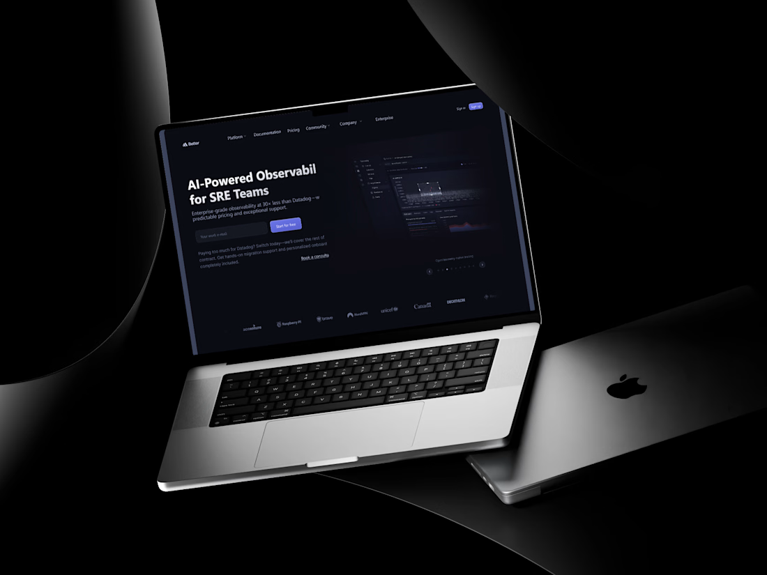
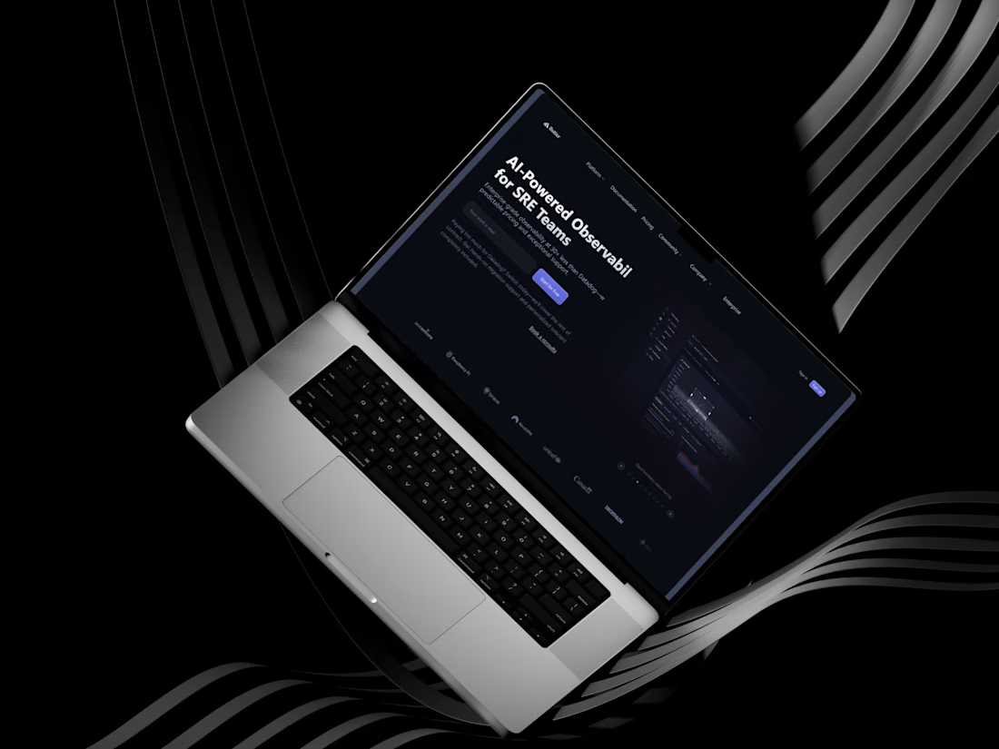
AI-Powered SRE SaaS Landing Page Design
Designed a high-converting, developer-focused landing page tailored for AI-powered observability and SRE (Site Reliability Engineering) teams.
The Challenge:
Building trust and communicating complex technical infrastructure solutions to a sophisticated audience requires a precise balance of authority, clarity, and visual appeal.
The Solution:
Dark-Mode Aesthetic: Leveraged a sleek, high-tech dark background with subtle neon/purple accents to instantly resonate with developers and technical buyers.
Clear Information Architecture: Structured the layout to guide visitors smoothly from a strong hero value proposition down to key metrics, feature breakdowns, code previews, pricing, and social proof.
Conversion-Focused Layout: Strategically placed call-to-action (CTA) buttons throughout the long-scroll layout to maximize conversion touchpoints.

The network for creativity
Join 1.25M professional creatives like you
Connect with clients, get discovered, and run your business 100% commission-free
Creatives on Contra have earned over $150M and we are just getting started











Related posts


Hiring: UX / Product Designer (remote, ongoing)
I run Novatur Design, a product design studio based in Malta. We work with startups through to enterprise clients such as The Daily Mail, across a range of industries from EV to Crypto, Fintech to IoT.
I’m looking for an all-round UX / product designer who can take a problem from user flows through to polished hi-fi UI. Figma, auto layout and design systems should be second nature.
This is ongoing contractor work on a monthly basis, not a one-off project. If it works well on both sides, there’s potential for it to go full time.
Remote, so you don’t need to be in Malta. Individual designers only, no agencies please.
If you’re interested, the application takes about 6 minutes:
https://tally.so/r/yXZ2dB
Ralph

Love the variety of industries you work with. Sounds like an amazing opportunity for the right designer.


🌲 Nordhaus | Prefab Timber Homes Website (Framer)
Homes that grow quietly with the forest, now on the web. 🏡
Nordhaus is a website for a Latvian builder of prefabricated timber homes, created in Figma and built in Framer as a responsive site for desktop, tablet and mobile. It brings the brand's calm Nordic character through full-screen photography, a scroll-driven process story, a horizontal model gallery and interactive testimonials.
✨ Template coming soon to Framer.


Wonderful design man

