The network for creativity
Join 1.25M professional creatives like you
Connect with clients, get discovered, and run your business 100% commission-free
Creatives on Contra have earned over $150M and we are just getting started
Back to feedPost

Working on my new template today — here's one section coming together.
Before Framer, I could only visualize this stuff in my head. Now I actually get to build it and watch it turn out for real.


The network for creativity
Join 1.25M professional creatives like you
Connect with clients, get discovered, and run your business 100% commission-free
Creatives on Contra have earned over $150M and we are just getting started











Related posts

Your next client might be one portfolio away. ✨
MyFolio Pro — a premium Framer template for freelancers, UI/UX designers, and creative agencies.
Template link: https://framer.link/E9JSnLX



love this as well man

Behind the scenes of the Treal Studio brand film.
Built in one week, from creative direction to sound design.


Love the overall feel, looks amazing 👌🏼

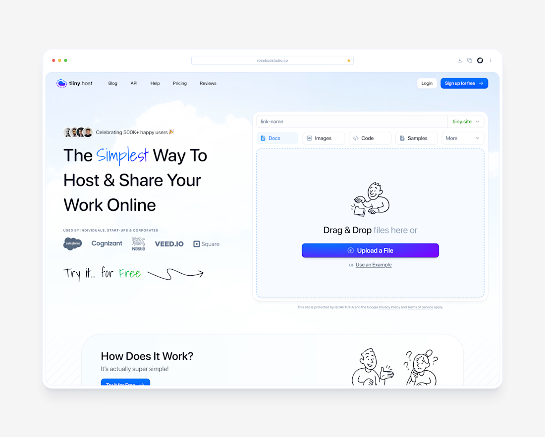
tiiny.host Landing Page
Description:
A clean, friendly landing page for tiiny.host, the easiest way to put a file online and share it with a link.
The goal was to make the product feel as simple as it actually is. The upload box sits right in the hero, so visitors can drag in a file and get a live link without scrolling or signing up first.
What I focused on:
1. Upload-first hero with a clear “Upload a File” action and file type tabs (Docs, Images, Code, Samples)
2. Hand-drawn illustrations and script accents to keep the tone light and approachable
3. Social proof up top: 500K+ users and logos like Salesforce, Nestlé, and Square
4. Soft sky gradient and plenty of breathing room so nothing feels technical or intimidating


The hand-drawn illustrations with the script accents are what make this landing page special, Dante. They keep a file-hosting tool feeling light and approachable instead of technical, which is exactly the tone the upload-first hero needed.