The network for creativity
Join 1.25M professional creatives like you
Connect with clients, get discovered, and run your business 100% commission-free
Creatives on Contra have earned over $150M and we are just getting started
Back to feedPost

What does luxury feel like on a screen?
That was the question behind this build.
I wanted to create an aviation experience that feels less like a traditional airline website and more like a premium travel brand.
So I leaned into:
→ Editorial typography
→ Cinematic aviation imagery
→ Spacious layouts
→ Minimal navigation
→ Strong visual hierarchy
→ Subtle luxury
→ Storytelling through every section
From “Not just a flight. A feeling.” to “Wherever next takes you.”, the goal was to make the entire experience feel like part of the journey — not just a place to book a flight.
No template.
No waiting for the perfect brief.
Just an idea → design → build → ship.


The network for creativity
Join 1.25M professional creatives like you
Connect with clients, get discovered, and run your business 100% commission-free
Creatives on Contra have earned over $150M and we are just getting started





Related posts

Just created a cursor that transforms the content beneath it. It follows your pointer with a subtle delay, then settles precisely on it when you stop.
There are 9 effects: Invert, Monochrome, Fisheye, Duotone, Cyanotype, Embossed Paper, Solarized, Infrared, and Chromatic

This is the type of detail that shows the taste of the designer, well done!!

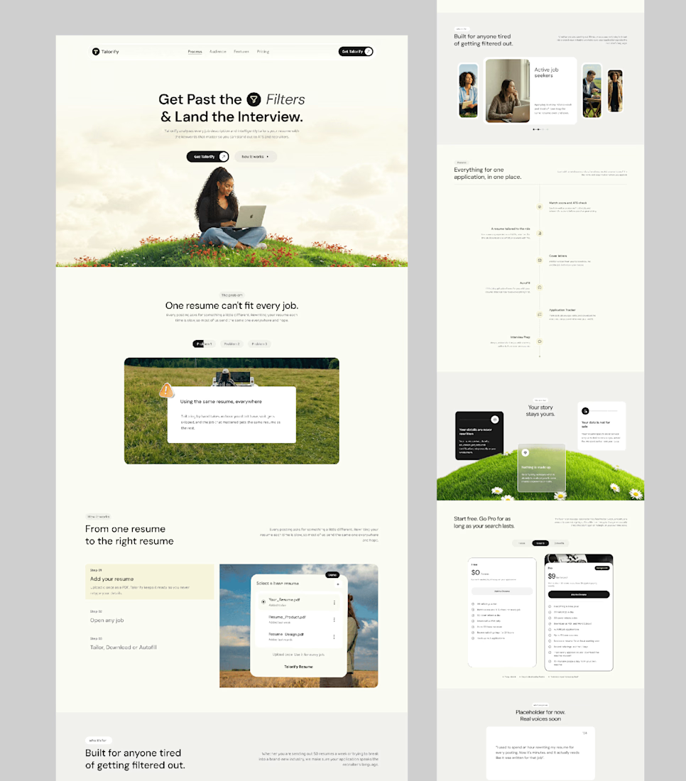
Talorify requested a high-converting landing page. Guess what?
Delivered the full design and development.
A high-converting landing page has one primary job, And this one is basically saying:
“Please get me from the store.” 🔥
Don’t overload your landing page with buttons that confuse your users. Give them one clear direction and make it easy to take action.
Check it out and tell me:
Would you call this design premium?
Hi, I’m Emmanuel Bliss, Product Designer (UI/UX).I bring clarity to what already exists and what is yet to exist.
Checkout the Live HERE



Definitely premium. Did they measure if this new design actually brought in more sign-ups and conversions compared to before?

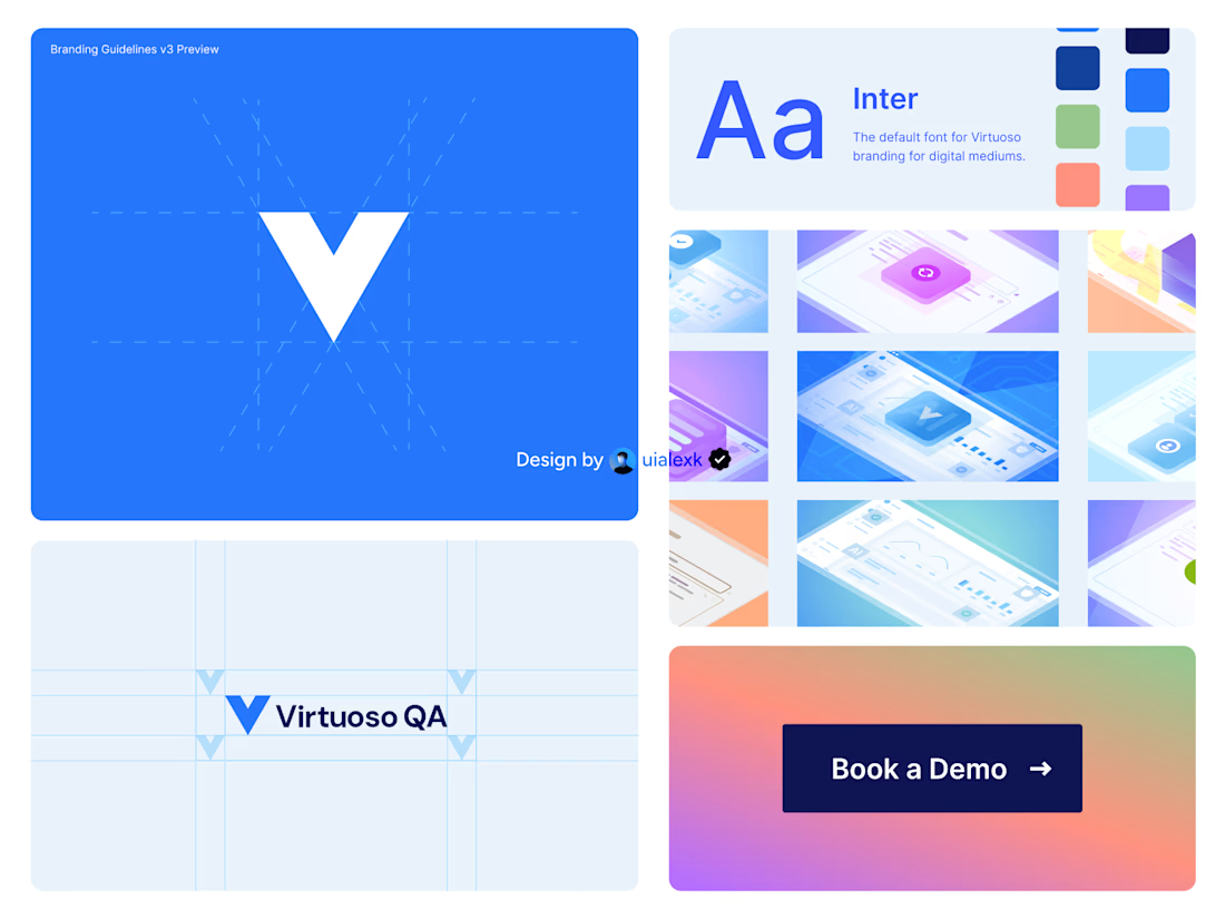
Branding v3 for Virtuoso
This design evolution, made an impact to the brand growth's by:
- Increasing website conversions
- Having consistent brand presence across digital mediums
- Increase brand awareness
See full case study here

One of the best designs I’ve seen today. Really solid work