The network for creativity
Join 1.25M professional creatives like you
Connect with clients, get discovered, and run your business 100% commission-free
Creatives on Contra have earned over $150M and we are just getting started
Back to feedPost

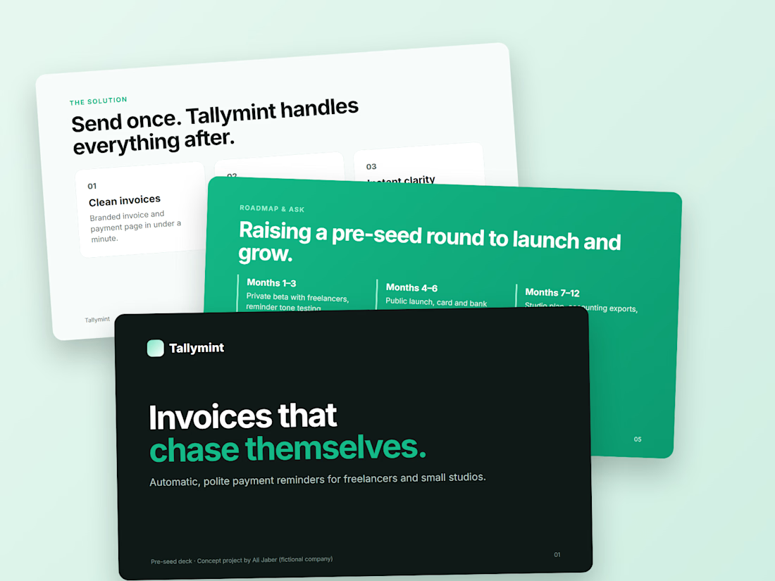
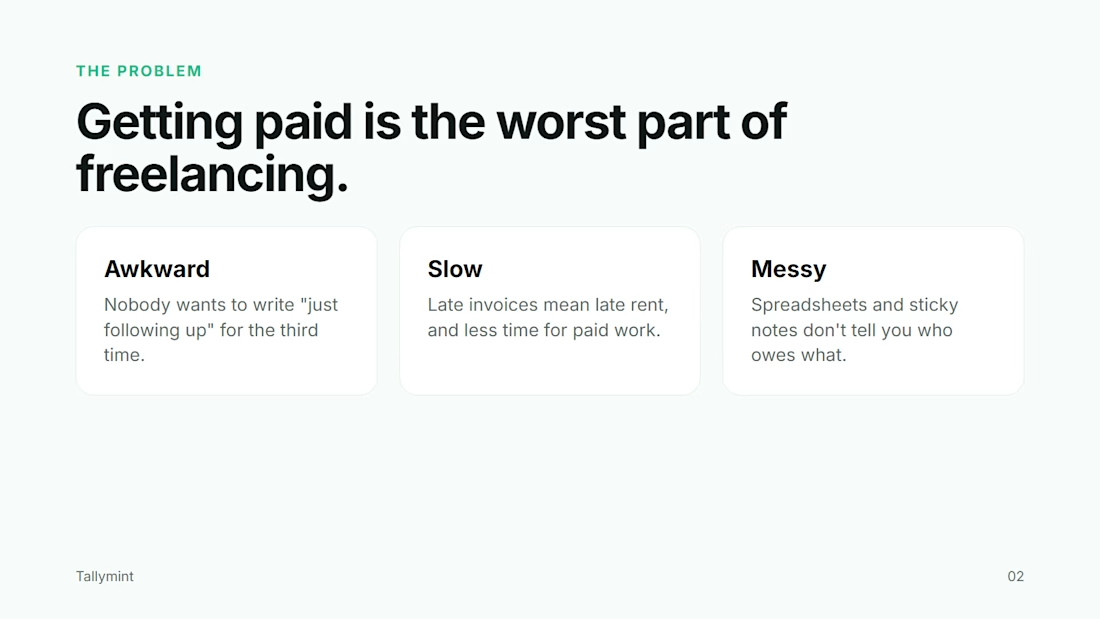
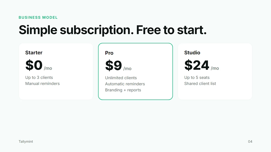
Turned an idea into a 5-slide pitch deck: problem, solution, pricing, roadmap and the ask. Same made-up startup as my last post, Tallymint.
A good deck isn't about fancy slides. Each slide should answer the one question the investor is already asking in their head, in as few words as possible.
If you've got notes, an old deck or just an idea, I can shape it into something you're proud to send.
The network for creativity
Join 1.25M professional creatives like you
Connect with clients, get discovered, and run your business 100% commission-free
Creatives on Contra have earned over $150M and we are just getting started











Related posts

What does a SaaS pitch deck look like when the brand gets out of the way of the story?
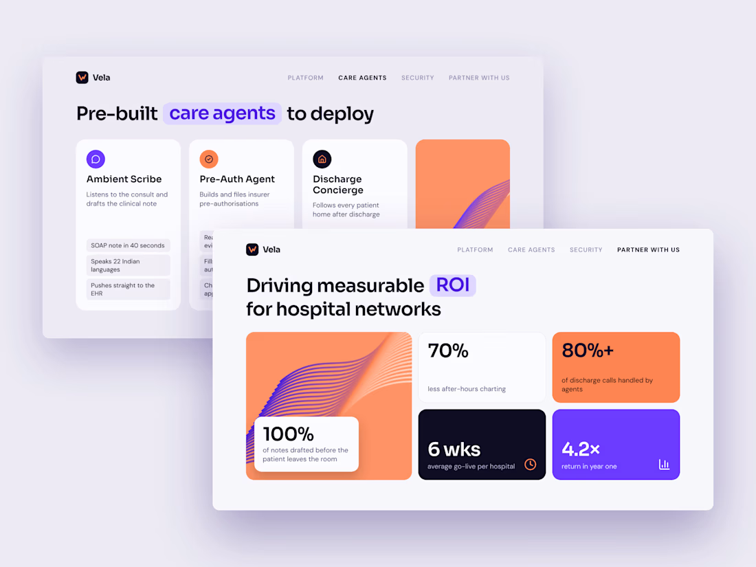
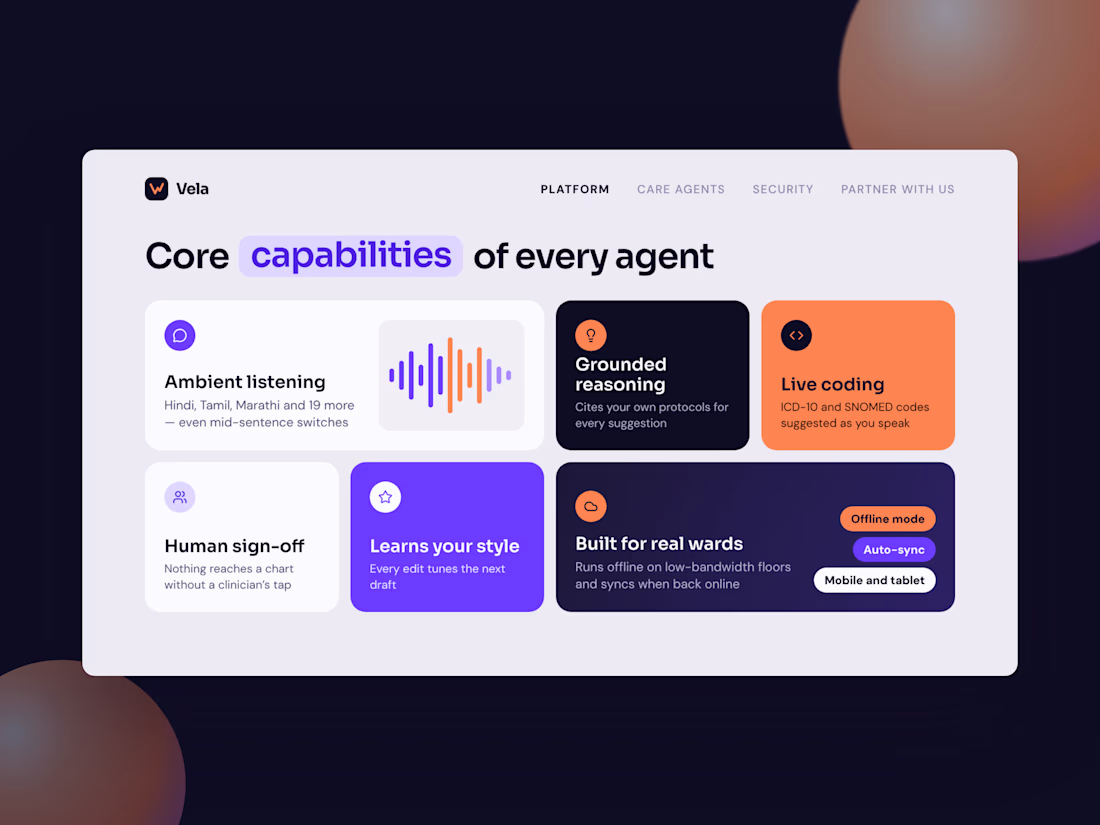
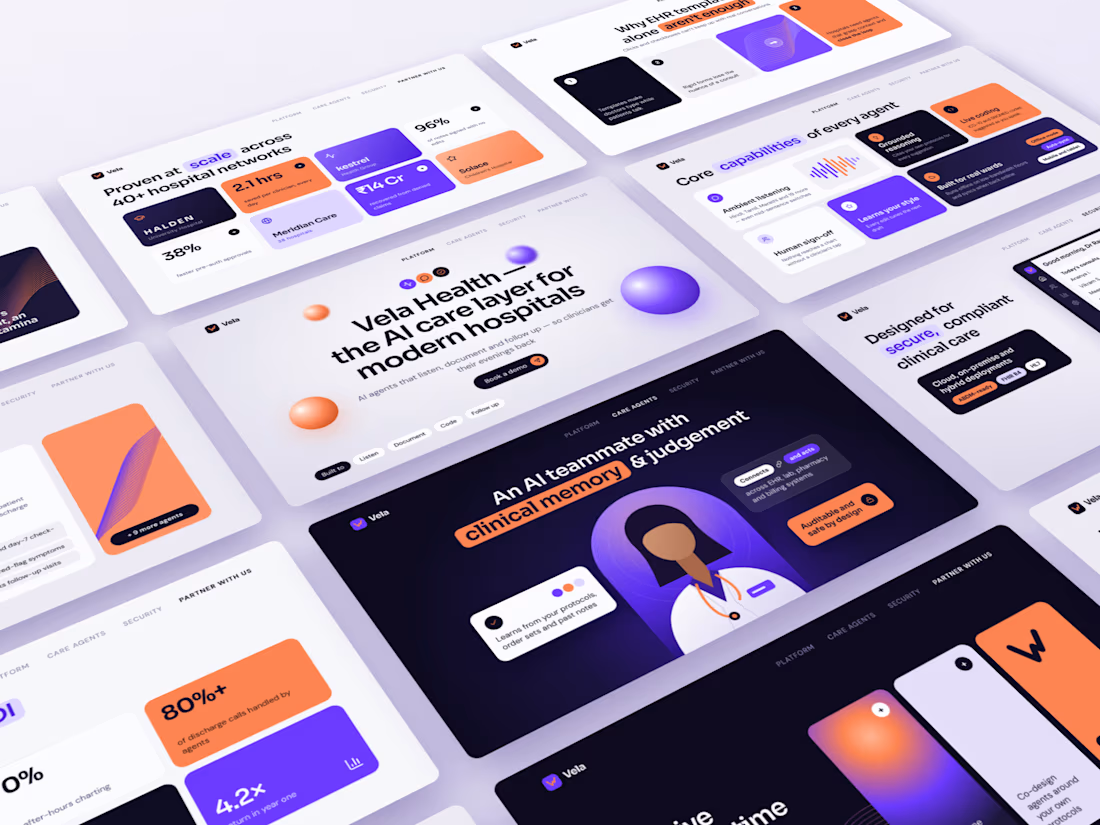
I gave myself a brief: an AI healthcare start-up pitching to hospital networks. No client and no brand guidelines, just a blank canvas.
Meet Vela Health (a concept brand), “the AI care layer for modern hospitals.”
The design choices:
→ Electric violet and coral instead of the usual safe healthcare blue
→ A bento-grid layout, so each slide makes one point at a glance
→ Key words in every headline highlighted in a colour pill
→ Glossy 3D spheres and flowing wave graphics in place of stock photos
→ A product dashboard designed from scratch, so the security slide shows the product instead of just describing it
11 slides covering the problem, the product, proof, rollout and ROI. It’s the full arc of an investor or enterprise pitch.
A good deck isn’t decoration. It’s how a complex product earns a 30-minute meeting.
If your SaaS deck still looks like 2019, let’s talk.
#PresentationDesign #PitchDeck #SaaSDesign #HealthTech #AIinHealthcare #BrandDesign #VisualDesign #Freelance




I really loved the color theme of this pitch deck

GlucoBrush | Animate Pitch Deck Designed on PowerPoint


Same content, different experience. A few thoughtful design choices can completely change how a presentation feels, flows, and communicates. Which version would you choose?

11 voted
31%
24 voted
69%
35 votes
Closed

Verde Vista 1 is more modern and futuristic specially with blue colors and robotic hand❤️
Great job Rasid🎉🎉🔥🔥