The network for creativity
Join 1.25M professional creatives like you
Connect with clients, get discovered, and run your business 100% commission-free
Creatives on Contra have earned over $150M and we are just getting started
Back to feedPost

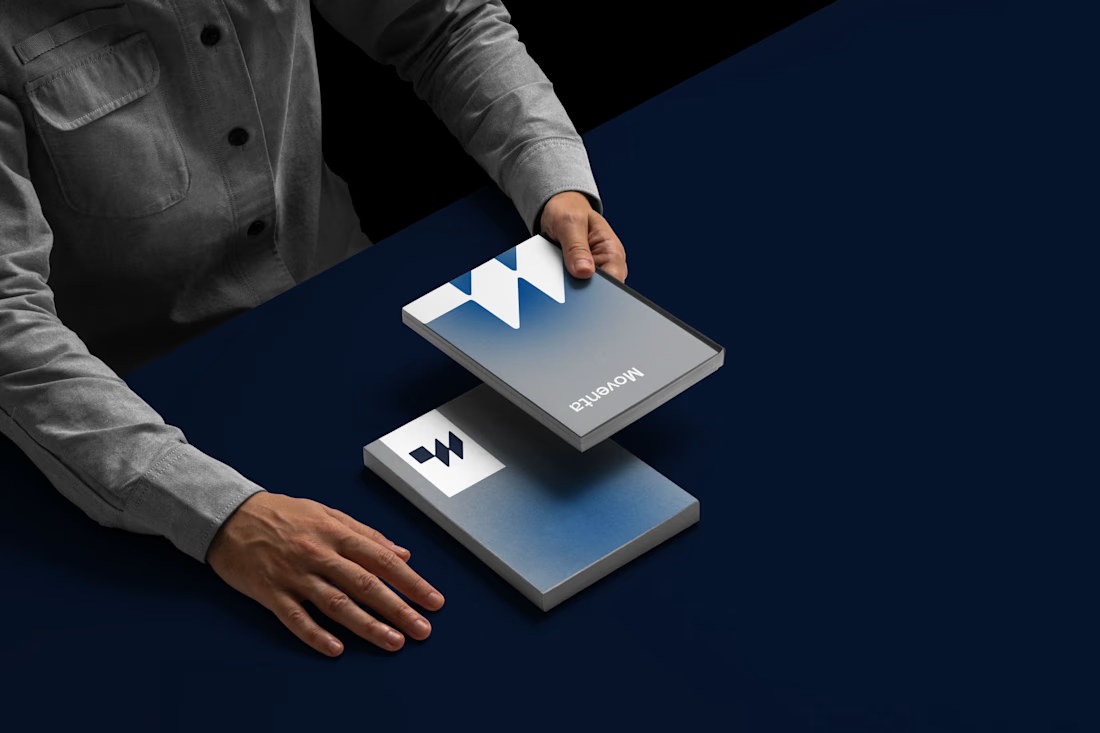
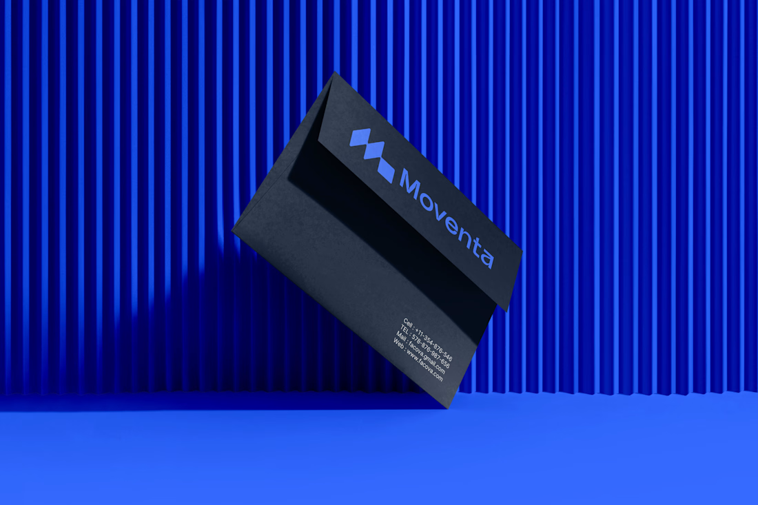
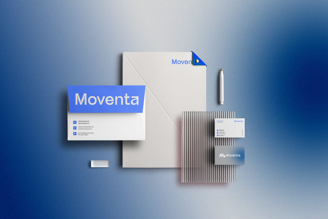
Snapshot from a $20k brand projects for a SF AI brand
What are your thoughts?


The orange-and-white system has real shelf presence—the oversized letterforms and repeated geometric rhythm make the identity feel both ownable and flexible. I’d be curious to see how the pattern behaves at small digital sizes where the wordmark has less room to breathe.


Love it
The network for creativity
Join 1.25M professional creatives like you
Connect with clients, get discovered, and run your business 100% commission-free
Creatives on Contra have earned over $150M and we are just getting started











Related posts


Same brand. Same palette. Two completely different proposals for a real estate developer.
A: An isotype built from blocks. Geometric, precise, the language of construction. It says we build.
B: Custom lettering with movement. Warmer, more editorial. It says we build places you’d want to live in.
36 voted
51%

35 voted
49%

71 votes
Closed

My vote is B, Milagros. Custom lettering with movement has real editorial warmth, which suits a developer selling places people actually want to live in.

Beyond grateful for every client and opportunity along the way. ❤️
Just getting started! 🙌

Huge congrats on $250K! 🔥 Super inspiring journey, Tamer. Just getting started indeed - on to $500K! 🚀



I like the Clarity and neatness in your work