The network for creativity
Join 1.25M professional creatives like you
Connect with clients, get discovered, and run your business 100% commission-free
Creatives on Contra have earned over $150M and we are just getting started
Back to feedPost
Taste Test
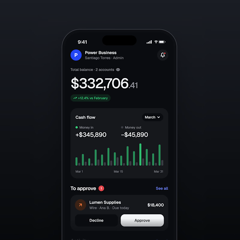
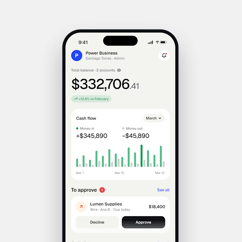
If you had to chose one to represent your business...
Would you pick light or dark mode?

38 voted
28%

98 voted
72%

136 votes
Closed


The dark mode is dope!

I love it too!

I think Dark mode
I like that one too, black and green is a nice combo!

Light mode feels more friendly, i would take that option.
Ok, thats understandable. Thank you man.

In my opinion, I will choose Dark mode. What would you choose?
Dark mode all day for me 💪🏼

Dark mode 🫠
As always 🫠

dark is so stunning
Thank you my bro 💪🏼

I see what you did there 😏

Light mode personally.
Nice preference. Thanks 🙏

Amazing Work
Yes bro, I'll keep them coming

Loved the dark mode!
Love that one too, for this one I think dark suits it more.

Dark Mode
Yep! I think dark mode is better for this one.

Dark wins man
By majority Vote! Dark Wins 🏆

These are completely different brands! I think it depends on the brand personality, right?! I do feel more masculine energy coming from dark mode for sure.
Yeah, I guess your right. It depends on the brand/situation.

I think Dark mode
Dark mode for me too. 🫡

dark mode!!!
Yes!!!

I love to design light mode I prefer using dark mode
I agree 💯

If the green smoke texture does not have any motion attached to it the it is totally unnecessary
Understandable.

Dark mode anyday
All day 💪🏼

Me too ✋️

Dark mode, tbh it really brings out the colors and it really is easier on my eyes now since most of my app usage is in dark mode
Yes, I use dark mode on almost everything now.

Dark looks premium.
Light looks elegant.
I'm a fan of premium
Yes, totally agree, got to go with premium.

I agree 💯


definitely the left version!
The network for creativity
Join 1.25M professional creatives like you
Connect with clients, get discovered, and run your business 100% commission-free
Creatives on Contra have earned over $150M and we are just getting started



Related posts

Dark Mode 🖤 or Light Mode 🤍?
Which one matches your vibe? 👀
15 voted
54%
13 voted
46%
28 votes
Closed

Both are nice clean designs...for me,Dark mode!

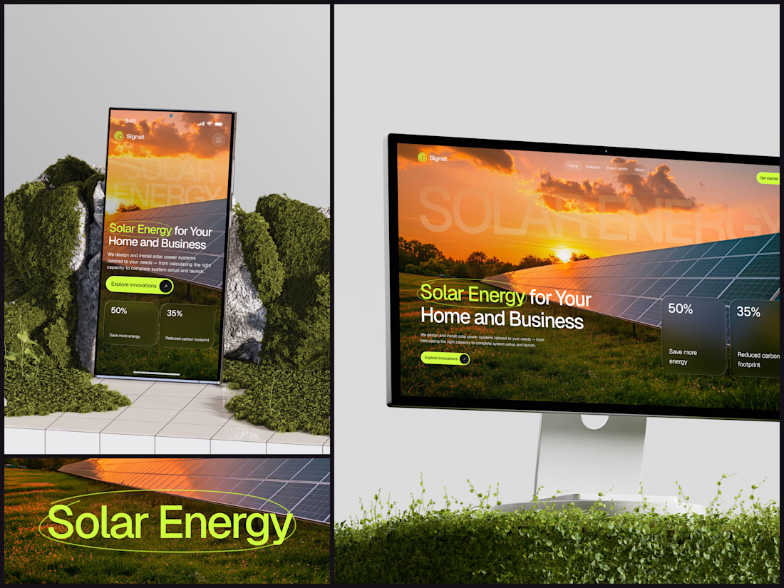
Solar Energy Website
A thin lime circle tells you which two words this page is about.
The headline sits over a sunset photo of a panel field. The "Get started" and "Explore innovations" buttons share the circle's lime, so the eye moves from the circled words straight to the next step.
Large faded capitals repeat those two words across the sky, faint enough to stay inside the photo. On mobile they break onto two lines, and the headline and button stack above two frosted cards.
Only two words of "Solar Energy for Your Home and Business" are lime, and the whole page follows them.
Designed by the Hue & Machine team.
#SolarEnergy #RenewableEnergy #CleanTech #WebDesign #LandingPage #HeroSection #UIDesign #ResponsiveDesign #MobileDesign #FigmaDesign



This is really cool, Nice job Dmytro

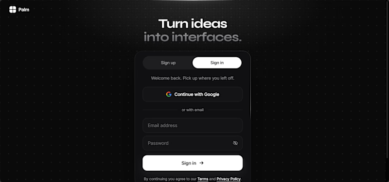
I still find to pick, I love the halftone on light mode, but there's something about the staged light on dark mode.
What do you think? Dark or Light?
3 voted
75%
1 voted
25%
4 votes
Closed

