The network for creativity
Join 1.25M professional creatives like you
Connect with clients, get discovered, and run your business 100% commission-free
Creatives on Contra have earned over $150M and we are just getting started
Back to feedPost

Your customers shop everywhere. Your brand should stand out everywhere. 🛒✨
From Amazon and Shopify to Walmart, Etsy & TikTok Shop, great eCommerce design helps your products get noticed, build trust, and turn clicks into customers.
I create high-converting marketplace visuals that don’t just look good; they communicate value and drive sales. 📈
5 Marketplaces. One design strategy. Bigger impact.
hashtag#eCommerceDesign hashtag#AmazonDesign hashtag#ShopifyDesign hashtag#Walmart hashtag#EtsySeller hashtag#TikTokShop hashtag#ProductDesign hashtag#MarketplaceDesign hashtag#eCommerceMarketing hashtag#ConversionDesign hashtag#ProductListingDesign hashtag#VisualMarketing

The network for creativity
Join 1.25M professional creatives like you
Connect with clients, get discovered, and run your business 100% commission-free
Creatives on Contra have earned over $150M and we are just getting started



Related posts


ESE GIN — Between the Dunes | Visual Identity & Packaging
ESE GIN draws its curves from the dunes. The signature S catches the light in sculpted olive glass and leaves its imprint in wax.


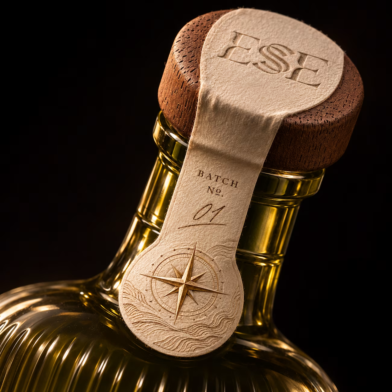
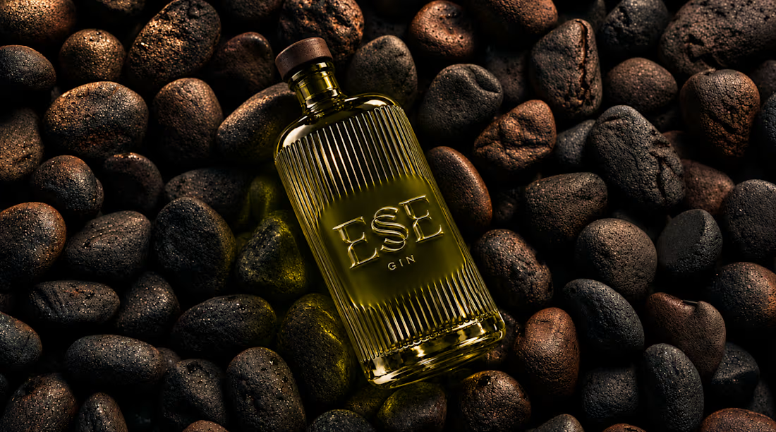

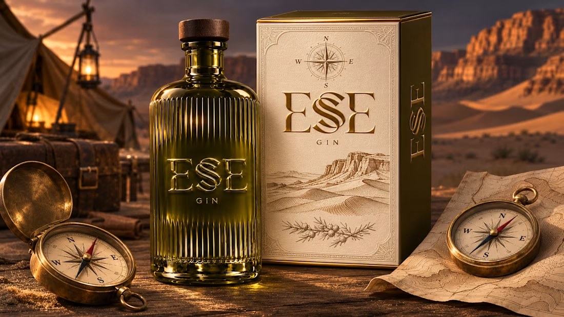

This is gorgeous, Maya — the sculpted olive glass with that S catching the light is such a clever way to carry the dunes into the bottle itself. And the wax seal imprint is a beautiful finishing touch, it gives the whole thing a crafted, almost apothecary feel. Really cohesive...

LUXE Furnish Studio is ready!!
I designed & built LUXE - a premium furniture brand on Shopify.
The goal was simple: Make it feel like a luxury showroom, not just an online shop.
What I did:
Clean, premium homepage with luxury branding
Curated collections: Sofas, Chairs, Tables & Decor
High-converting product pages with clear pricing & Add to Cart
Fully mobile-responsive - looks perfect on phone & desktop
Fast, clean navigation for easy shopping
Built on Shopify with a premium, minimal aesthetic focused on conversions.
If you need a luxury Shopify store that actually sells - let's build yours.
Live Demo: luxe-furnish-studio.myshopify.com
Password: 00
Services: Shopify Store Design, Shopify Development, E-commerce UI/UX

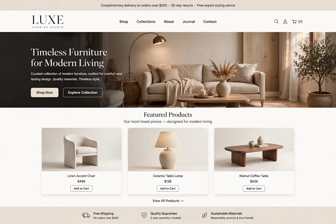
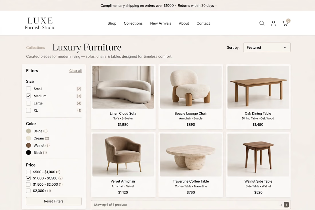
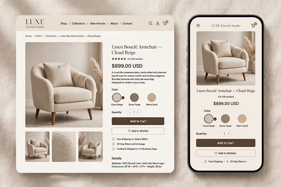

The warm beige palette and the sofa hero with the arc lamp feel like a real showroom, and the mobile product page keeps the same calm look. Which part took longer, the homepage or the product page?


Which homepage would make you more likely to explore the platform?
HackStack features bold typography, teal gradients, and a centered layout focused on AI tools and automation. DataVistaHQ uses purple accents, a split layout, and a prominent dashboard preview to introduce its business intelligence platform.
I would like your perspective on the visual design, clarity, and first impression. Which approach communicates its value more effectively and makes you want to take the next step?
Vote for your preferred design and share what influenced your choice: the colors, headline, layout, dashboard preview, or overall presentation.
#WebDesign #AIWebsites #UIUXDesign #SaaSDesign #TransformedDesign


2 voted
17%

10 voted
83%

12 votes
Closed

Visually, I lean toward DataVistaHQ, but the cognitive load is really high. The value proposition and the stats feel like they're competing for attention.
On the other hand, HackStack has a much better visual hierarchy. The value proposition and CTA group immediately give me a...