The network for creativity
Join 1.25M professional creatives like you
Connect with clients, get discovered, and run your business 100% commission-free
Creatives on Contra have earned over $150M and we are just getting started
Back to feedPost

3 Signs Your Kajabi Website Needs a Redesign
Your Kajabi website may look good.
But does it make it easy for people to understand your offer and take action?
Here are 3 signs it may be time for a redesign:
1. Visitors do not know what to do next
If your homepage has too many buttons, links, or offers, people can easily get confused.
A good website should guide visitors toward the next step.
2. Your offer is hard to understand
Your visitors should quickly know what you offer, who it is for, and how it can help them.
If they need to read through your whole website to understand your offer, your message needs work.
3. Your website works better on desktop than mobile
Your clients may be checking your website from their phones.
If your text is too small, buttons are hard to click, or sections feel crowded, you may be losing potential customers.
A Kajabi redesign is not just about making your website prettier.
It is about making the experience clearer, easier, and more effective.
Think your Kajabi website needs an upgrade?
Send me a message. I can help you find what is working, what is not, and what can be improved.
#KajabiExpert #KajabiWebsite #KajabiDesigner #CourseCreator #OnlineCourse #WebDesign #OnlineBusiness #Kajabi

The network for creativity
Join 1.25M professional creatives like you
Connect with clients, get discovered, and run your business 100% commission-free
Creatives on Contra have earned over $150M and we are just getting started

Challenges
View all


Related posts


Have you ever gone this hard on a 404? It's your one chance to turn a frustrating situation around for the better 🪩
Try it: https://jjettas.com/404


This is an engaging 404 page really awesome

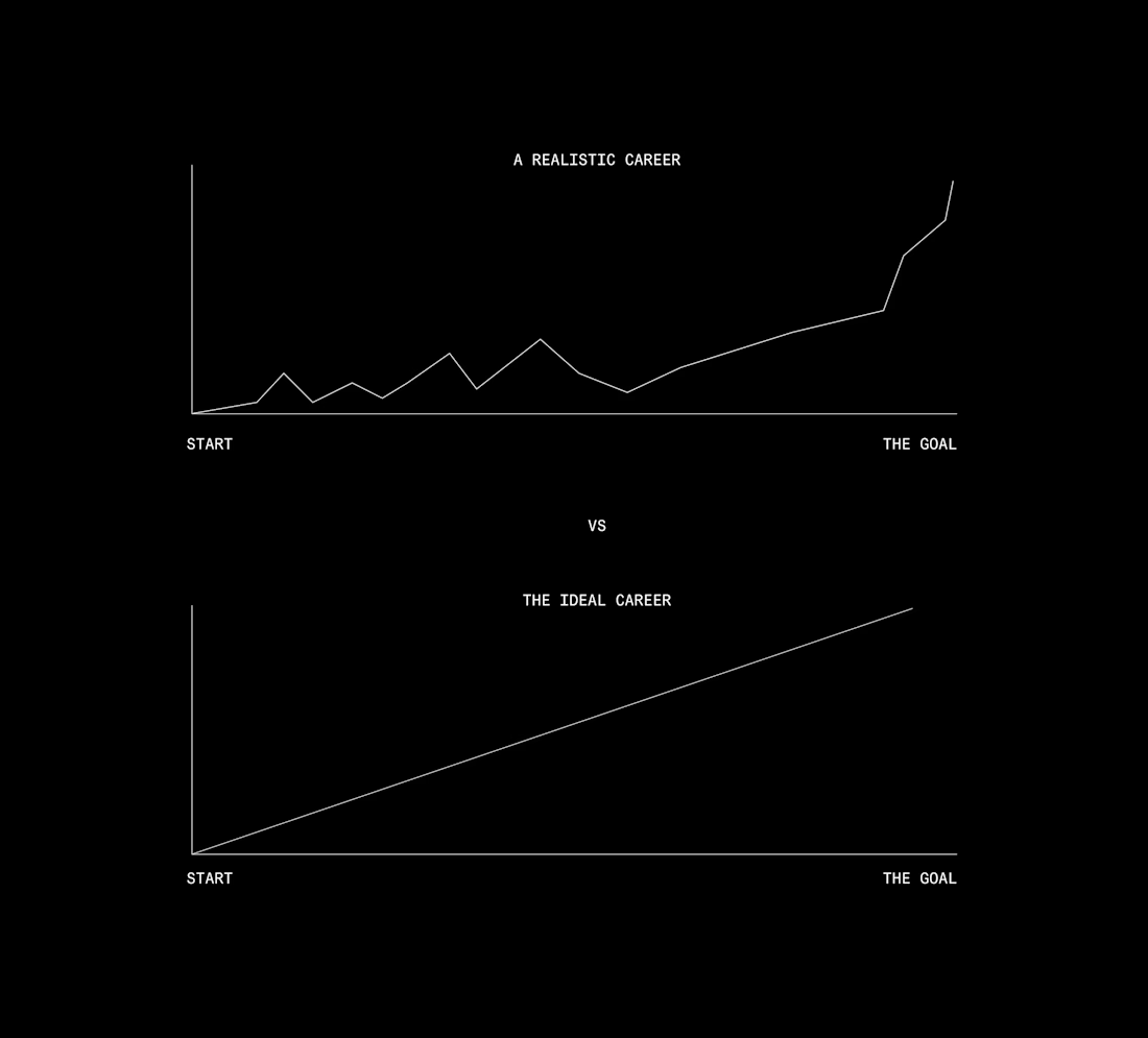
My career as a designer has never been a consistent one.
No straight line. No winning year on year. Honestly, the bumpiest journey imaginable to get where I am.
I started in this industry with a cracked version of Photoshop, running on a PC that would crash with anything I designed.
I once worked for a company on 12k a year and could barely make rent. But I did what I could, because I love what I do.
To anyone expecting perfection in your first year, think twice. Technology lets us get better faster, sure, but you still need the fundamentals of design and business. Without them you're just guessing at what's good, and your clients pay the price.
Take your time. The reality of success is still damn hard work. A social following doesn't pay the way you think it does not unless you know how to sell or create.
If I could give someone a piece of advice, it'd be this: Be patient, Be willing to give more than you take and don't rely on AI to do all the thinking for you.

How long have you been in this industry? Since I started this career, I have been a huge fan of your work. From which design period did you start to show the desired outcome after you joined?


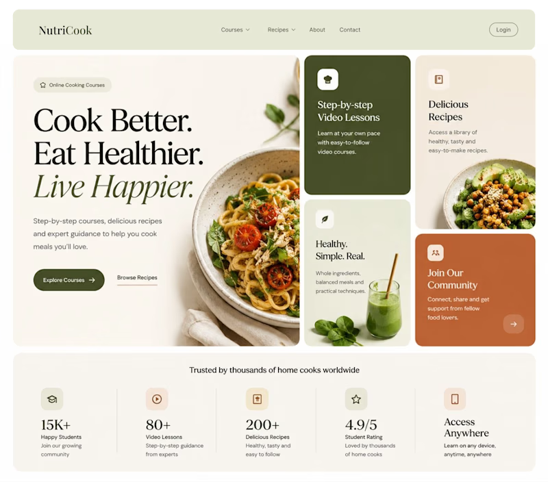
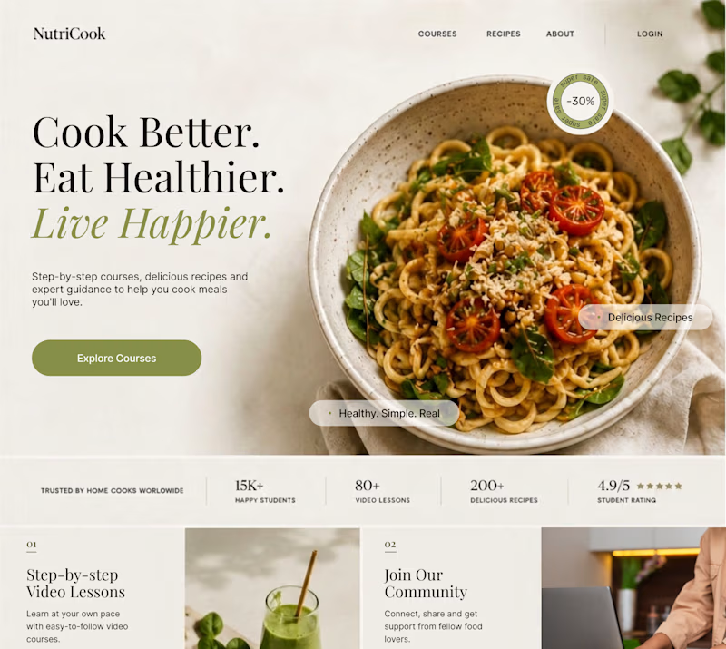
Same content. Two completely different vibes.
What happens when you keep the course content the same, but change the structure, typography, and color palette?
Two hero sections. One course. Two different visual experiences.
Which one would you choose? 1 or 2?
29 voted
41%
42 voted
59%
71 votes
Closed
Option 1 works well , the heirarchy and card layout on the hero is very smart