The network for creativity
Join 1.25M professional creatives like you
Connect with clients, get discovered, and run your business 100% commission-free
Creatives on Contra have earned over $150M and we are just getting started
Back to feedPost


The network for creativity
Join 1.25M professional creatives like you
Connect with clients, get discovered, and run your business 100% commission-free
Creatives on Contra have earned over $150M and we are just getting started



Related posts

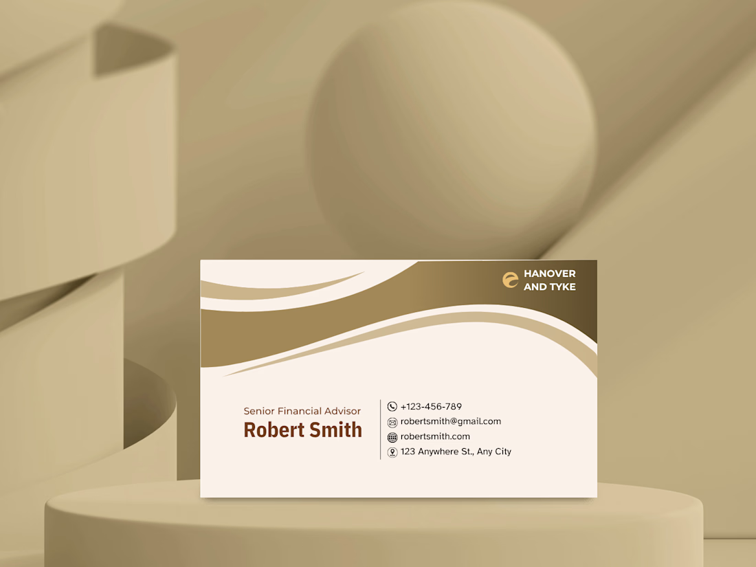
A business card concept for a financial advisory brand.
For finance, I wanted the card to feel trustworthy and calm rather than flashy. A warm gold and cream palette, flowing curves at the top to add movement, and a clean contact block with simple icons so the details are easy to scan.
Gold and cream for a finance brand: classic and trustworthy, or too soft? Tell me what you think. 👇


This is a clean and elegant business card design. The soft beige and gold color palette feels sophisticated and trustworthy, which works perfectly for a financial advisor. The wave elements add a modern touch without making it look cluttered. Typography is well-balanced, and the...


