The network for creativity
Join 1.25M professional creatives like you
Connect with clients, get discovered, and run your business 100% commission-free
Creatives on Contra have earned over $150M and we are just getting started
Back to feedPost

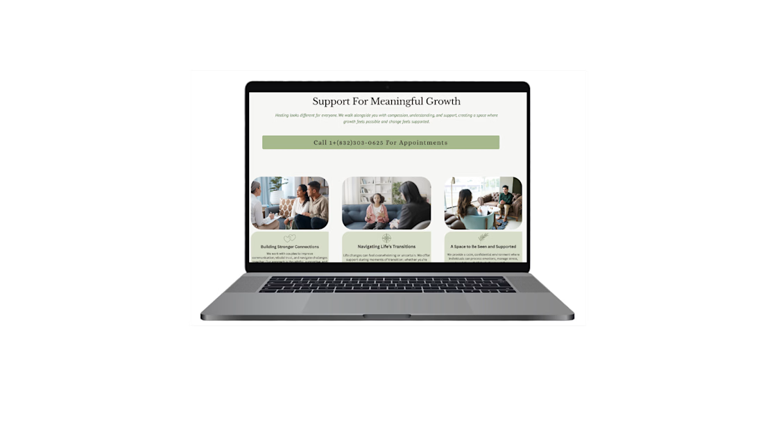
Services Section – Clear, Guided Decision-Making
This section was designed to clearly communicate the practice’s core services while guiding users through an organized, easy-to-scan layout. The goal was to reduce uncertainty and help visitors quickly identify the support that aligns with their needs.
Each service is visually grouped with supportive imagery and concise descriptions to balance emotional reassurance with informational clarity. The structure minimizes cognitive overload while reinforcing trust and professionalism.
Key considerations:
• Clear service categorization
• Strong visual hierarchy
• Scannable layout for faster decision-making
• Emotionally supportive imagery
• Prominent call-to-action placement
The result is a structured service overview that builds confidence and encourages the next step toward booking.


The network for creativity
Join 1.25M professional creatives like you
Connect with clients, get discovered, and run your business 100% commission-free
Creatives on Contra have earned over $150M and we are just getting started





Related posts

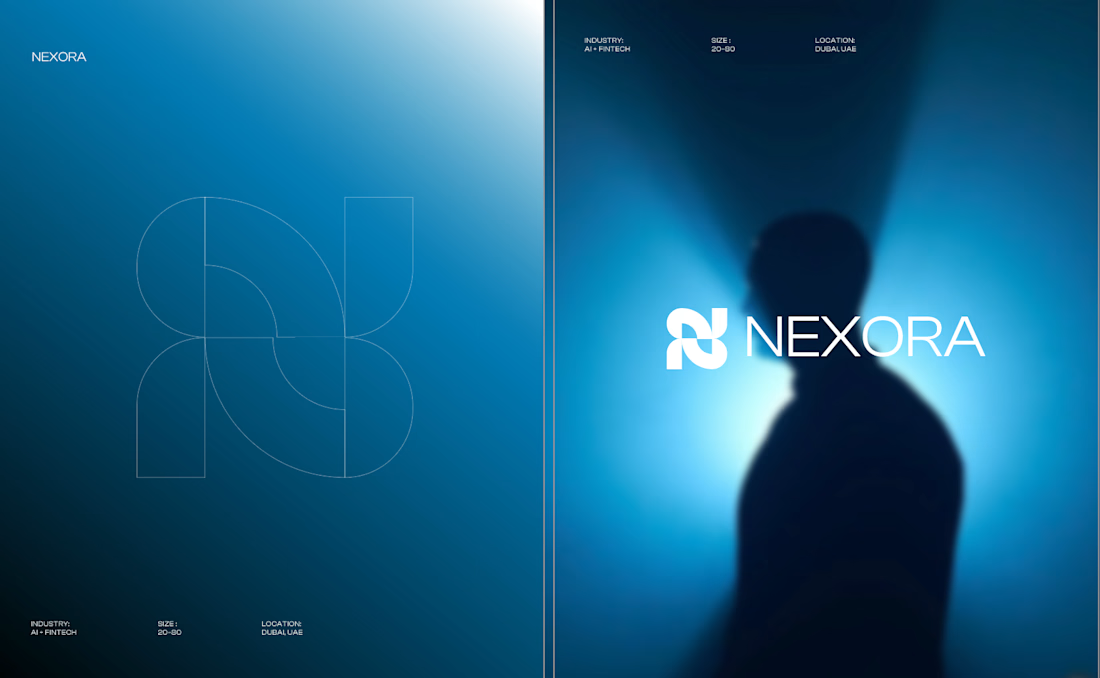
Currently building a new identity for an AI + fintech company in Dubai.
Still early, but this is one of the directions we’ve been exploring for the brand.
The idea was to avoid the usual “AI company” visual language and build something that feels more established, precise, and quietly futuristic.
We’ve been playing with geometry, light, and a much more restrained visual system around the mark.
Still developing this one, so I’m curious:
Would you push this direction further, or keep it this restrained?

Honestly the logo presentation is impressive




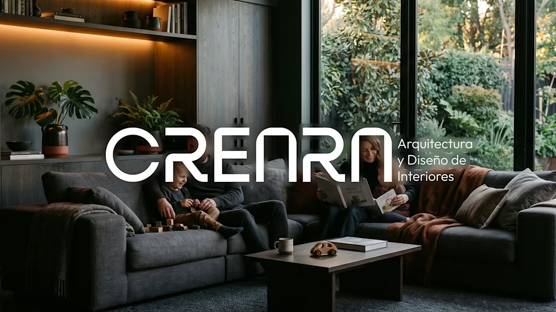
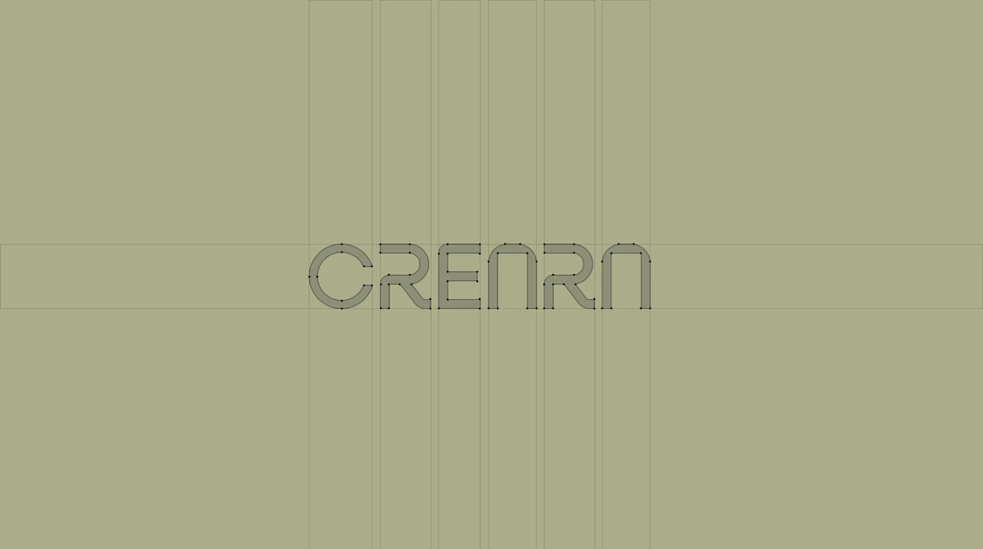
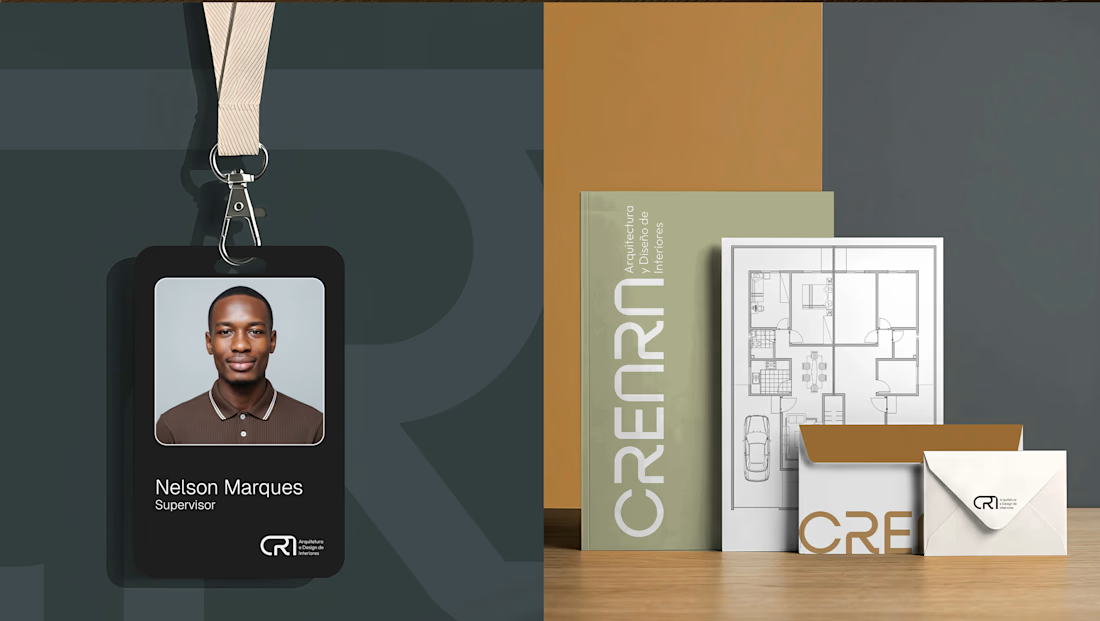
CREARA is a Spain-based architectural firm with a unique selling point: creating spaces that align with the lifestyles desired by young families.
With a premium, minimalist aesthetic, the firm stands out by avoiding cookie-cutter designs, instead creating bespoke solutions tailored to each client's specific needs.
Focusing primarily on young families, the visual identity is soft, modern, and sustainable.


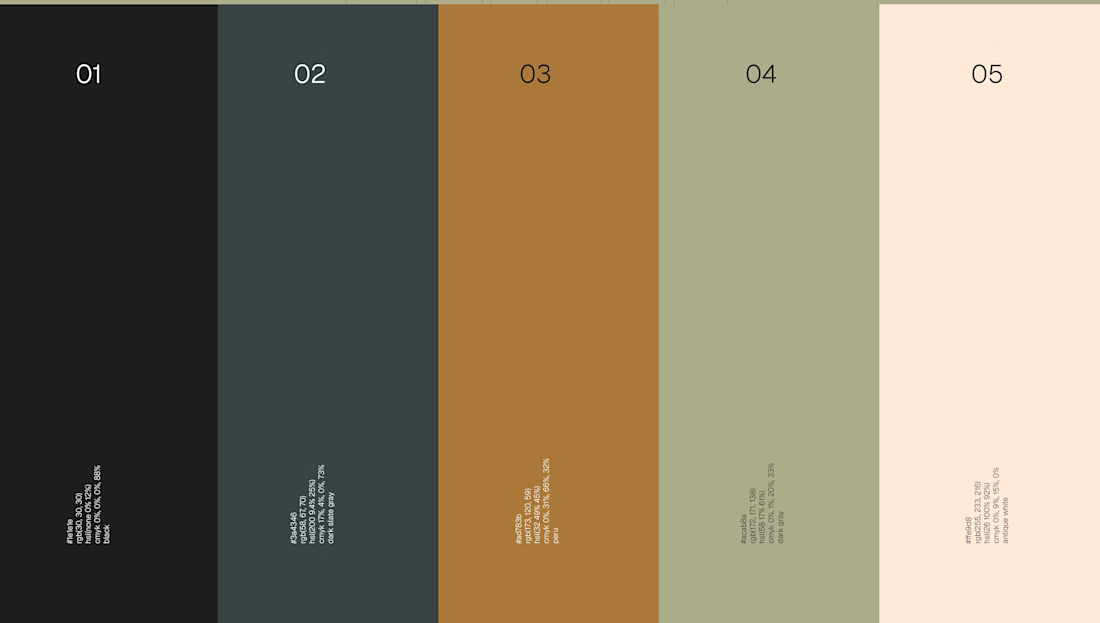

The young-families angle is the tricky constraint here, since premium minimal usually gets read as slightly untouchable and families are the audience least inclined to want that. The softened wordmark and the warmer half of the palette look like where that gets absorbed. Was the...