The network for creativity
Join 1.25M professional creatives like you
Connect with clients, get discovered, and run your business 100% commission-free
Creatives on Contra have earned over $150M and we are just getting started
Back to feedPost

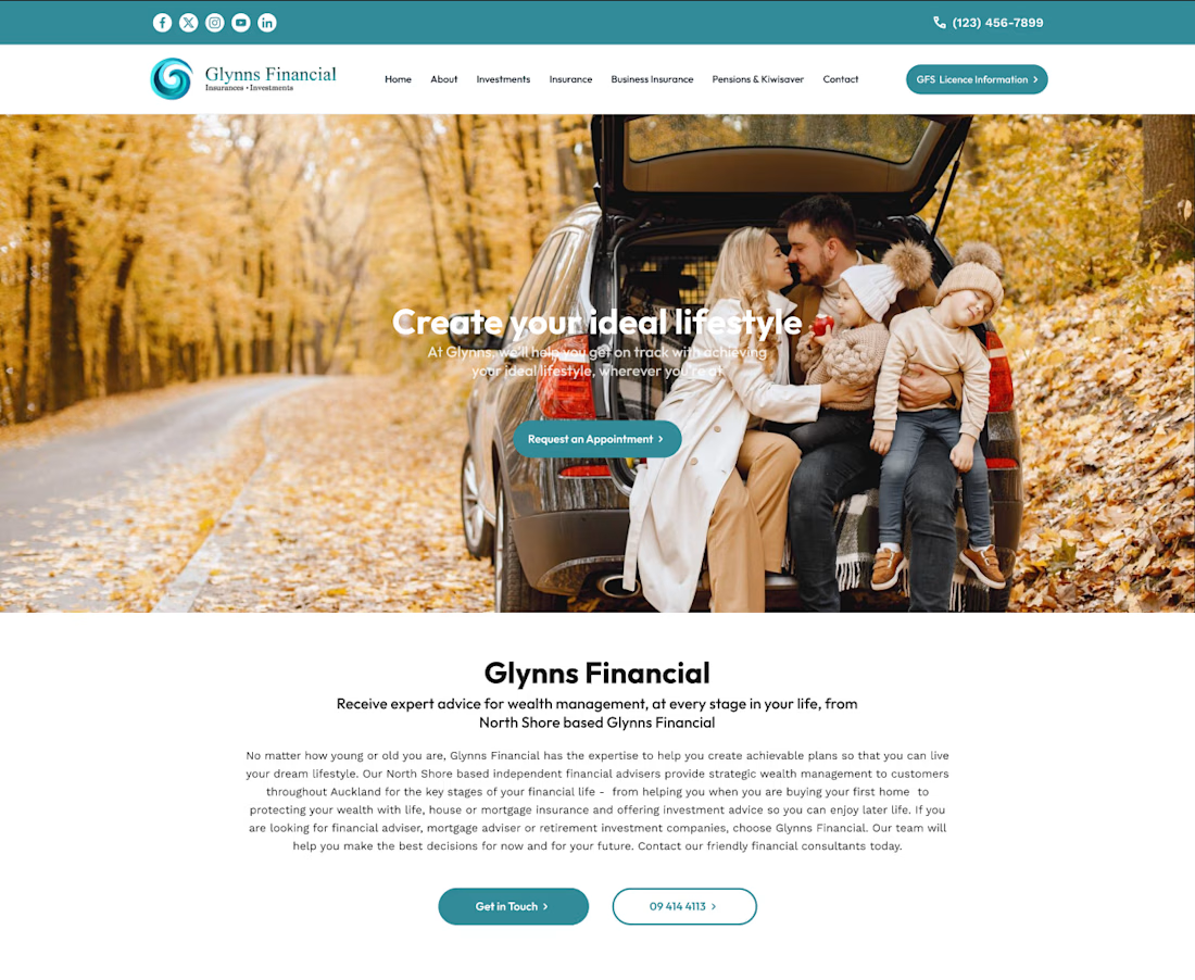
This project for Glynns Financial was developed as a trust-centric digital gateway for personal and business wealth management. The design philosophy centers on "Reliability through Clarity," utilizing a clean, corporate-modern aesthetic to make complex financial services feel accessible and human.
Here is a breakdown of the development and design strategy for this site:
1. UX Strategy: The "Life-Stages" Funnel
The architecture was developed to guide users through a logical trust-building journey:
The Emotional Hook (Hero): We utilized high-quality lifestyle photography (a family in nature) to anchor the technical services in real-world outcomes: freedom, security, and "creating your ideal lifestyle."
Service Categorization: We implemented a "Card-Based" layout for the core pillars—Investments, Insurance, Mortgages, etc. Each card uses custom iconography and concise copy to prevent information overload.
The Education Phase: A custom-built FAQ accordion was developed to address common barriers to entry, helping to move the user from "curious" to "informed" without leaving the page.
2. Visual Identity & UI Design
Color Palette: The primary brand color is a professional teal/deep sea green. This was chosen because it sits between the "stability" of blue and the "growth" of green—perfect for a financial firm.
White Space & Breathing Room: Large margins and generous leading (line spacing) were used to give the content a premium, uncluttered feel. This reflects the "calm" expertise of a financial advisor.
Typography: We utilized a modern, geometric sans-serif font. Bold weights are used for the value propositions, while lighter weights handle the body text to maintain a sophisticated, corporate look.
3. Trust & Conversion Modules
Social Proof Integration: We developed a dynamic testimonial slider featuring verified Google reviews. This provides immediate third-party validation, which is critical in the financial sector.
Lead Generation Form: The "Make an Enquiry" footer was designed with a high-contrast teal background to separate it from the informational content. The form is simplified into four essential fields to maximize conversion rates.
Accessibility & Navigation: A "Sticky" navigation bar was implemented, ensuring the "SECURE MORE INFORMATION" call-to-action is always visible as the user scrolls through the content.
4. Technical Goals
The site was built with a responsive-first approach, ensuring that the complex grid of service cards collapses elegantly into a single column for mobile users. We prioritized high-resolution asset loading for the hero and mid-page imagery to maintain the "luxury" feel across all screen sizes.


The network for creativity
Join 1.25M professional creatives like you
Connect with clients, get discovered, and run your business 100% commission-free
Creatives on Contra have earned over $150M and we are just getting started
Related posts


Yes, they're good job bro

Every piece tells a story. The brand should too.
This project is a luxury jewelry label that needed to feel timeless, elegant, and shoppable. We built a deep teal visual world model, campaigns, close-up product shots, and a cohesive grid identity.
The result? A brand that looks as precious as what it sells.
Available for branding & content projects; let's talk.
#JewelryDesign #BrandDesign #LuxuryAesthetic #FineJewelry #VisualIdentity #ContentCreation #FreelanceDesigner


Nice work!


Recent website design for Mirabel Agency.
Check it out → mirabel(.)agency

Nice work!







Trending

Claude
Claude has entered the design space. How are you using Claude Design?

Contra University
Learn from expert creatives how to earn more using next-gen AI tools.
creativeaiflow
Creative AI workflows are evolving. What tools do you use, and what are their strengths and weaknesses?
portfolioreview
The best portfolios tell a story, not just show a grid. Share yours for feedback.
freelancerlife
Freelancer life is wins, pivots, and everything in between. What’s yours right now?