The network for creativity
Join 1.25M professional creatives like you
Connect with clients, get discovered, and run your business 100% commission-free
Creatives on Contra have earned over $150M and we are just getting started
Back to feedPost


Thanks!

The typography choice here really captures the futuristic essence of the poster. Strategic font selection always makes a huge difference in visual identity. Brilliant execution!
The network for creativity
Join 1.25M professional creatives like you
Connect with clients, get discovered, and run your business 100% commission-free
Creatives on Contra have earned over $150M and we are just getting started











Related posts


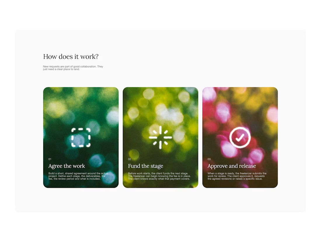

Your web sections always have such strong art direction. Great to see the brand carried right into the layout.

I’ve been working on a bold, modern-retro logotype and can’t decide between these two options.
🆘 Which one feels more aesthetically pleasing to you?
11 voted
26%
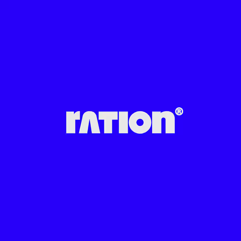
31 voted
74%
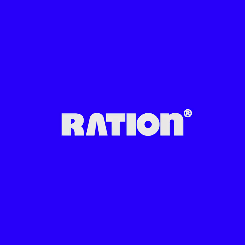
42 votes
Closed

CAPITAL is great but SMALL is unique great job Nawras 🔥🔥

Public animation for Binance.
What do you think guys?


Stunning work! Love both the design and the way you presented it. ❤️✨