The network for creativity
Join 1.25M professional creatives like you
Connect with clients, get discovered, and run your business 100% commission-free
Creatives on Contra have earned over $150M and we are just getting started
Back to feedPost
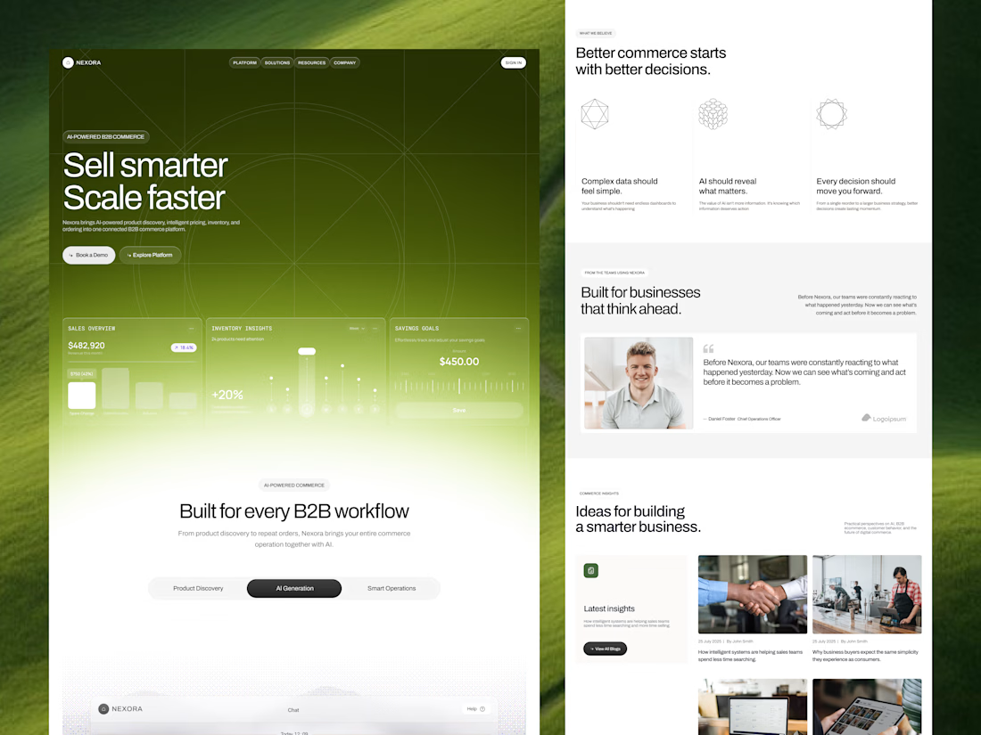
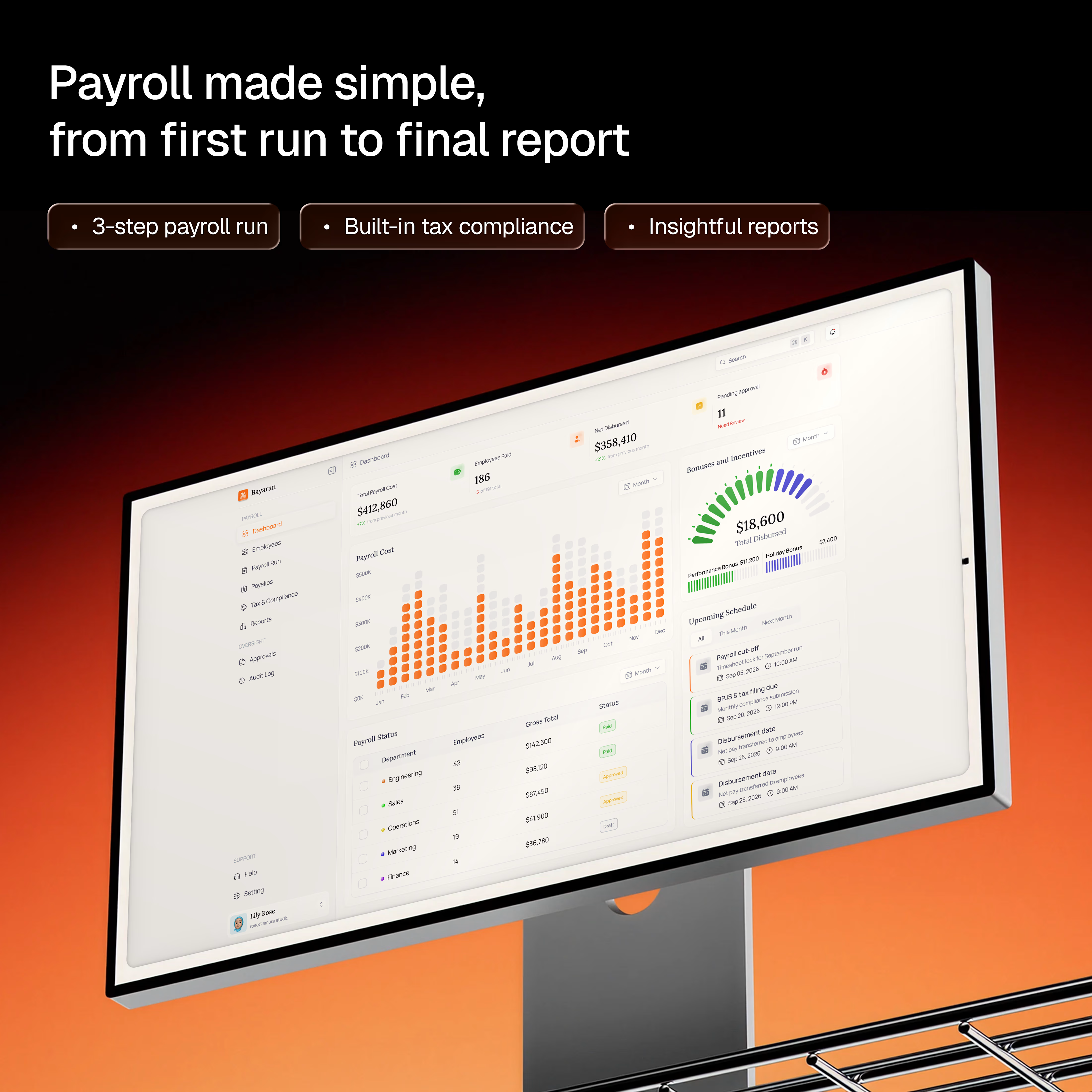
Most SaaS products don’t feel complicated because they have too many features.
They feel complicated because users don’t know what to do next.
A good experience creates clarity through hierarchy, context, and clear actions.
The goal isn’t to make the interface look simple.
It’s to make the next step feel obvious.
#ProductDesign #UXDesign #SaaS #UIUX #DigitalProductDesign




Great design & presentation.


Thanks

Thanks for your valuable comment.

Separating feature count from complexity is the sharper point here. A 3-feature app can still feel opaque if the primary action isn't visually dominant, which is exactly what the single-bold-CTA-per-screen approach in those dashboard mockups is solving for.
Thanks for your valuable comment.

The next-step-feels-obvious framing is the real distinction, plenty of clean looking UIs are actually just vague about what to do.
The network for creativity
Join 1.25M professional creatives like you
Connect with clients, get discovered, and run your business 100% commission-free
Creatives on Contra have earned over $150M and we are just getting started





Related posts


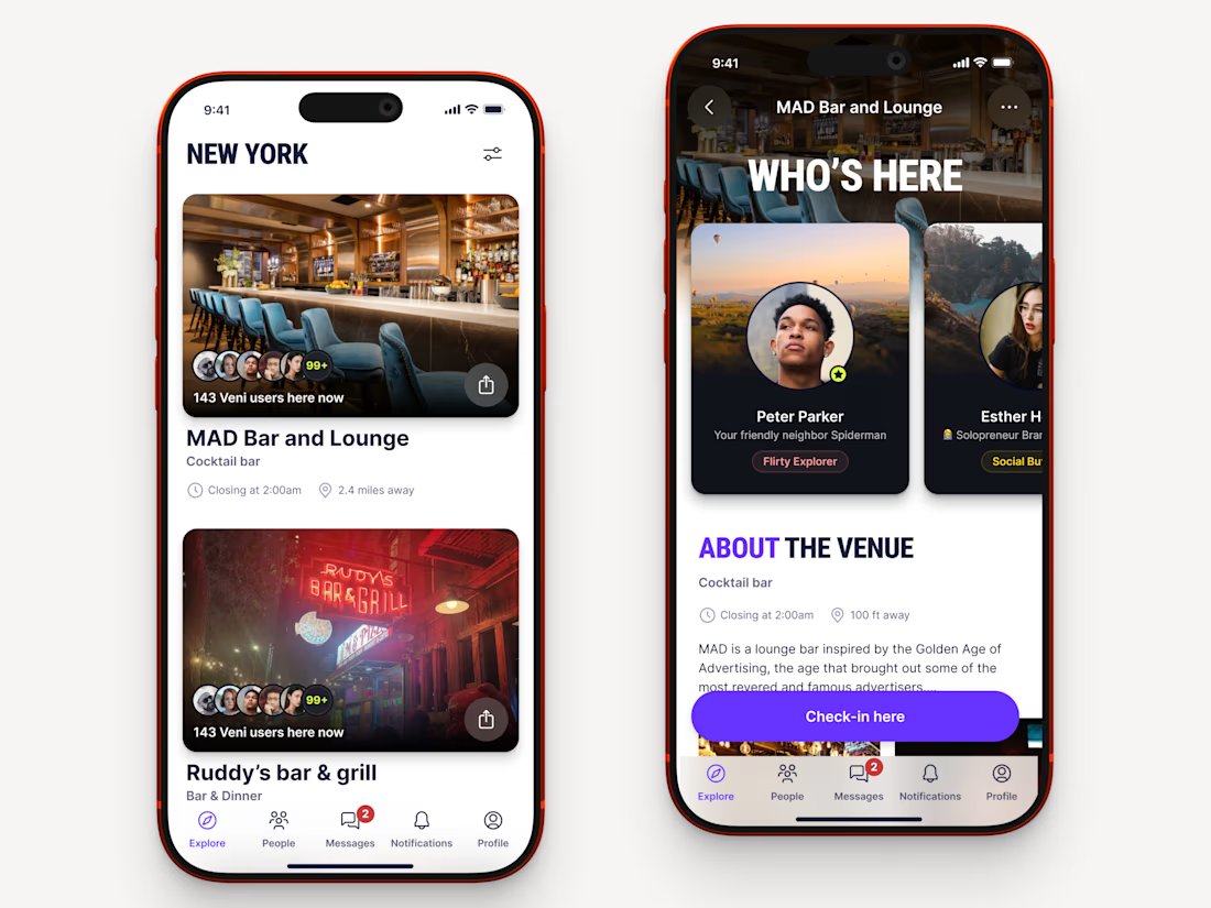
Recently worked on a mobile app for local networking.
Find venues (bars, clubs, conference halls, etc..) nearby, see who's there and connect.



Great!


Our goal was to make pricing, inventory and ordering data feel simple and human for an AI-powered B2B commerce platform. We'd love to hear your thoughts!

Engaging background and nice gradient to not make the section look seprate 🔥