The network for creativity
Join 1.25M professional creatives like you
Connect with clients, get discovered, and run your business 100% commission-free
Creatives on Contra have earned over $150M and we are just getting started
Back to feedPost


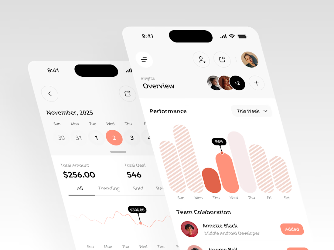
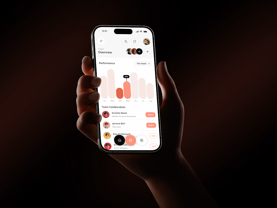

The coral red charts against the dark phone-in-hand shots make this pop, Rakesh. That Performance bar visual with the team collaboration section underneath gives the whole thing a real product feel. Clean mobile dashboard work.
The network for creativity
Join 1.25M professional creatives like you
Connect with clients, get discovered, and run your business 100% commission-free
Creatives on Contra have earned over $150M and we are just getting started









Related posts

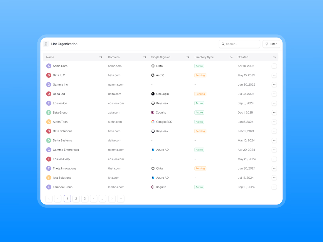
Designing a clean, scalable table component for modern SaaS dashboards.
Focused on information hierarchy, readability, and efficient data management, this table UI brings organisation data, SSO providers, directory sync statuses, and creation dates into one structured view.
✨ Clean data presentation
🔍 Search and filter functionality
🏷️ Clear status indicators
↕️ Sortable columns
📄 Intuitive pagination
🎯 Consistent spacing and visual hierarchy
Great dashboard design isn’t just about displaying data — it’s about making complex information easier to scan, understand, and manage.
What do you think of this table component?

Traditional corporate training often feels disconnected from everyday work. Skillio helps bridge that gap with personalized five-minute sessions, job-specific AI simulations, and instant feedback.
The mobile experience supports role-based learning across professions, with interactive chat and voice exercises that recreate realistic workplace situations. A lime-green, lavender, and deep-green palette, bold typography, and a flower-shaped performance chart make progress easy to understand and engaging to explore.
Explore the project on Dribbble:
https://dribbble.com/shots/27808131-Mobile-App-Powered-Employee-Training

Sweeet

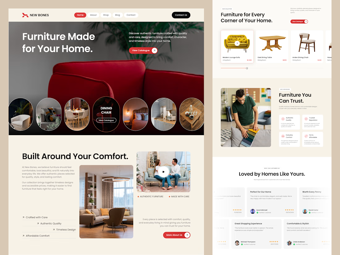
Excited to share my latest design project: New Bones 🛋️
New Bones is a furniture e-commerce landing page designed to make discovering home items and exploring decor trends completely seamless. The main focus was to break down complex online shopping layouts into a clean, minimal, and frictionless user journey.
From smooth product slider discovery to a transparent trust badge flow, every section is crafted with close attention to clear visual hierarchy and layout consistency.
Check out the full UI/UX case study here! 👇

Nice focus on simplifying furniture discovery!