The network for creativity
Join 1.25M professional creatives like you
Connect with clients, get discovered, and run your business 100% commission-free
Creatives on Contra have earned over $150M and we are just getting started
Back to feedPost

Recently collaborated with Toya Indonesia on a UI/UX challenge: how do you communicate 30+ years of technical manufacturing expertise in a way that feels approachable?
We approached this in two layers. First, we designed a thoughtful information architecture that breaks down complex manufacturing concepts into clear, digestible narratives. Second, we created a cohesive visual system and responsive web design, paired with a design system library that's ready for execution and future scaling.
The result? A website that doesn't just look premium it educates visitors and positions Toya Indonesia as the innovation leader they've earned the right to be.
https://www.behance.net/gallery/241548187/Toya-Indonesia-Web-Design

The network for creativity
Join 1.25M professional creatives like you
Connect with clients, get discovered, and run your business 100% commission-free
Creatives on Contra have earned over $150M and we are just getting started
Challenges
View all


Related posts


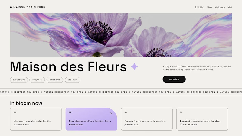
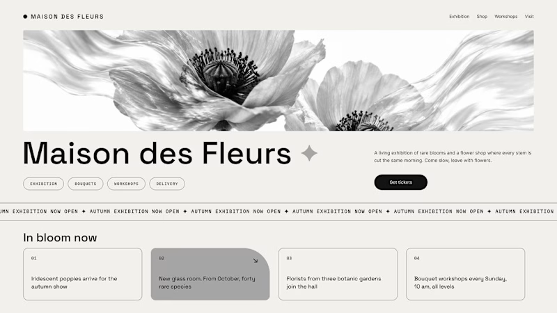
Should a flower shop ever go black and white?
Same flower house, same layout. We only took the color out.
1. Full color. The iridescent petals do the selling: lilac, pink, a little shimmer. The photo is the brand, and every accent on the page borrows from it.
2. Monochrome. No color at all. Shape, texture and typography have to carry everything, and the page suddenly reads like a gallery catalogue.
Color sells the flower. Monochrome sells the exhibition.
Which one would get you through the door?
67 voted
91%
7 voted
9%
74 votes
Closed

The problem with monochrome is that, throughout computer history, it has conditioned users to associate gray and monochrome with being disabled, dysfunctional, or something to ignore and avoid.

Luxury Lighting E-commerce Website Design for Modern Home Decor
A modern luxury lighting e-commerce website concept crafted to showcase premium statement pieces through a refined, immersive, and editorial-inspired digital experience. The design combines warm ambient lighting, bold typography, cinematic imagery, and clean minimalist layouts to create a sophisticated online presence for a high-end home decor brand. Every element is thoughtfully designed to enhance product storytelling, improve user engagement, and deliver a seamless shopping experience across all devices.


really nice design


Great design Daniel 🎉🎉