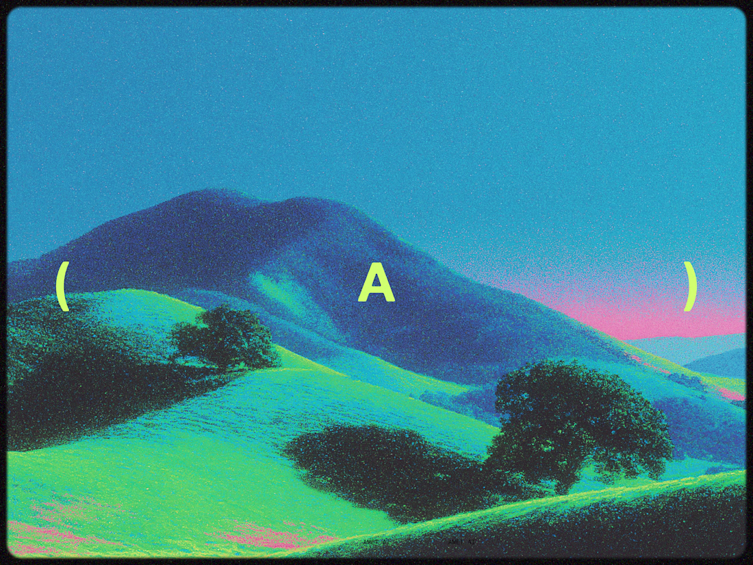
The network for creativity
Join 1.25M professional creatives like you
Connect with clients, get discovered, and run your business 100% commission-free
Creatives on Contra have earned over $150M and we are just getting started
Back to feedPost
Rachel K.
Brand Strategy & Visual Identity
Client: Rachel K, Major Gifts Consultant
Sector: Independent Consulting / International Development
Deliverables: Brand Strategy, Visual Identity System, Stationery Suite, LinkedIn Profile Template
Year: 2025
The Situation
Rachel K. had spent years doing serious work, helping organizations build major gifts programs that actually raised money. She was good at it. Her clients trusted her. But her brand wasn't telling that story.
When she decided to formalize her consulting practice, she needed more than a logo. She needed a brand that could walk into a boardroom and command the same credibility she'd spent years earning in person.
The Challenge
The international development fundraising space is relationship-driven and reputation-heavy. Major gifts donors aren't responding to marketing — they're responding to trust signals. For Rachel to compete with established consultancies and land the mandates she was qualified for, her brand had to do two things simultaneously: feel strategically rigorous and personally credible.
The risk in this space is defaulting to one end of a spectrum. Too corporate and you lose the relational warmth that defines major gifts work. Too personal and you sacrifice the authority that justifies premium positioning. Most consultants in this space pick one and live with the trade-off. The goal here was to hold both.
The Approach
Before any visual decisions were made, we did the strategy work. That meant getting clear on Rachel's positioning — not just what she did, but the specific value she created that no one else in her market could claim.
What emerged was a positioning built around the idea of the strategic bridge: Rachel sits at the intersection of organizational strategy and donor relationship-building, translating complex programs into narratives that move high-net-worth individuals to give. She's not a fundraiser who adds strategy. She's a strategist who understands fundraising at the deepest level.
That clarity shaped everything downstream.
Positioning: "The Strategic Bridge for International Major Gifts Growth"
Brand personality: Trusted guide. Strategically confident. Internationally fluent. Collaborative, not prescriptive.
With the strategy locked, the visual identity had a clear job: make the positioning visible.
The Work
The Graphic Device
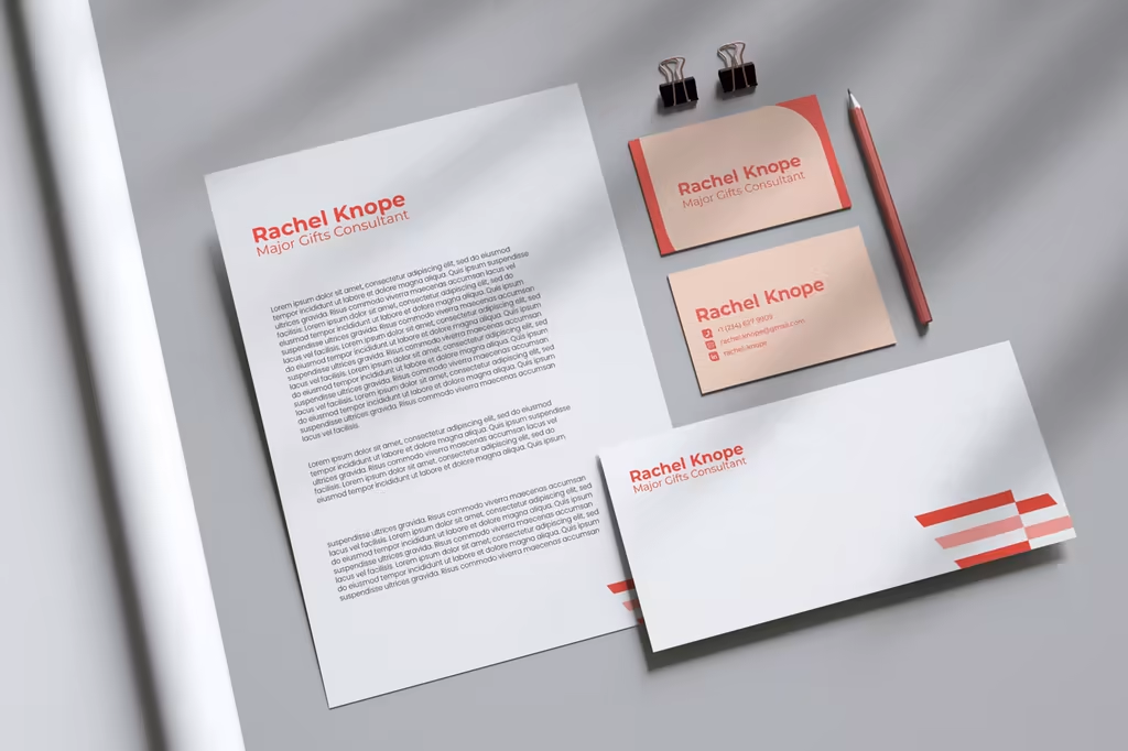
The identity is anchored by a bold stripe system — stacked horizontal bars in coral and navy that step and offset across the page. The motion in the pattern does real strategic work: it suggests movement, momentum, and structure all at once. For a consultant whose entire value proposition is about bridging two things, organizations and donors, strategy and relationship, a graphic language built on connection and layering felt like the right call. It's also highly recognizable at small sizes, which matters across the touchpoints Rachel uses most.
Colour
The palette was a deliberate provocation against the consulting category. The primary colours — dusty pink, warm red, deep forest green, salmon, and soft peach — are warmer and more human than anything you'd typically see from a strategic consultancy. The extended palette pushes further: navy, electric cobalt, vivid lime green, and powder blue give the system genuine range.
The thinking behind it was intentional. Major gifts consulting is a space full of safe blues and greys — brands that signal credibility by looking like every other institutional player. Rachel's palette signals something different: confidence that doesn't need to hide behind convention. The warmth of the primary colours reinforces the relational quality of her work, while the depth and range of the extended system shows there's real strategic substance underneath. Bold, but not reckless. Human, but not soft.
Typography
The wordmark is set in a clean, rounded sans-serif that balances authority with approachability. "Rachel Knope" carries the weight, with "Major Gifts Consultant" stepping back as a clear, readable descriptor. The system was designed to work at every scale, from a business card to a LinkedIn profile header.
Stationery Suite
The full suite covers letterhead, business card, and envelope — each applying the stripe device consistently without being repetitive. The business card in particular was designed to feel considered: in a field where major gifts relationships often start in rooms, the card needs to hold up as a physical object, not just a data transfer.
LinkedIn Profile Template
Given that LinkedIn is Rachel's primary business development channel, a branded profile template was included as part of the deliverables. The system translates cleanly to digital — the stripe graphic and colour palette work just as well on screen as they do in print.
The Result
Rachel left the engagement with a brand that matched the level of her work. The strategy gave her language to articulate her value in proposals and conversations. The identity gave her a visual system she could deploy confidently across every touchpoint, from a cold LinkedIn message to a C-suite presentation.
The brand stopped making her look like a freelancer and started making her look like the senior strategic partner she actually is.
The network for creativity
Join 1.25M professional creatives like you
Connect with clients, get discovered, and run your business 100% commission-free
Creatives on Contra have earned over $150M and we are just getting started
Related posts
looks awesome !!
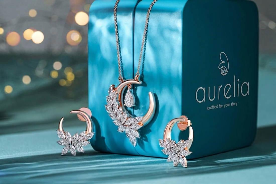
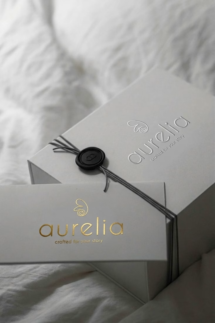
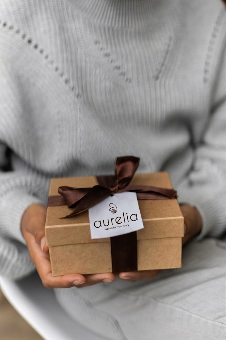
Every great brand starts with a story worth telling. 💎
Aurelia isn't just jewelry — it's the moment you want to remember forever. Crafted from the finest materials, personalized for the person who matters most.
This is how a luxury brand is born. From concept to creation — one detail at a time.
Your moment. Forever.
Nice One
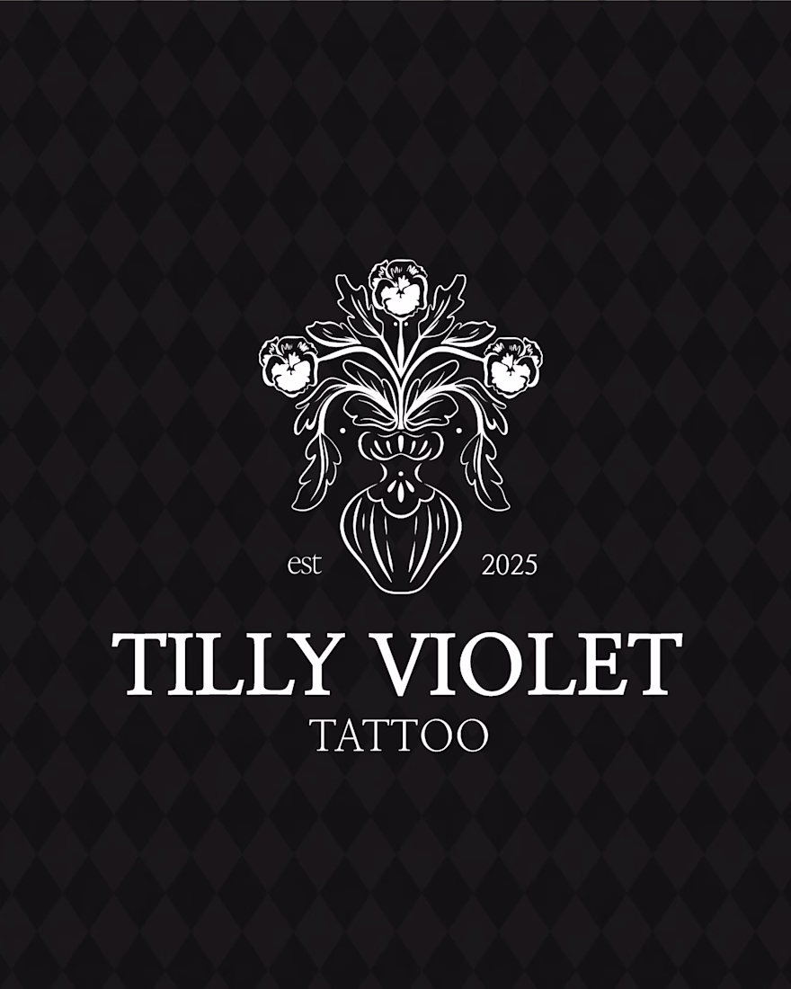
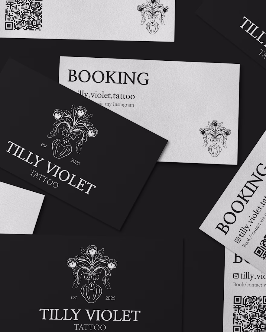
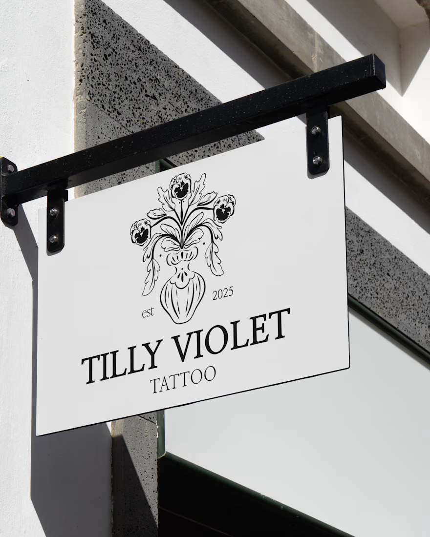
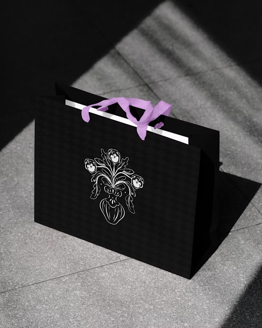
Brand Identity for a Tattoo Studio.
Our goal was to get Tilly out into the professional world of tattooing in a way that felt clean and personable to her. We delivered a full starter brand identity that enabled Tilly to feel the most confident on her journey. Centred around the violet flower and her love for oriental design, this identity became a friendly, approachable business for Tilly to now take forward in her career.
Great work ! well done
Trending
Claude
Claude has entered the design space. How are you using Claude Design?
Contra University
Learn from expert creatives how to earn more using next-gen AI tools.
creativeaiflow
Creative AI workflows are evolving. What tools do you use, and what are their strengths and weaknesses?
portfolioreview
The best portfolios tell a story, not just show a grid. Share yours for feedback.
freelancerlife
Freelancer life is wins, pivots, and everything in between. What’s yours right now?