The network for creativity
Join 1.25M professional creatives like you
Connect with clients, get discovered, and run your business 100% commission-free
Creatives on Contra have earned over $150M and we are just getting started
Back to feedPost
One thing I've learned while building templates and interactive components:
The hardest part isn't creating something visually impressive.
It's knowing what to leave out.
Every animation, every spacing decision, every visual accent should have a purpose. When everything tries to stand out, nothing does.
The best interfaces don't demand attention—they guide it.


That line about every visual accent needing a purpose is going straight into my next client kickoff deck. Was there a specific animation on this one that almost made the cut but got cut?

Absolutely. 😄
There were a couple of interactions that didn't make the final version—not because they were bad, but because they were too noticeable. Whenever the animation became more interesting than the content, it was an easy decision to cut it.


stunning!
Thank you! That means a lot. I spent a lot of time refining the details.

Thank you! 😄
Really happy you noticed that. The zoom is subtle by design—I wanted to add a sense of depth without distracting from the projects.
The network for creativity
Join 1.25M professional creatives like you
Connect with clients, get discovered, and run your business 100% commission-free
Creatives on Contra have earned over $150M and we are just getting started
Trending

Claude
Claude has entered the design space. How are you using Claude Design?

Contra University
Learn from expert creatives how to earn more using next-gen AI tools.
creativeaiflow
Creative AI workflows are evolving. What tools do you use, and what are their strengths and weaknesses?
freelancerlife
Freelancer life is wins, pivots, and everything in between. What’s yours right now?











Related posts


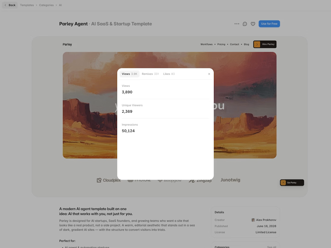
Parley just crossed 50K impressions on Framer Marketplace 🎉
It has been just over a month since launch, and the template has already reached:
• 3,890 views
• 331 remixes
• 83 likes
It’s incredibly rewarding to see hundreds of designers and creators use Parley as a starting point for their own projects.
Thank you to everyone who supported the launch 🤎


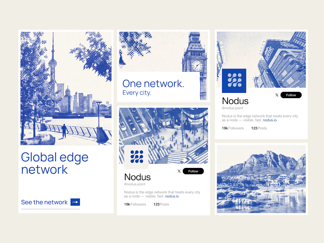
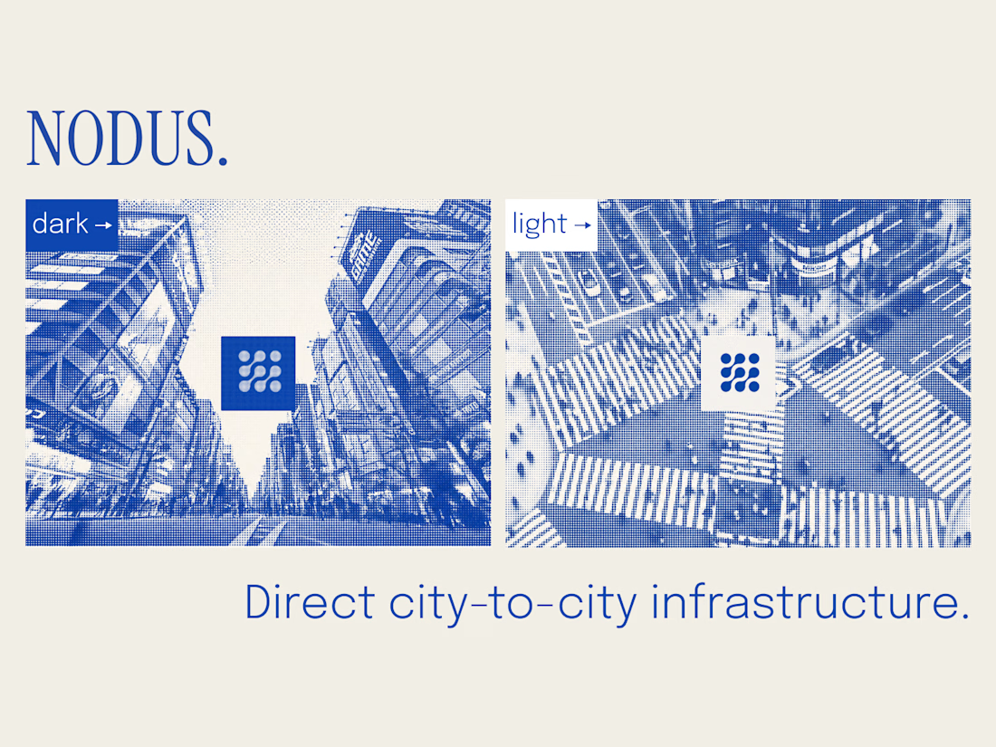
I build the brand system before the site — so the product can scale without breaking visually as it grows.
Nodus treats every city as a node. The core asset is generative: any city renders in the same halftone style — London, Tokyo, Cape Town, or any city added later. New market, new visual, zero drift.
Covers logo, color, type, the city-node visual language (static + motion), web direction, and social templates.
System first, so everything after it scales.


Obsesseddd

Most websites look good.
Few make people stop, trust, and take action.
This landing page was designed with one goal: clarity over complexity.
Every section has a purpose:
- Clear visual hierarchy
- Generous whitespace
- Clean, modern UI
- Scalable components
Good design isn't about adding more,it's about removing what doesn't help users.
I'd love to hear your thoughts:
What part of a landing page has the biggest impact on conversions?
If you'd like, I can also make it more viral, designer-focused, or client-attracting.


Weldone ☀️ 💖