The network for creativity
Join 1.25M professional creatives like you
Connect with clients, get discovered, and run your business 100% commission-free
Creatives on Contra have earned over $150M and we are just getting started
Back to feedPost

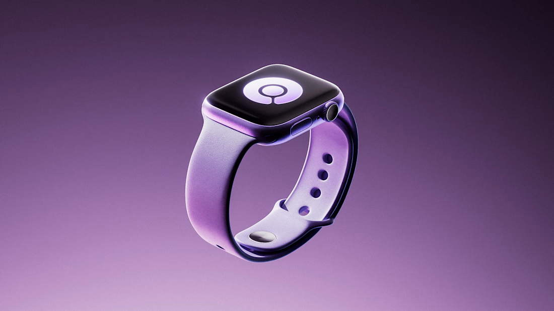
Apple Watch — Product Render. Direction & Lookdev,


The network for creativity
Join 1.25M professional creatives like you
Connect with clients, get discovered, and run your business 100% commission-free
Creatives on Contra have earned over $150M and we are just getting started







Related posts

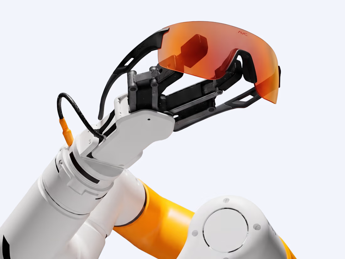
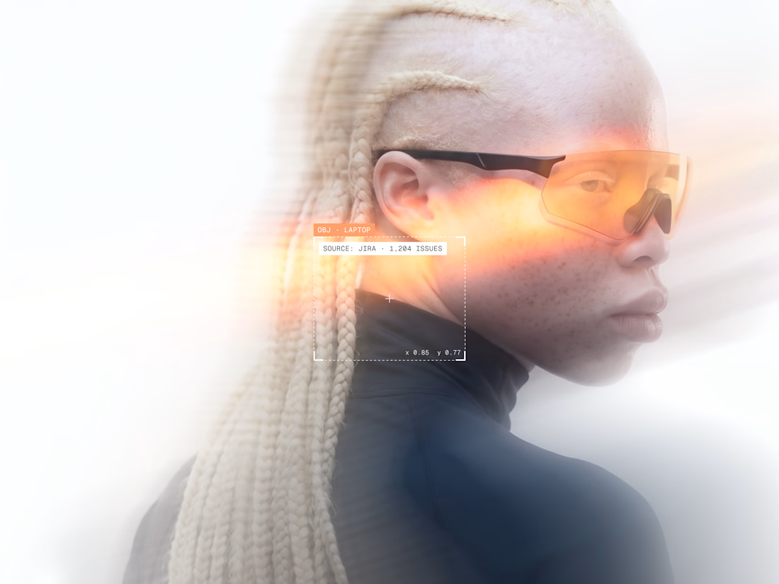
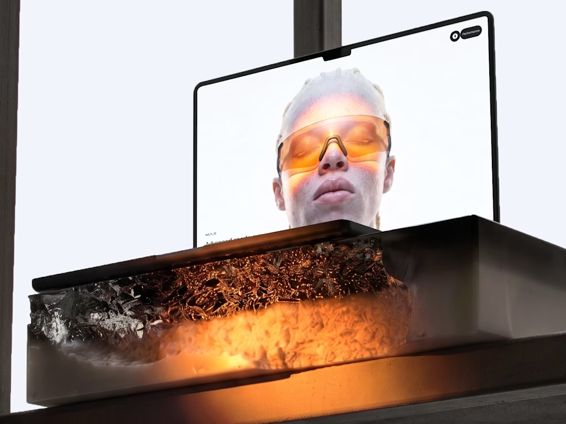
A personal brand concept exploring the future of AI-powered performance eyewear.
I wanted to create something that blends sports, technology, and futuristic aesthetics into one cohesive visual identity.
From the eyewear design and product visuals to art direction, 3D renders, and motion every detail was developed to give AVC its own distinctive character.
Not just another pair of sports glasses. A vision of what next-generation wearable technology could look like.
More explorations coming soon.



Blending sports and tech into eyewear is a tough positioning, but the system holds together — the renders, art direction, and product visuals all speak the same visual language rather than competing. Where the execution lands next will be in the packaging and retail touches; if...


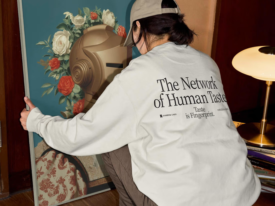
A cultural tribute to the history of human artistic mastery for @Contra Labs


HandOff ™. A short robotic study 3D cinematic. Check it out

That's stunning James great job your animations and visuals is unbelievable 🔥🔥🔥🔥🔥