The network for creativity
Join 1.25M professional creatives like you
Connect with clients, get discovered, and run your business 100% commission-free
Creatives on Contra have earned over $150M and we are just getting started
Back to feedPost

Typography animation for the "PURE" design studio logo. Letters organically "grow" with root-like textures against a moody water backdrop, creating an atmospheric, premium brand intro.

The network for creativity
Join 1.25M professional creatives like you
Connect with clients, get discovered, and run your business 100% commission-free
Creatives on Contra have earned over $150M and we are just getting started

Challenges
View all


Related posts

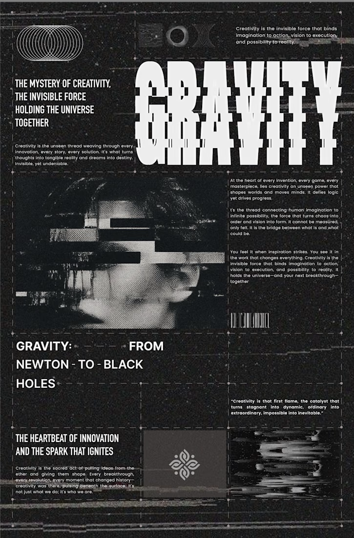
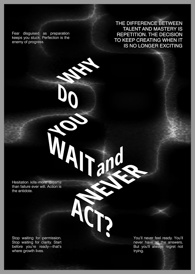
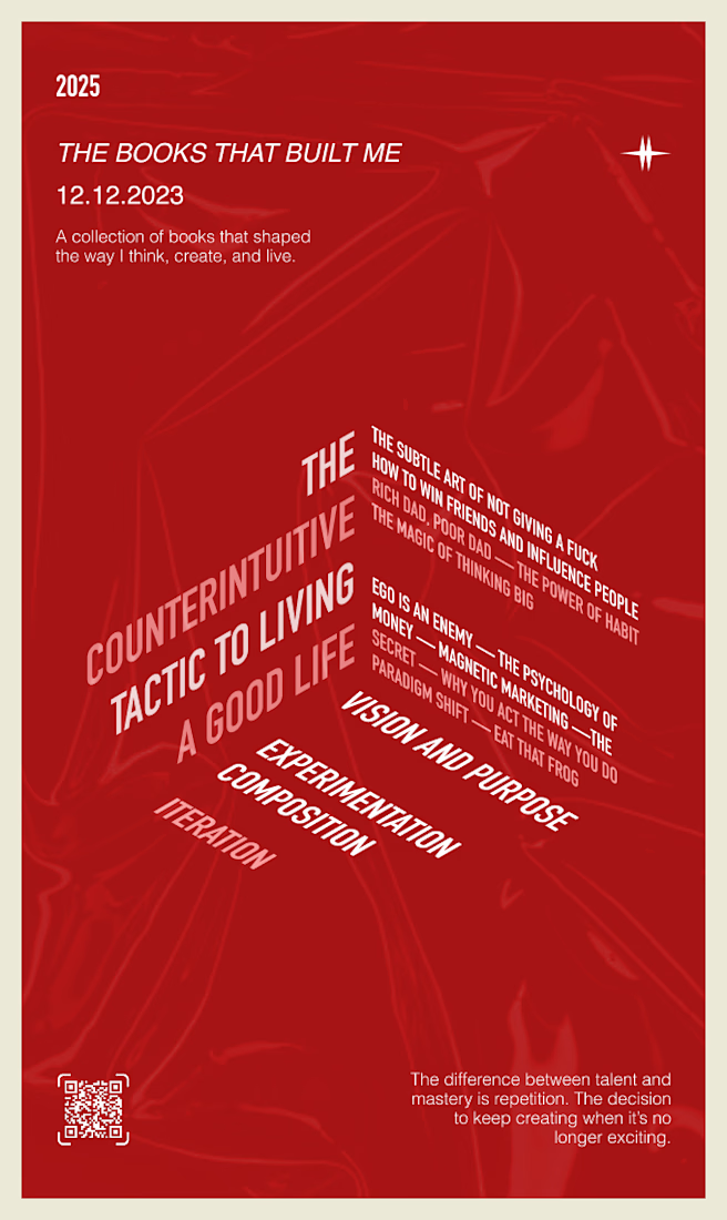
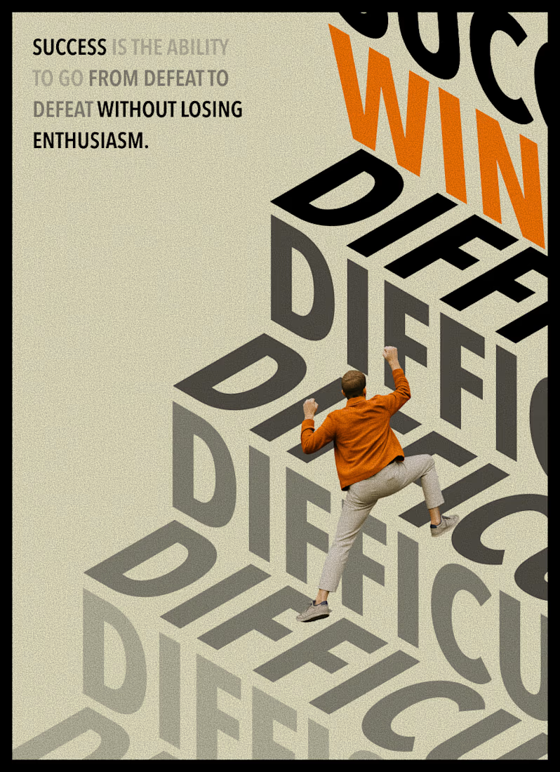
Typography becomes more than language when it starts to behave like an image. Scale, rhythm, distortion, and space give words a physical presence, creating compositions that can be read, felt, and experienced before they are fully understood.


Love the bold and gritty approach. Great set!

I just like making things like this.
I made this one as an experiment without opening a single design app. Basically, I just kept telling Codex what I wanted it to do.
It’s not a magic button. It took around 100 prompts and quite a few hours. But the fact that you can make something like this just by talking, without touching a keyboard or mouse, is still pretty wild.
And the whole thing runs and renders right in the browser.

Creative Direction for Innerceuticals


The pivot from the real product bottle into that geometric particle animation is a smooth way to move from proof to brand world. Was Innerceuticals specifically asking for that split, ground it in the actual product first then get conceptual after, or did that pairing come together in the edit?