The network for creativity
Join 1.25M professional creatives like you
Connect with clients, get discovered, and run your business 100% commission-free
Creatives on Contra have earned over $150M and we are just getting started
Back to feedPost

A client came to us stuck... every time they edited their Kajabi newsletter, it changed every single issue at once
@Kajabi isn't built for newsletters. We rebuilt the whole thing using 3 of its systems in a way they were never meant to combine. Landing pages per issue. Course archive for members. £12/month paywall with 2 free issues before it kicked in
The one thing worth stealing from this — drip logic. Every new subscriber starts at Issue 1 on day 0, no matter when they join. Late subscribers never get ahead. The system handles it automatically
Client now publishes every issue alone. No calls. No developer. That was the goal from day 1
Save this if you're trying to monetise content on a platform that wasn't built for it
#MembershipSite #NewsletterBusiness #ContentMonetisation #EvertherStudio

The network for creativity
Join 1.25M professional creatives like you
Connect with clients, get discovered, and run your business 100% commission-free
Creatives on Contra have earned over $150M and we are just getting started











Related posts

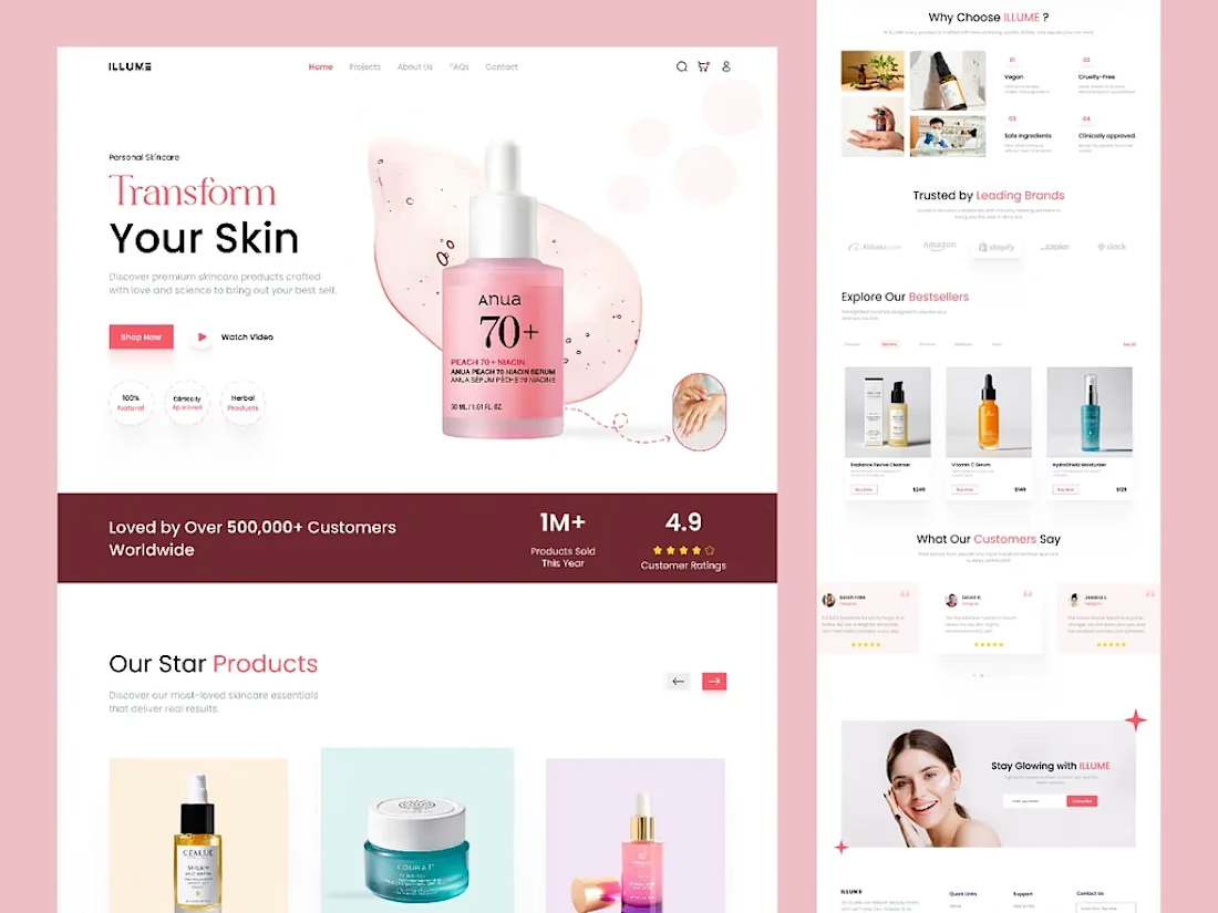
We are excited to share the new landing page for Illume, a premium skincare brand! ✨
This website features a sleek and elegant design, ensuring easy navigati...


This is a great reminder of how much good design adds to an online business.


Another project wrapped up! ✨ And this one was a little different for us.
For the first time, we designed and built an entire Kajabi website in Dutch. And here's the thing – nobody on our team speaks Dutch. 😅
Was it a little intimidating at first? Absolutely.
But we had an incredibly patient client who provided all the content we needed, and we focused on what we do best: design, development, and creating a great user experience.
The result? A beautiful website, a fully set-up course platform, and a client who's 100% happy with the outcome.
A little reminder from this project: Don't be afraid to take on something you've never done before.
Trust your skills, trust your experience, and sometimes just say yes to the challenge. You might surprise yourself.

Well done! Looking forward to seeing more of your Kajabi work.
What does your customer see 3 seconds after paying?
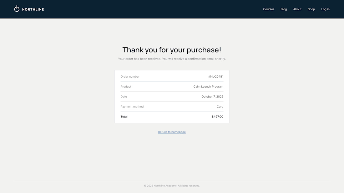
On most Kajabi sites it's a plain "Thank you for your purchase" and a receipt. It's the moment of highest trust, and the page offers nowhere to go.
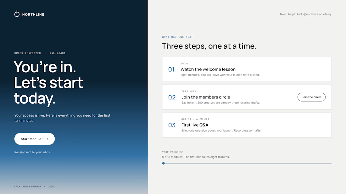
So we design the thank-you page as the first page of the course:
01 – One clear first step. "Start Module 1" sits above everything else. Momentum beats confirmation.
02 – A visible "what happens next". Today, this week, the first live call, with a calendar button. Clear dates calm the doubts that come right after paying.
03 – Proof they're in the right place. A link to the community, a human email they can reply to, progress at 0 of 8.
The receipt still lives in the inbox. It just isn't the headline.
Same brand, same colors. The only difference is where the page leads.
What did the last thank-you page you saw actually ask you to do?
Love the focus on making the experience feel simple for users.