The network for creativity
Join 1.25M professional creatives like you
Connect with clients, get discovered, and run your business 100% commission-free
Creatives on Contra have earned over $150M and we are just getting started
Back to feedPost
Taste Test

I’m happy to share a new logo redesign! ✦
I had the opportunity to redesign this logo for a client from Cambodia, and the entire redesign was completed within a day.
What do you think of the new direction? Share your thoughts in the comments! 👇
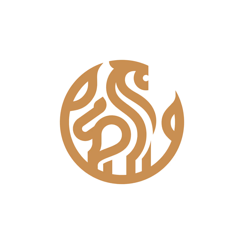
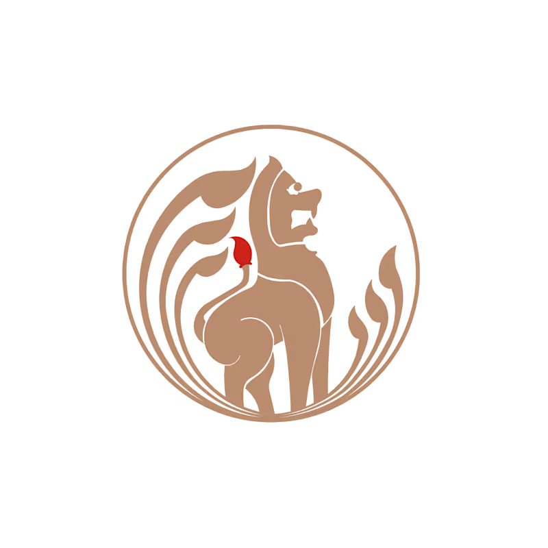
5 votes
Ends in 1d


The network for creativity
Join 1.25M professional creatives like you
Connect with clients, get discovered, and run your business 100% commission-free
Creatives on Contra have earned over $150M and we are just getting started





Related posts

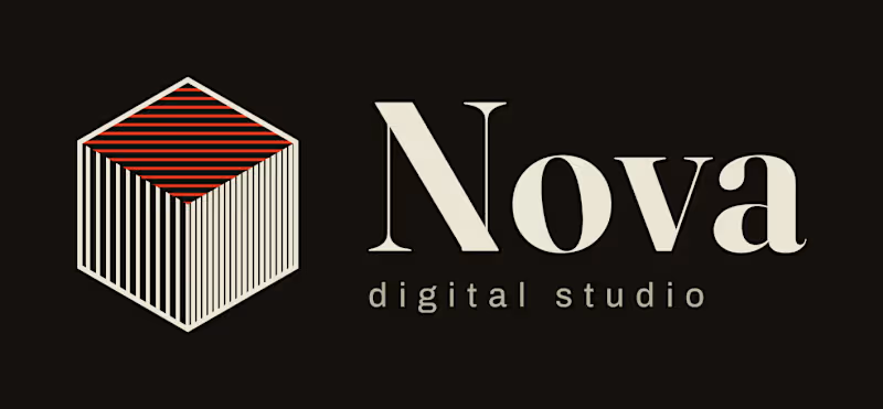
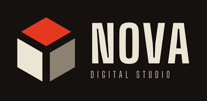
Logo Design for my agency.
I already made my decision!
Which one do you prefer?
0 voted
1%
0 voted
1%
0 votes
Closed

Engraved for me. The fine line hatching gives the cube some real craft, and the serif feels more considered for a digital studio, while Burst reads closer to a generic tech mark. I'd just check how those thin lines hold up at favicon size.

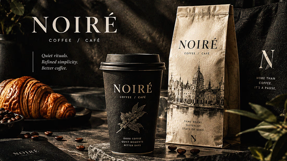
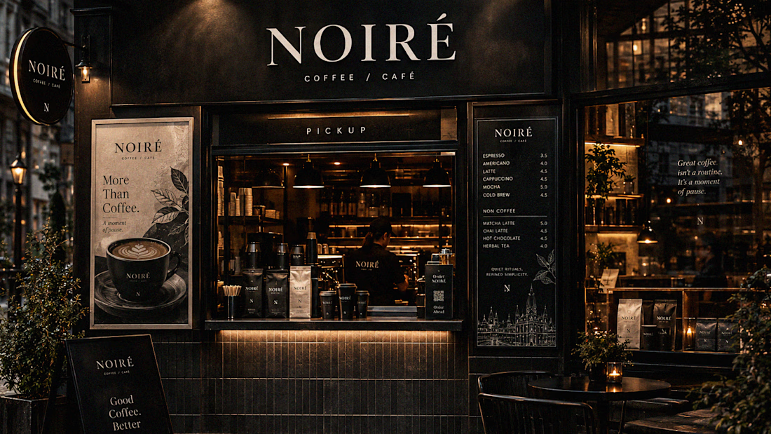
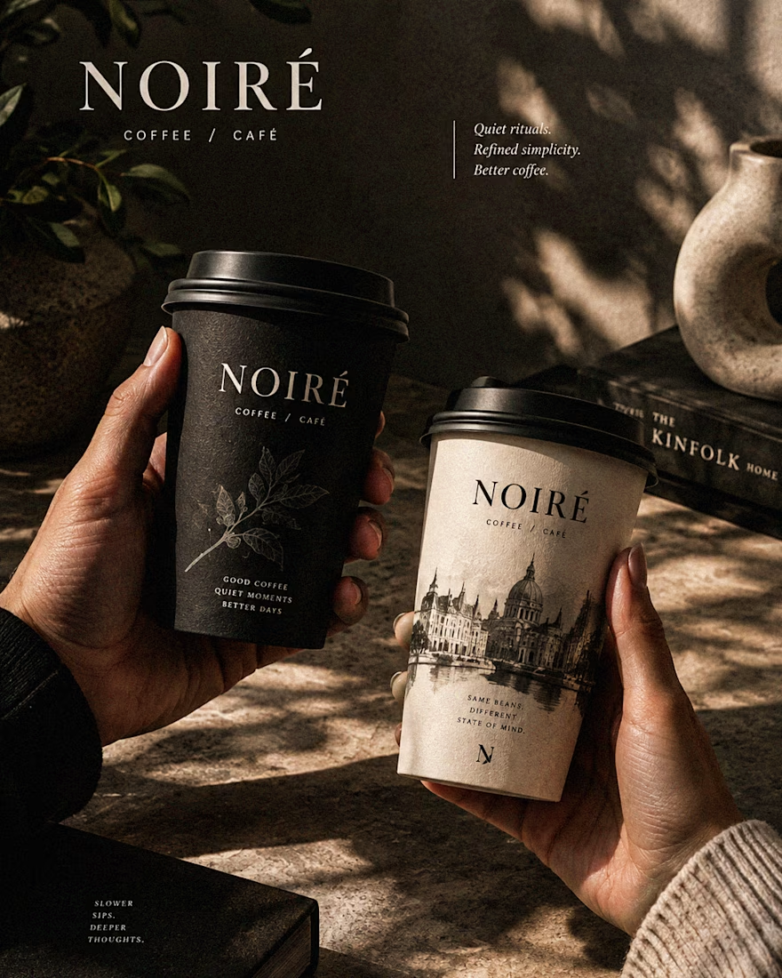
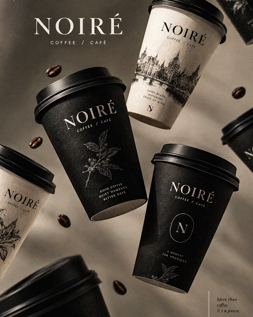
I Just Created NOIRÉ 🔥
A Coffee Brand Built Around the Pause.
NOIRÉ is a premium café brand built around a simple idea:
Great coffee should feel like a moment of pause, not another part of the
routine.
The project explores a complete visual identity, packaging
system, takeaway cups, coffee bags, tote bags, menu design, café applications and lifestyle campaign direction.
Instead of relying on the usual loud coffee aesthetics, I
built NOIRÉ around deep charcoal, warm ivory, soft graphite, refined
typography, subtle botanical illustrations and quiet editorial compositions.
The visual language is intentionally dark, tactile, and understated - giving every touchpoint the feeling of a slow morning, a quiet table, and coffee worth taking your time with.
From the cup in your hand to the café around you, every detail was designed to make the brand feel like a ritual.
Waiting for your thoughts in the comments 🙌🔥
branddesignertastetestBrand DesignGraphic DesignPackaging DesignAdobe IllustratorAdobe InDesignAdobe Photoshop




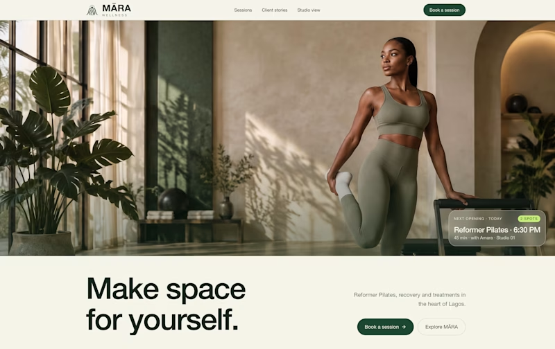
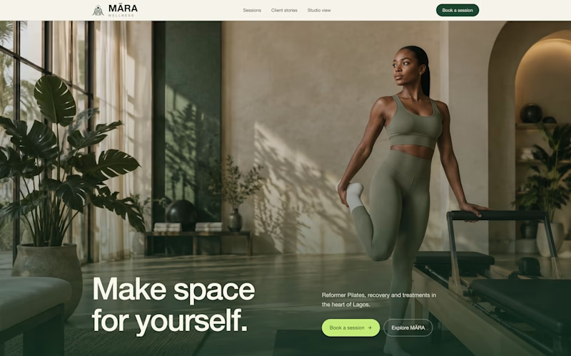
exploring some visual directions, which of this hero design looks better?
4 voted
40%
6 voted
60%
10 votes
Closed

Option 1 looks cleaner and more balanced. The layout feels more spacious and premium. ✨