The network for creativity
Join 1.25M professional creatives like you
Connect with clients, get discovered, and run your business 100% commission-free
Creatives on Contra have earned over $150M and we are just getting started
Back to feedPost

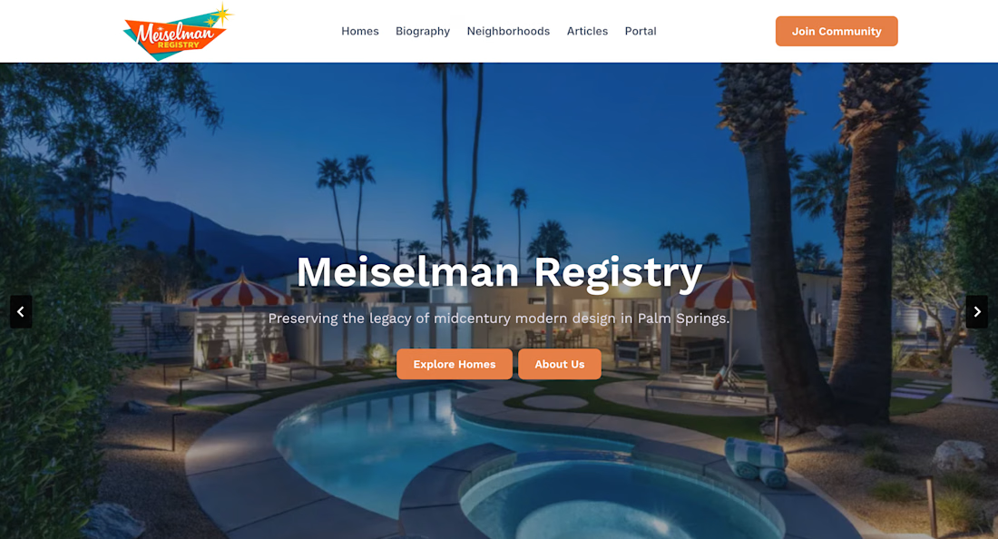
Led the website positioning, content structure, and messaging strategy for Meiselman Registry, shaping a clearer user journey around its homes, stories, and community.

The network for creativity
Join 1.25M professional creatives like you
Connect with clients, get discovered, and run your business 100% commission-free
Creatives on Contra have earned over $150M and we are just getting started

Challenges
View all


Related posts

A website should make the product easy to understand.
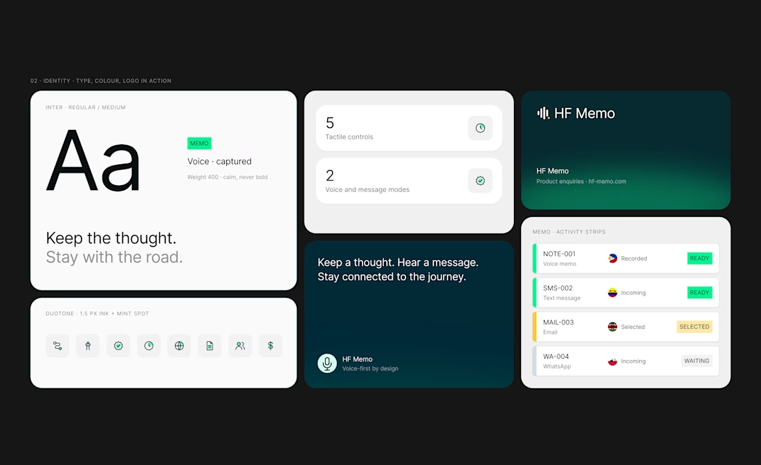
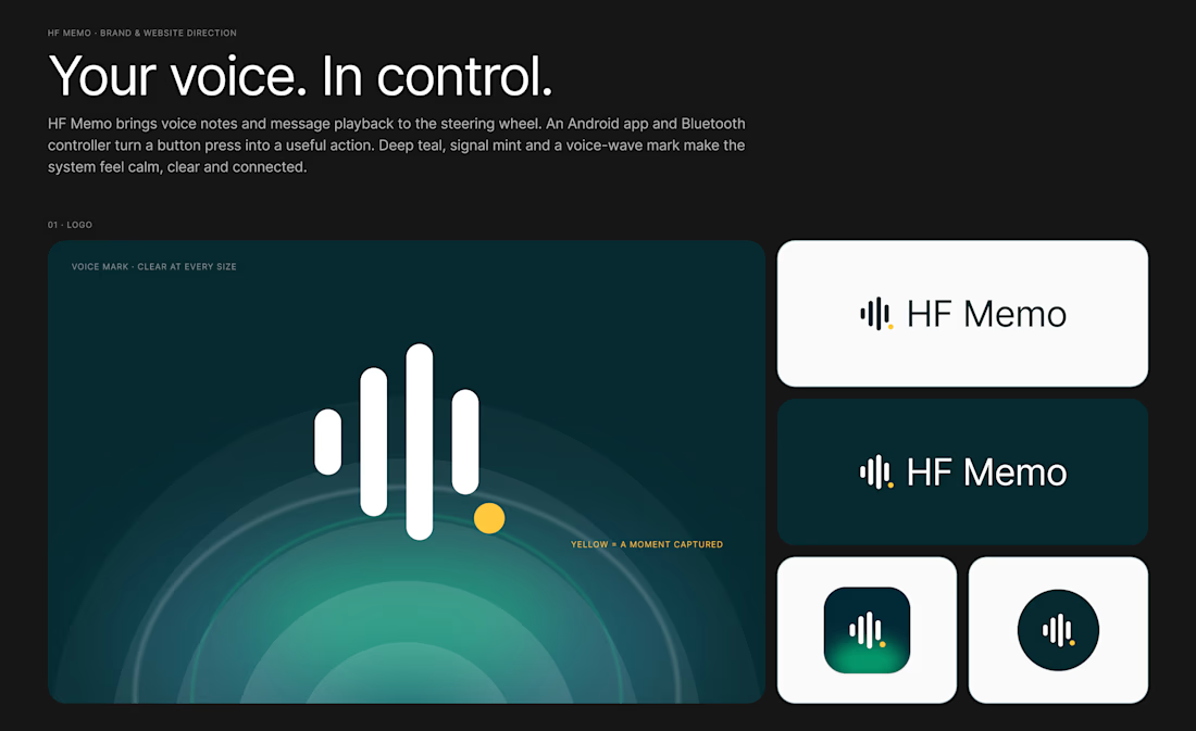
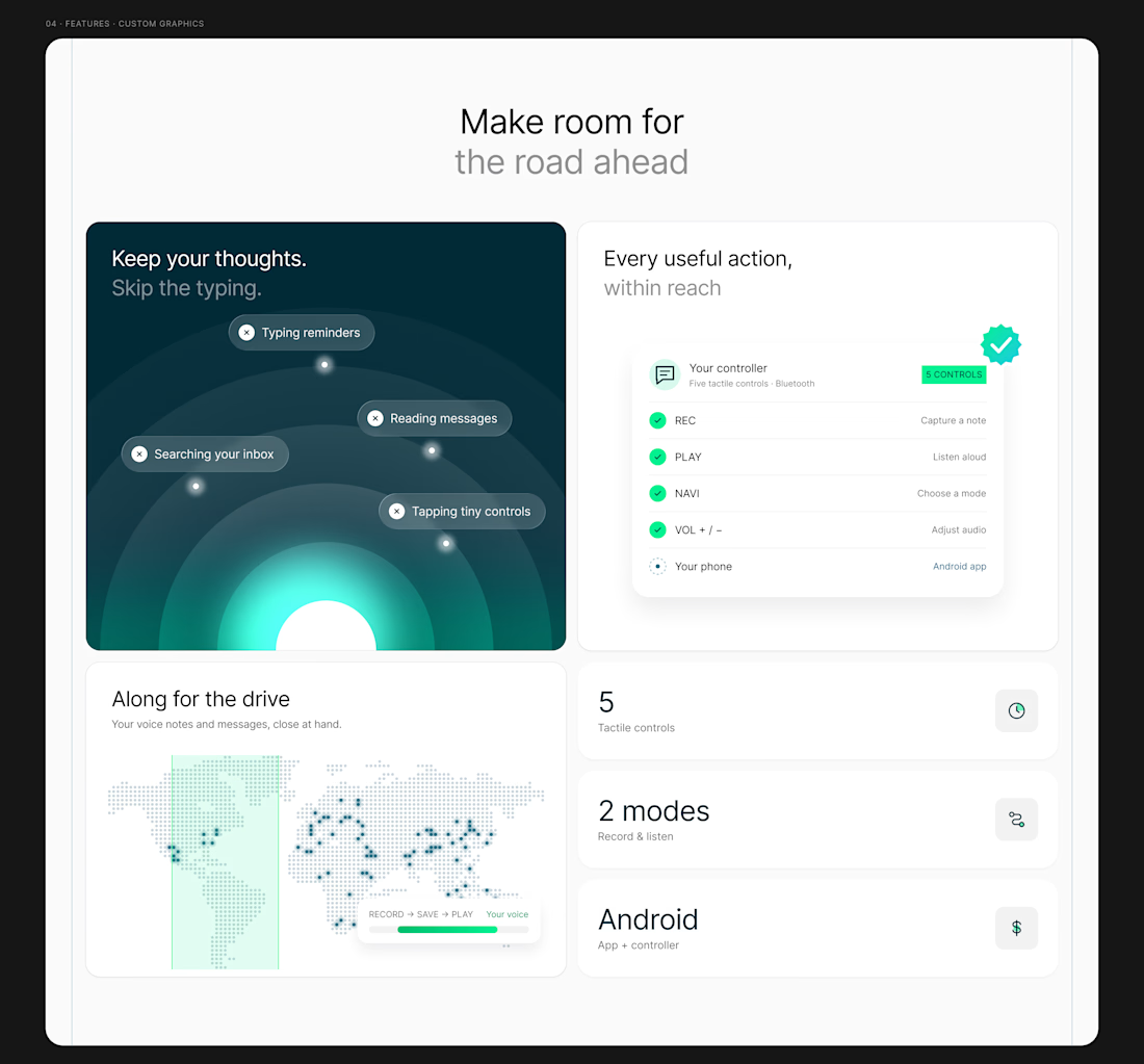
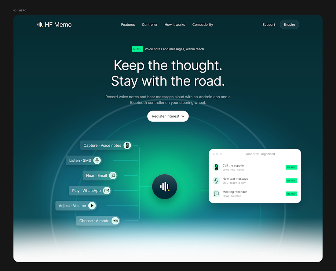
My latest redesign concept explores a new direction for HF Memo—an Android app and Bluetooth controller for recording voice notes and hearing messages aloud.
I focused on showing the experience: capture a thought, replay a recording, and understand what each controller button does.
Clean typography, light backgrounds, and lime accents give the product room to tell its story.
Designed in Figma, with editable layouts and custom graphics.
Have a product that needs a clearer website? Let’s connect.
#webdesign #uidesign #figma #productdesign




Just completed this Webflow website project for CT Moving & Storage
The goal was to make the website feel trustworthy, easy to navigate, and simple for customers who need moving, packing, or storage services.
I focused on clear service sections, strong customer reviews, location-based pages, responsive design, and a smooth quote-request journey that helps visitors move from searching to taking action.
I’d love to hear your thoughts, does the website give you the confidence you’d want before trusting a company with your move?
#Webflow #WebDesign #WebflowDesigner #UIDesign #UXDesign #WebDevelopment #MovingCompany #LocalBusiness #ResponsiveDesign #WebsiteDesign #PortfolioProject #Contra


This is a masterclass in design execution. The concept is strong, the presentation is polished, and the visual hierarchy is incredibly well handled. Excellent work from start to finish.

I'm about to go on a #30days Personal Content Creations Challenge about my NoCode stack with @Contra till I get my first client on contra
Content will be available in my post feed, You can afford to miss it
Rooting for myself 😎, Daily update will be drop here.
Cheers 🥂🥳

