The network for creativity
Join 1.25M professional creatives like you
Connect with clients, get discovered, and run your business 100% commission-free
Creatives on Contra have earned over $150M and we are just getting started
Back to feedPost

Nuvo is a clean, editorial Framer template built for
freelancers, coaches, students and creators who want
to build a focused, profitable personal brand online.
Designed with intention every section, every page
and every interaction has been crafted to feel premium
without being complicated. Nuvō combines editorial
typography with a modern layout system that converts
visitors into clients.


The network for creativity
Join 1.25M professional creatives like you
Connect with clients, get discovered, and run your business 100% commission-free
Creatives on Contra have earned over $150M and we are just getting started







Related posts

Libra season is here, and so is spring (in my side of the world)!
🌸🍃 ☀️🌈
I'm using this blooming moment to rebuild my personal brand from the ground up: re-evaluating, brainstorming, and bringing my whole toolset to the table. 💻🧠⚡️
As a multipotential creator, making everything I do fit into one clear story isn't always easy. So I'm giving it the time it deserves, and I'm curious to see where it leads.
STAY TUNED! 😊


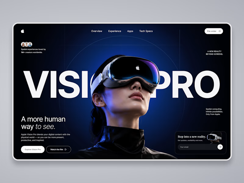
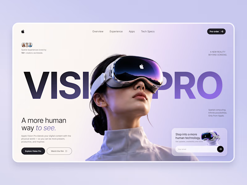
Which Apple Vision Pro Landing Page Feels More Premium?
I'm exploring two visual directions for an Apple Vision Pro landing page concept and would love your feedback.
Option A: Dark cinematic interface with immersive spatial-computing vibes.
Option B: Soft lavender & light minimal interface with a premium Apple-inspired aesthetic.
Which version would you choose for a real product launch page, and why? Your feedback will help shape the final case study.

10 voted
59%
7 voted
41%
17 votes
Closed

Option A wins...Its visual appearance suddenly grad against Option B!!

My new portfolio, shown in dark mode.
I designed and built it end to end in a strict monochrome style. It opens with a block-letter SAIF wordmark that bulges under the cursor, over a live particle field. Further down, a dotted globe pins where I work from in Turin, Italy.
My projects play on their own in a device-style showcase that tilts into place as you scroll. Next, 3D letters spelling motivational words fall toward the footer, where they turn into a small slicing game you can play.
Built with React, TypeScript, GSAP, Three.js and WebGL, with a light/dark toggle, smooth scrolling and a custom cursor.
