The network for creativity
Join 1.25M professional creatives like you
Connect with clients, get discovered, and run your business 100% commission-free
Creatives on Contra have earned over $150M and we are just getting started
Back to feedPost


Why Good Dashboard UI/UX Design Starts With Clarity, Not Visuals
Most dashboards don't fail because of poor UI design. They fail because users struggle to understand what matters, where to focus, and what action to take next.
With 7+ years of experience in UI/UX and Product Design across SaaS, Fintech, and AI-powered products, I use these 3 questions to evaluate every dashboard screen:
1. Visual Hierarchy: What is the most important information users should notice first?
2. User Flow & Actions: What is the next logical action users should take?
3. UX Simplification: What can be removed without compromising usability or clarity?
These simple UX principles help create better SaaS dashboards, improve information architecture, reduce cognitive load, and make complex digital products easier to use.
Watch the quick breakdown above.
Which area do you find most challenging in dashboard design: 1, 2, or 3? Share your thoughts in the comments.
Follow for practical insights on SaaS UI/UX Design, Product Design, Dashboard UX, and AI-powered digital products.
#UIDesign #UXDesign #ProductDesign #SaaSDesign #DashboardDesign #EnterpriseUX #UXStrategy #Figma



The network for creativity
Join 1.25M professional creatives like you
Connect with clients, get discovered, and run your business 100% commission-free
Creatives on Contra have earned over $150M and we are just getting started



Related posts

Your body is ready for sleep. But is your mind ready to switch off?
That’s the moment Elivara is designed for.
Instead of another endless scroll, imagine opening an experience that makes slowing down feel natural.
Because better rest starts with how you end your day.
Would you trade 20 more minutes of scrolling for 20 minutes of peace?
#SleepApp #UIUXDesign #ProductDesign #WebDesign #MotionDesign

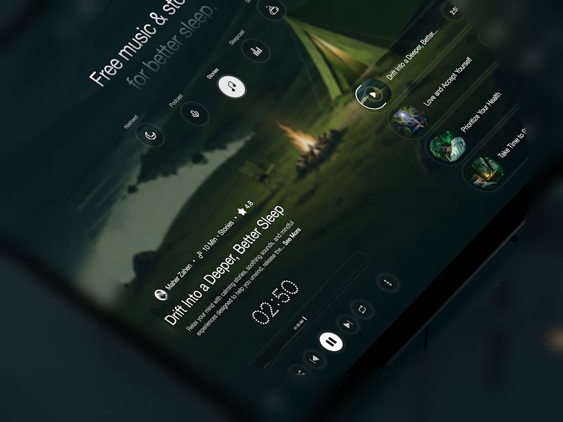
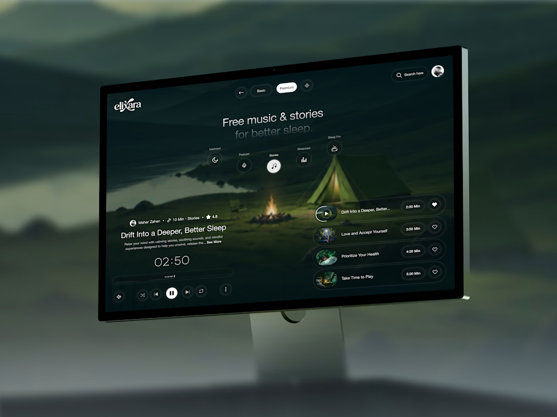

Great UX understands the user's state of mind, not just what they want to click.

Clinora — Rethinking the Healthcare Dashboard Experience
How can complex health information feel simpler, clearer, and more engaging?
Introducing Clinora, a healthcare dashboard UI concept focused on presenting health metrics through a clean, organized, and visually engaging interface.
Design highlights
• Health monitoring dashboard with organized metric cards
• Heart rate, blood pressure, and blood sugar indicators
• Prescription reminders and consultation scheduling
• 3D anatomical visuals to create a more engaging experience
• Soft blue tones, clear information hierarchy, and consistent UI component.
My goal with this concept was to explore how thoughtful UI/UX design can make health information easier to navigate while maintaining a modern, approachable visual language.
What would you improve first in this dashboard: information hierarchy, data visualization, or navigation?
#Ui design #Ux design #Healthcare design #Dashboard design #Product design #Figma


Looks clean!

Tendee - Dating App UI UX Design
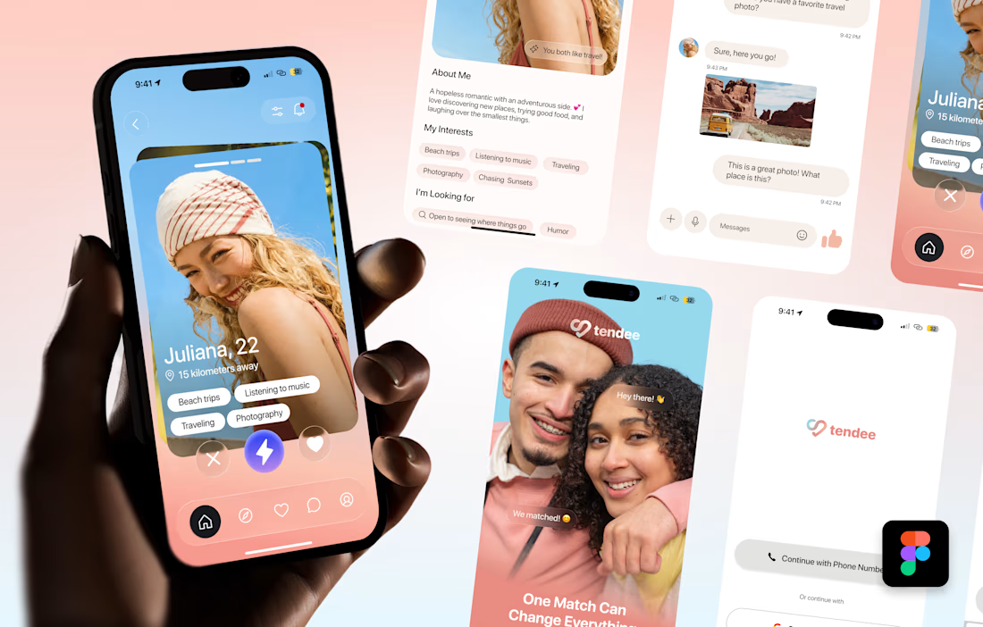
A mobile app UI design showcase focused on discovery, profiles, matching and conversation.
The visual challenge was to bring profile content, interest tags, primary actions and messaging into a consistent mobile experience. The design uses a soft lavender and coral palette, clear typography, rounded cards and recognizable navigation.
The selected mockup presents a profile discovery screen, detailed profile information, chat, onboarding and sign-in views. These screens demonstrate visual hierarchy, consistent interface styling and attention to mobile interactions.
Personal portfolio showcase. Project cost is an illustrative quote for comparable design work, not a past client payment. The date marks this showcase's preparation in October 2026; duration is an estimated production timeframe.

Love the colors!