The network for creativity
Join 1.25M professional creatives like you
Connect with clients, get discovered, and run your business 100% commission-free
Creatives on Contra have earned over $150M and we are just getting started
Back to feedPost

Tahedl: Multi-SKU Packaging & Brand Brochure Layout
Senior Packaging & Pre-Press Layout Expert
Description:
Comprehensive multi-SKU product packaging roll-out and technical marketing layout deployment for Tahedl (Germany). Transitioning premium food assets from 1:1 factory-ready dielines directly to market-ready print materials.
Technical Deliverables:
Label Engineering: Exact vector dieline setup, text-safe zoning, and structured typography grids tailored for industrial cylindrical cans.
Pre-Press Management: 100% factory-ready file preparation including exact bleed limits, color separation, and regulatory text safety (allergen listings) .
Brochure Layout Integration: Maintaining strict grid alignment across supplementary commercial print assets to ensure absolute visual consistency


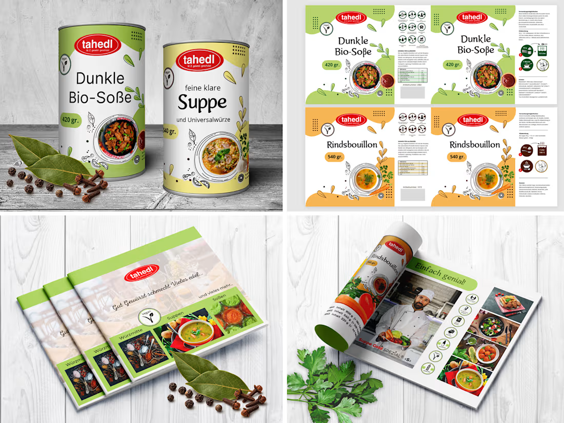

This is a gold standard for commercial packaging design, Lara. Clean vector layouts, flawless dieline setup, and perfect technical execution for Tahedl. Truly impressive!
The network for creativity
Join 1.25M professional creatives like you
Connect with clients, get discovered, and run your business 100% commission-free
Creatives on Contra have earned over $150M and we are just getting started
Related posts


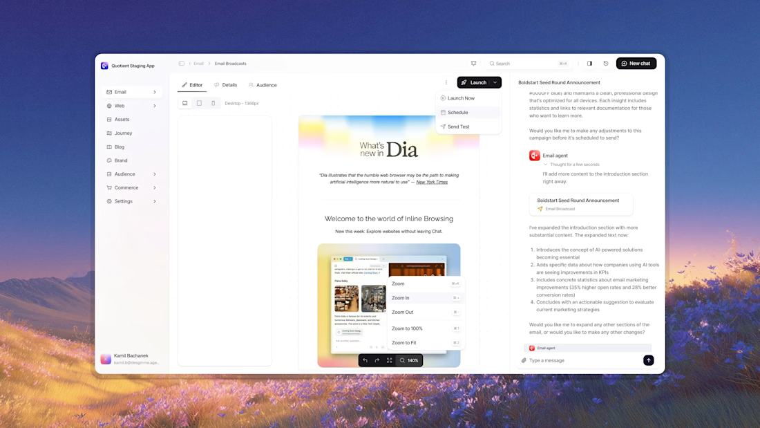


Awesome dude


Celvana brand identity & packaging for a red light therapy brand launching in the US.
The category is crowded with identical, unbranded panels. Celvana sells precision, so the brand had to look like medical equipment you can trust: clinical, exact and professional.
Brand identity case study
Packaging case study

This is high end branding


We’re testing two filtering layouts for a template library.
Top Filters
The filters are placed above the content. This option feels lighter, leaves more space for the cards, and works well when there are only a few main categories.
Sidebar Filters
The categories remain visible in the sidebar. This makes the available options easier to scan and works better for more complex filtering, but takes up some of the content space.
Which layout would help you find the right template faster?

24 voted
39%
37 voted
61%
61 votes
Closed

Such a clean presentation. You can tell a lot of thought went into this.