The network for creativity
Join 1.25M professional creatives like you
Connect with clients, get discovered, and run your business 100% commission-free
Creatives on Contra have earned over $150M and we are just getting started
Back to feedPost

Most Shopify homepage banners are written like ads for the brand, not directions for the shopper.
"Elevate your every step" sounds nice. It doesn't tell a first-time visitor what you sell, who it's for, or where to tap.
Four quick fixes:
Say what you sell in plain words.
Name the button after where it goes. "Shop running shoes", not "Shop now".
Drop the auto-rotating slider. Lead with your strongest message.
On mobile, let a few best sellers peek above the fold.
None of these need a redesign. Most are a copy change and a section setting.
What's the headline on your homepage banner right now?
#Shopify #CRO #Ecommerce

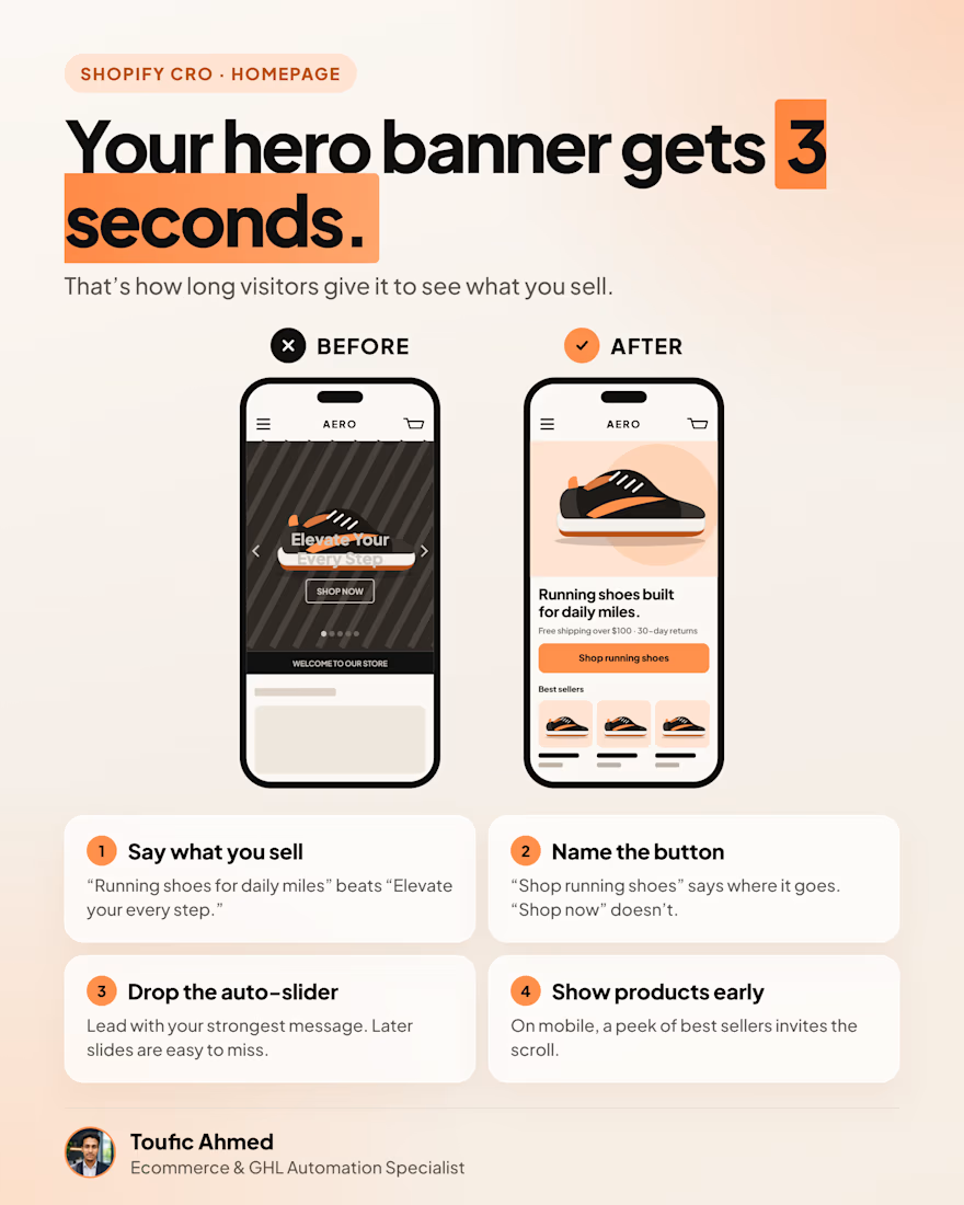

The button naming one is so underrated. Naming it after the destination takes all the guesswork out of the click. The 3 seconds framing in the graphic is a great hook too. Do clients usually push back on dropping the auto-slider, or are they happy to let it go?

Dropping the auto-slider is such an easy win. Do you see it help conversion often?
The network for creativity
Join 1.25M professional creatives like you
Connect with clients, get discovered, and run your business 100% commission-free
Creatives on Contra have earned over $150M and we are just getting started



Related posts

LUXE Furnish Studio is ready!!
I designed & built LUXE - a premium furniture brand on Shopify.
The goal was simple: Make it feel like a luxury showroom, not just an online shop.
What I did:
Clean, premium homepage with luxury branding
Curated collections: Sofas, Chairs, Tables & Decor
High-converting product pages with clear pricing & Add to Cart
Fully mobile-responsive - looks perfect on phone & desktop
Fast, clean navigation for easy shopping
Built on Shopify with a premium, minimal aesthetic focused on conversions.
If you need a luxury Shopify store that actually sells - let's build yours.
Live Demo: luxe-furnish-studio.myshopify.com
Password: 00
Services: Shopify Store Design, Shopify Development, E-commerce UI/UX
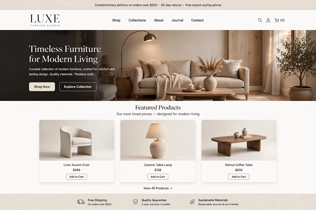
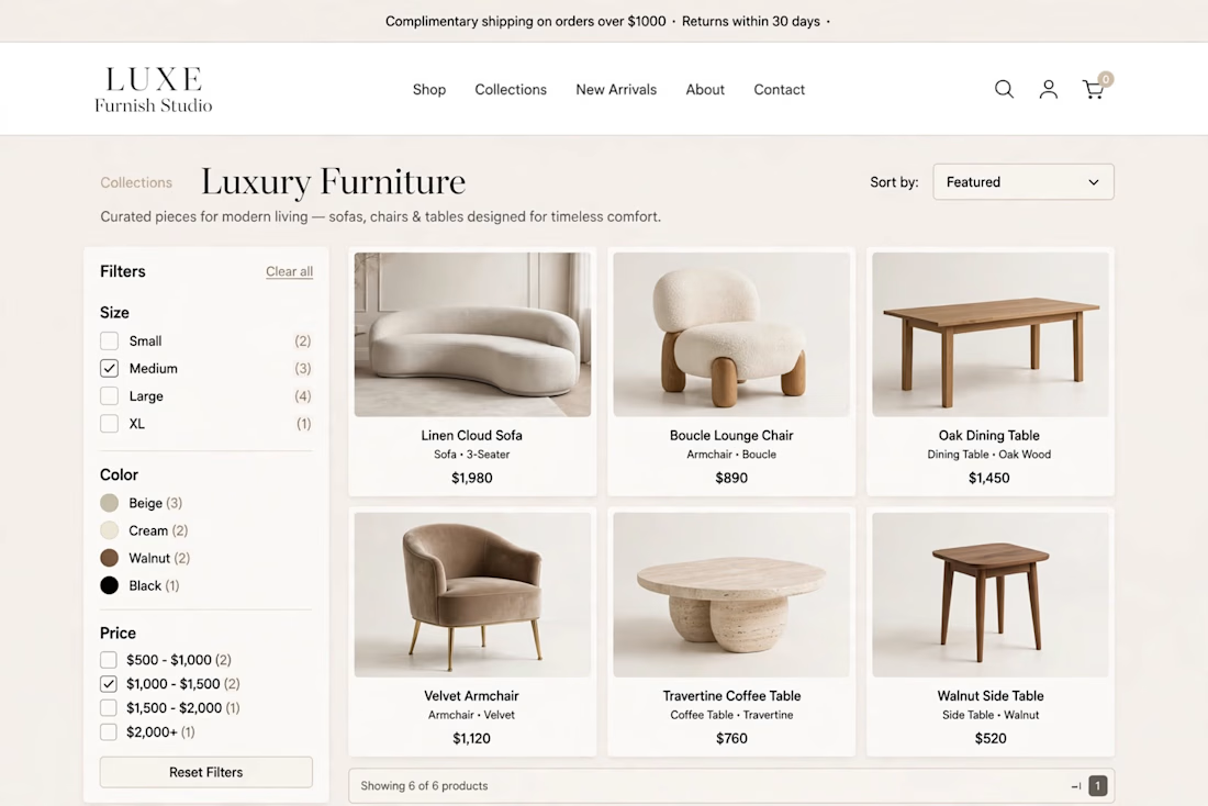
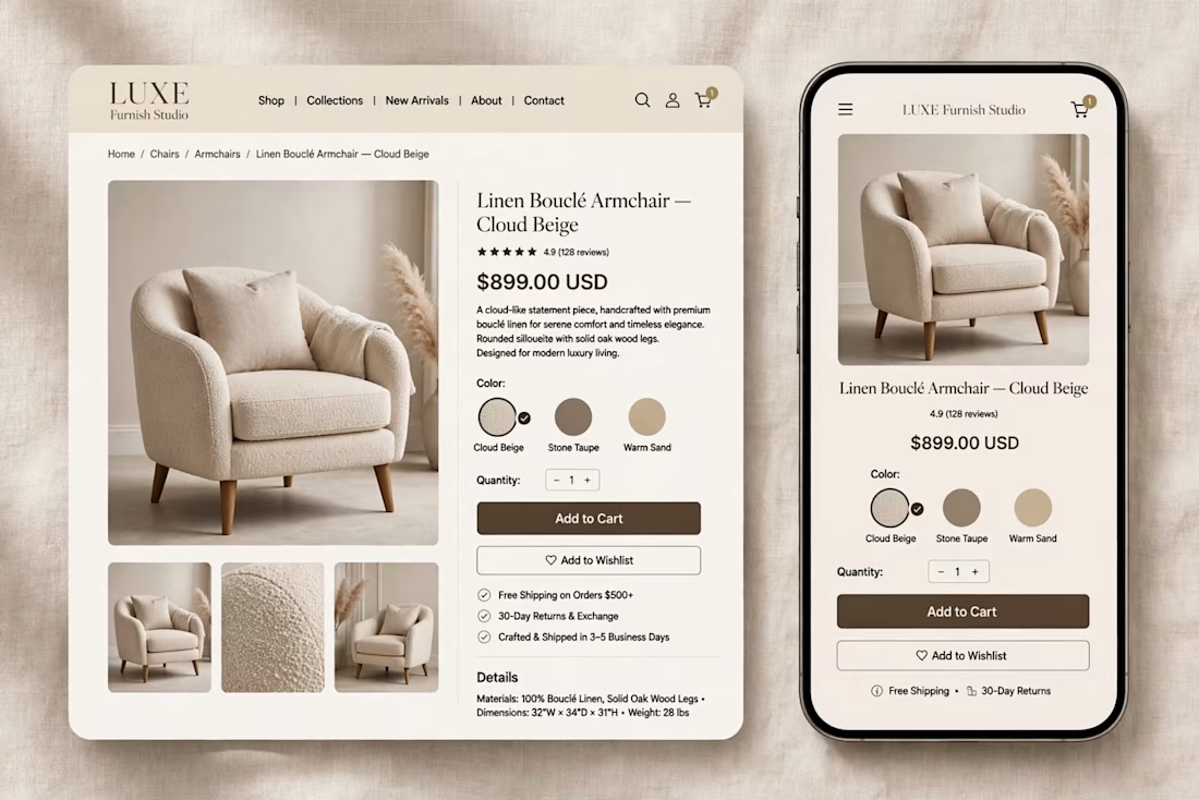

The warm beige palette and the sofa hero with the arc lamp feel like a real showroom, and the mobile product page keeps the same calm look. Which part took longer, the homepage or the product page?

Hi Contra, I'm Loke from Winslov Media in Copenhagen 👋
I help Shopify and DTC brands with Meta ads, from setup and testing to the creatives that stop the scroll.
I like ads that don't look like ads. A search bar, a sticky note, a bit of simple math. They feel like content, so people actually read them.
Here are 4 new concepts I made for fictional brands to show the style.
I'm taking on a few new brands in the UK and US. If your Meta ads feel stuck, send me a message.
Which one would make you stop scrolling?
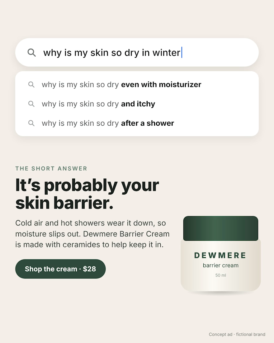
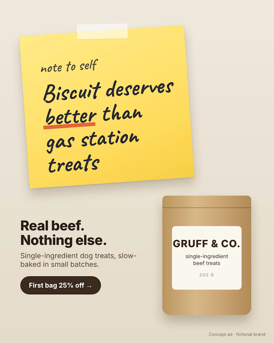
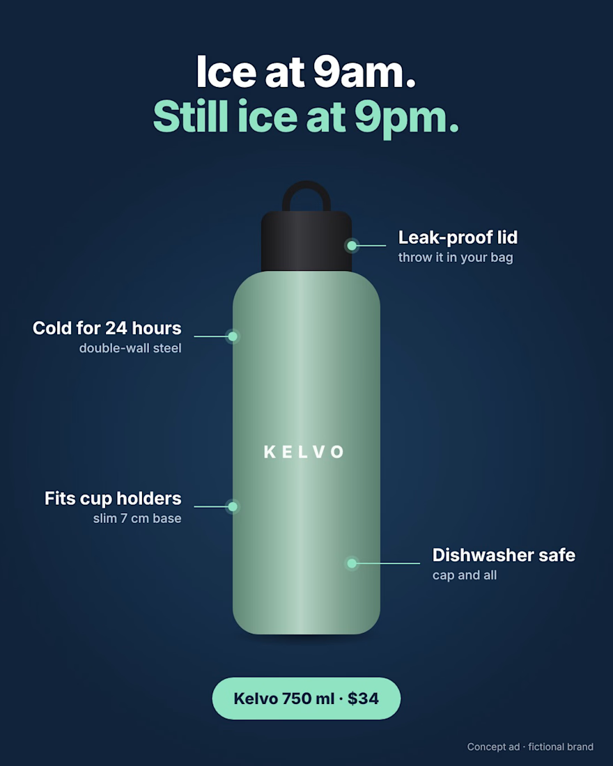
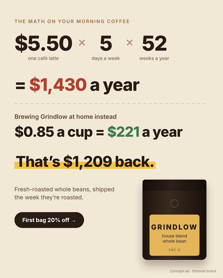
The yellow sticky note ("Biscuit deserves better than gas station treats") stops me first: a human voice and one colour pop on a quiet layout. The $1,209 back math ad is a close second, the number does the selling.

Introducing our new jacket collection — where bold character, timeless style, and attention to detail come together. 🧥✨
Looking to elevate your brand with a custom-designed website or a creative concept for your next advertising video?
Let's bring your vision to life. Get in touch with me to discuss your project and create something unique for your brand.
📩 DM me to get started.
#JacketCollection #FashionDesign #StreetwearStyle #FashionBrand #WebsiteDesign #WebDevelopment #CreativeDesign #VideoAdvertising #BrandIdentity #DanvoraStudio


Amazing