The network for creativity
Join 1.25M professional creatives like you
Connect with clients, get discovered, and run your business 100% commission-free
Creatives on Contra have earned over $150M and we are just getting started
Back to feedPost

Your website shouldn’t just look good. It needs to perform under pressure.
One of the biggest mistakes founders make is hiring a "page builder" instead of a technical architect. Dragging and dropping templates is easy. Building a scalable digital ecosystem is not.
When a website relies on bloated plugins and messy architecture, you get 5-second load times, broken mobile layouts, and lost revenue.
Here is my baseline standard for every custom build:
Lean Architecture: Custom HTML/CSS/Liquid where it counts, minimizing third-party bloat.
Speed Engineering: Strict asset compression (WebP/WebM) to ensure sub-3-second load times.
Future-Proof CMS: A backend that is locked down and easy for your internal team to manage without breaking the frontend layout.
Whether we are building in WordPress, Framer, or Shopify, the infrastructure matters just as much as the UI.
🚀 I am open to projects. If you have a complex migration or a custom build on the horizon, let’s talk architecture.


The network for creativity
Join 1.25M professional creatives like you
Connect with clients, get discovered, and run your business 100% commission-free
Creatives on Contra have earned over $150M and we are just getting started
Related posts


I felt something was off with my own website.
Too plain. Not how I envisioned the brand.
So I added more creative touches and built a real story into it. Now everything makes sense.
It finally feels like Outredge 🚀
https://outredge.com/


That big bold wordmark with the corner brackets gives it so much more character. "A marketing site as good as your product" is a strong line too, says exactly what you do.


What happens when one website has to talk to two different people?
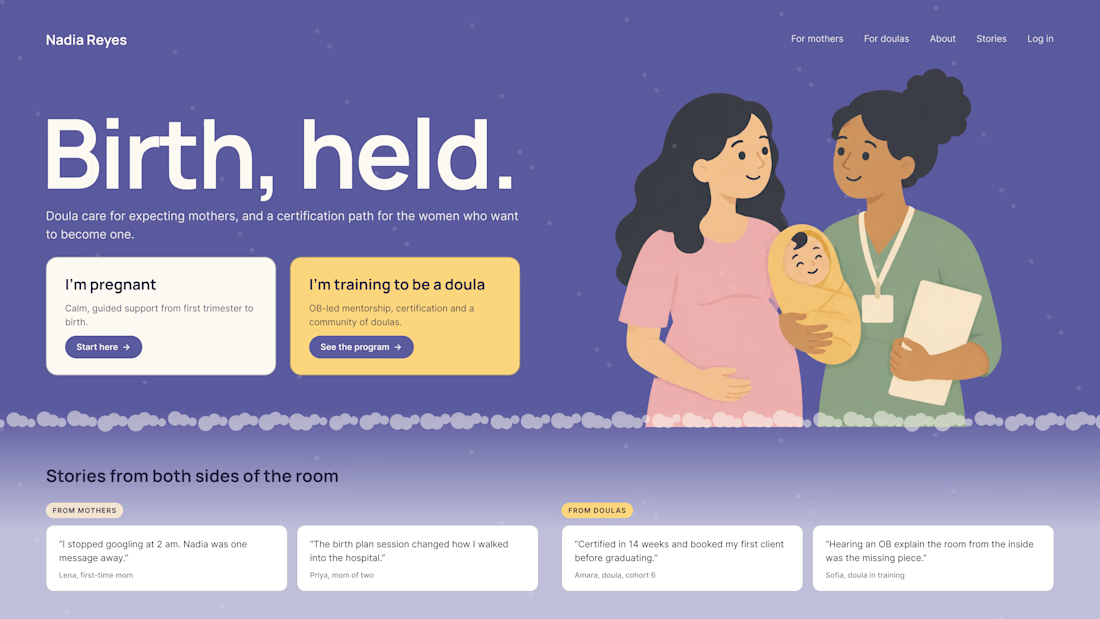
A client of ours teaches two audiences at once: expecting mothers who want a calm pregnancy, and women who want to become doulas. One brand, one site, two very different reasons to visit.
The usual fix is a hero that speaks to "everyone" and lands with no one. We designed it as a fork in the road instead:
1. Two doors in the hero. "I'm pregnant" and "I'm training to be a doula", side by side, equal weight. The visitor picks a path in one click, and the headline above them stays about the shared value.
2. One voice, two tones. The mothers' path is softer: fewer words, more room, gentle photos. The doula path is more structured: modules, certification, dates. Same fonts, same colors, different rhythm.
One proof section, split in two. Testimonials from mothers on the left, from doulas on the right. Each visitor sees people like them before the price.
Writing for everyone is writing for no one. Give each reader a door.
Have you ever designed a page for two audiences at once? How did you split it?

Love that purple hero with the two cards right up top.

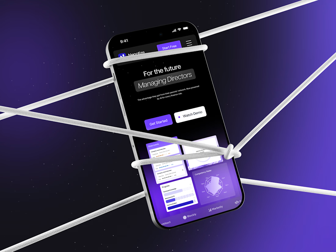
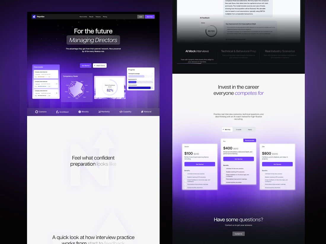
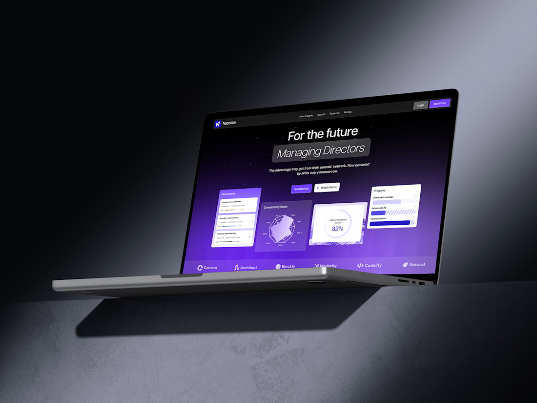
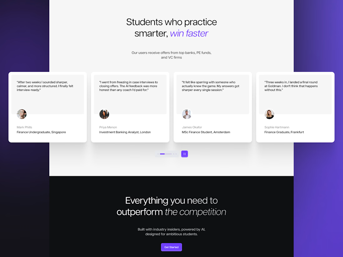
What do you think of this landing page design for an AI-powered finance interview prep platform? 👀
Dark, bold, and built around a strong tech feel.
Would love to hear your thoughts in the comments!


wow!