The network for creativity
Join 1.25M professional creatives like you
Connect with clients, get discovered, and run your business 100% commission-free
Creatives on Contra have earned over $150M and we are just getting started
Back to feedPost
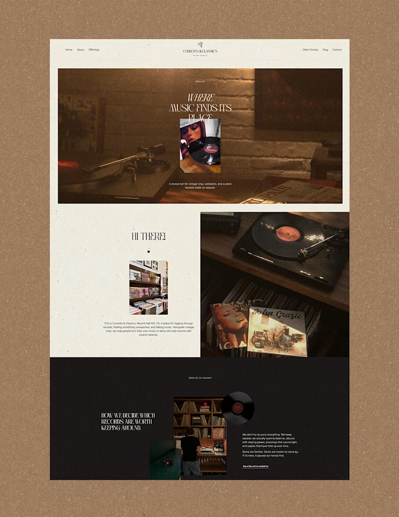
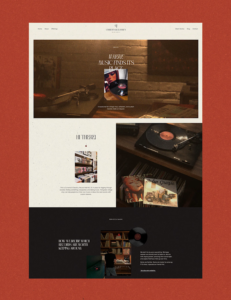
Taste Test


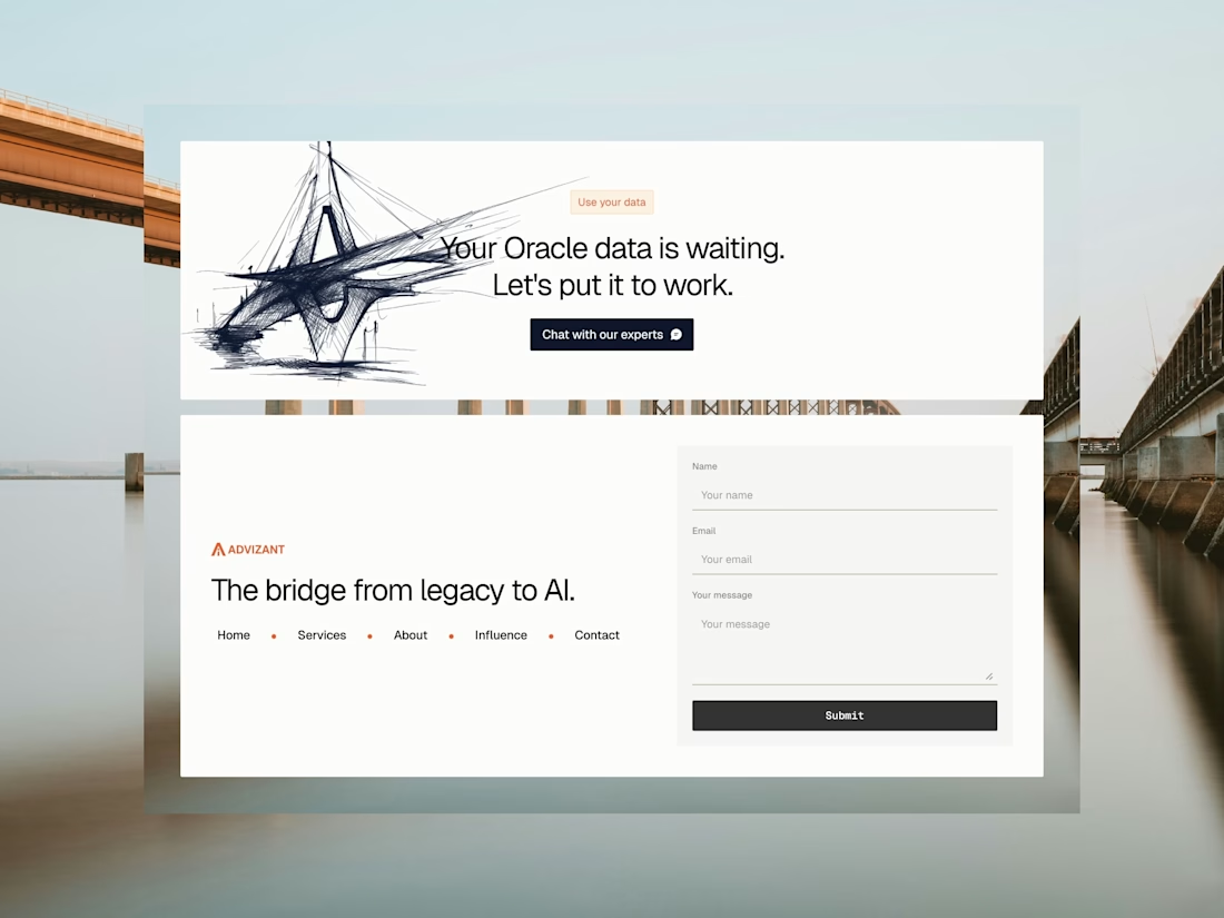
For my case study I'm trying to decide on the background color for the website🤔 the original website that the case study is for is https://currentsclassics.com/ and the case study is https://thecloudfairy.nl/currents-classics/ I’d love your thoughts!
13 voted
68%
6 voted
32%
19 votes
Closed


Brown feels more cohesive here.
From a product/UX perspective, the softer background keeps attention on the content rather than competing with it.
Red is visually striking, but it subtly shifts hierarchy toward the container instead of the information.
Brown supports readability +...

Red feels right. It adds warmth and connects well with the analog, vinyl vibe of the project. If contrast stays strong and the work remains the focus, I’d keep it.

I love this approach Jasmijn! The brown background feels warmer and more inviting - it complements those beautiful warm wood tones in the product photography. The red is striking but feels a bit more aggressive. For a classics/music brand, brown creates the right sophisticated vintage vibe.

Red one would look good with slight changes in colours

The color contrast works better in the brown bg
The network for creativity
Join 1.25M professional creatives like you
Connect with clients, get discovered, and run your business 100% commission-free
Creatives on Contra have earned over $150M and we are just getting started
Related posts

Blue or Purple?
12 votes
Ends in 1d

The animation is neater in the purple variant.


Great!!

Comparing the winner of the Contra Labs Creative Area with the image I used for my latest project. Interested in what you would have picked. Let me know.
17 votes
Ends in 1d

Option A has a Mood About it 🙌


Trending


Notion
Notion isn’t just where you work, it’s starting to work for you. What agents are you building?
portfolioreview
The best portfolios tell a story, not just show a grid. Share yours for feedback.
brandguidelines
Brand guidelines are becoming living systems, not static documents. What are you building for your clients?
aivideo
AI video tools are moving at warp speed. Which ones are you experimenting with?
freelancerlife
Freelancer life is wins, pivots, and everything in between. What’s yours right now?