The network for creativity
Join 1.25M professional creatives like you
Connect with clients, get discovered, and run your business 100% commission-free
Creatives on Contra have earned over $150M and we are just getting started
Back to feedPost

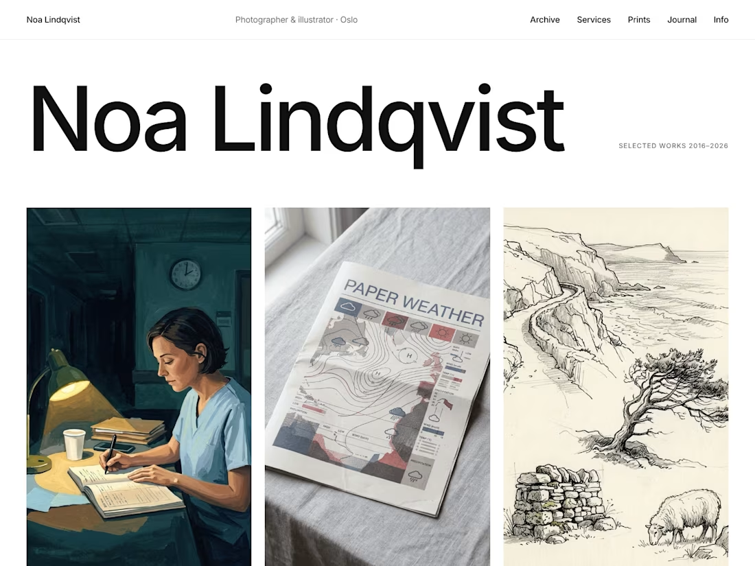
Contact Sheet just got a big update.
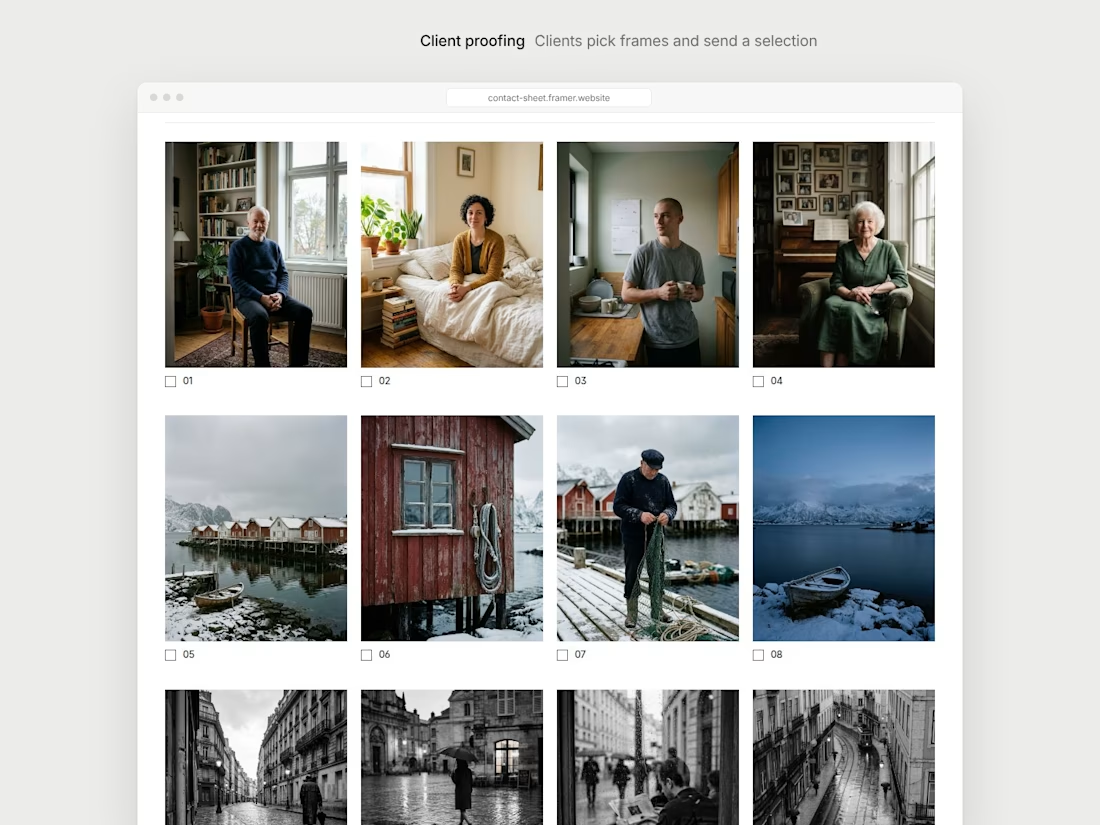
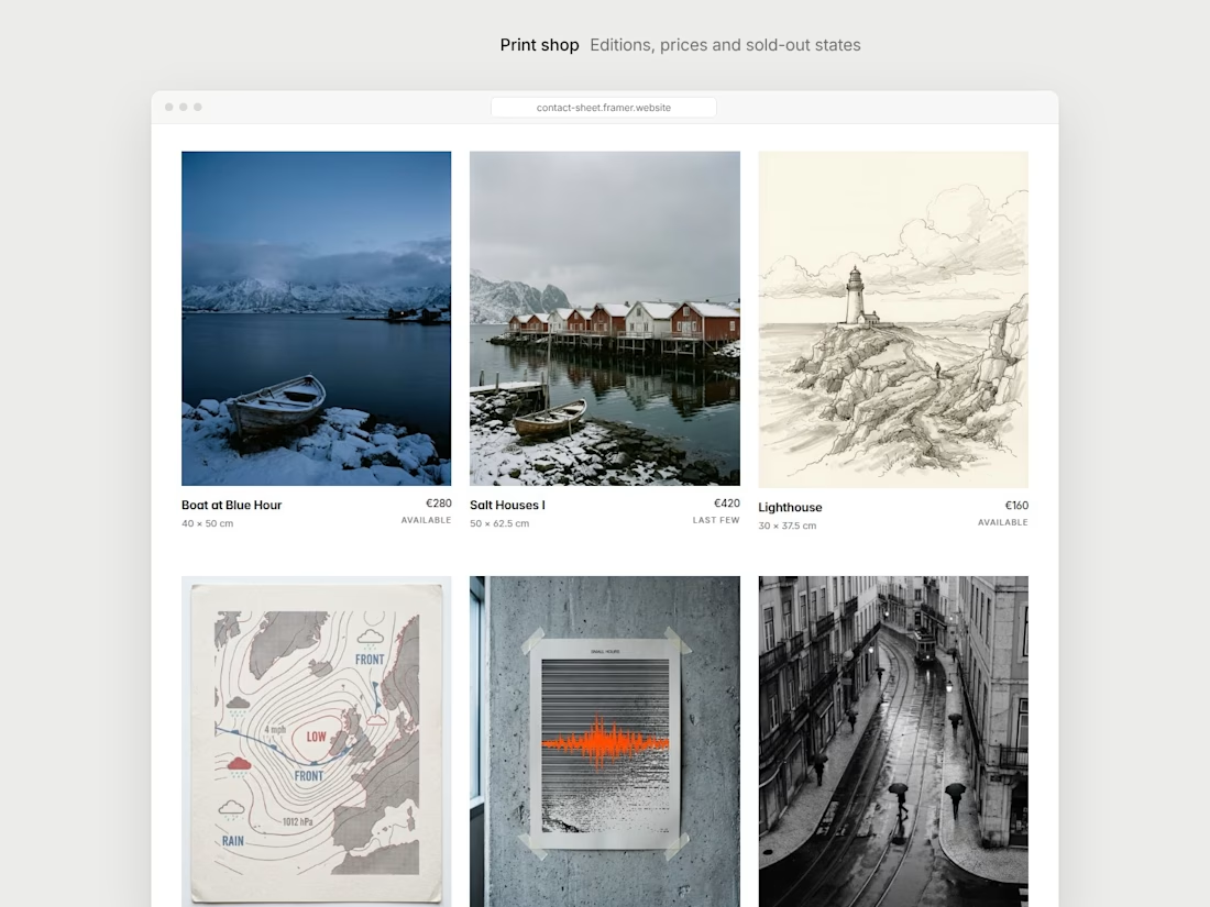
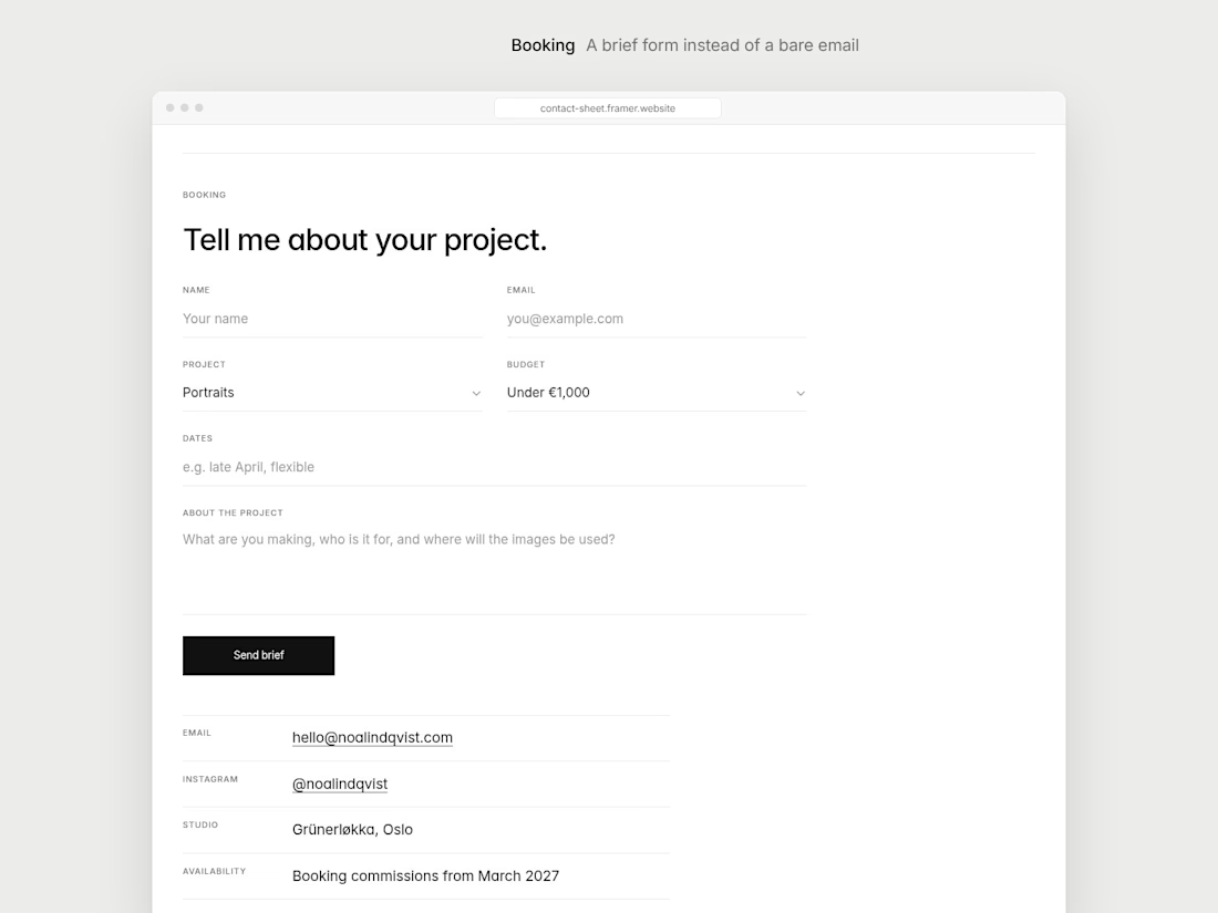
After launch I kept thinking about what photographers actually need from a site beyond a nice grid. So I added three things I haven't seen in other portfolio templates:
Client proofing: a private contact sheet where clients tick the frames they want edited and send their selection.
A print shop with editions, prices and sold-out states.
A booking brief form instead of a bare email address.
There's also a Journal, project galleries with a full-screen lightbox, and a Services page.
Live preview: contact-sheet.framer.website
I would be really glad to hear what you think.
The network for creativity
Join 1.25M professional creatives like you
Connect with clients, get discovered, and run your business 100% commission-free
Creatives on Contra have earned over $150M and we are just getting started



Related posts

Framer agent templates are out, and seven of mine are in 🔥
Plakat, Datum, Halation, Parallel, Tender, Signal and Oda.
An agent template is built for Framer's agent to work on. Every colour and text style has a name that says what it's for, there's a design system page, and skills that tell the agent how the site fits together.
So you can ask for a rebrand, a new section or a whole new page. The agent works with the template's own styles and components and doesn't have to guess.
All agent templates: https://www.framer.com/marketplace/templates/?agent=true
Mine, also in HTML and React: https://no-code.supply/templates


Naming every colour and text style by purpose so the agent knows what it's touching is the part I think most templates will need to catch up on. Congrats on getting seven in at launch, Lauri!


This Framer Page Load is made by me recently. 🚀
The page effect of Framer took shape in just 5 Steps!
i've tried to build this without any components, so I only set up the animations and loadings ⚡️
Check the replies for the rest of the tutorial.

Clean work, love it.

Just launched: Faro, a luxury travel website template for Framer.
Travel agencies and tour operators do not sell with a checkout. They sell with conversation. So Faro is built around one goal: turn visitors into enquiries.
What makes it work
Cinematic flight-window hero that plays your video as visitors scroll
Enquiry-first pages: every button leads to your contact form, with no cart to set up
Tour packages with pricing cards, a comparison table, add-ons and FAQs
Destination and journey pages with itineraries, highlights and quick facts
What's inside
11 pages, including Home, Destinations, Journeys, About, Contact, Thank You, 404 and legal pages
2 CMS collections (Destinations and Signature Journeys) with sample content
Reusable components, color styles and text styles for fast rebranding
Fully responsive, with a mobile menu, Back button and Back To Top button
SEO-ready structure and a built-in documentation page
Design: deep navy, brass gold, Fraunces and Inter. Calm, premium and easy to edit.
Launch price: $39 through November 2026.
Live preview: [https://farotravel.framer.website/ ]
Get Faro on Framer: [https://www.framer.com/marketplace/templates/faro/ ]
I'd love your feedback. If you build with it, tag me so I can see what you make.


The airplane window opening on the hero says travel without a single stock photo, and the gold Start Planning button stays in the nav the whole time. Does that hero animation add noticeable load time on mobile?