The network for creativity
Join 1.25M professional creatives like you
Connect with clients, get discovered, and run your business 100% commission-free
Creatives on Contra have earned over $150M and we are just getting started
Back to feedPost

Aditya here, a visual designer and web developer based in Bali.
When I’m not behind the desk, I love exploring nature and coffee. They’ve become my go-to medicine whenever burnout hits.
Instead of talking about my work, I want to use this #contraquest moment to share something with anyone reading this:
keep a positive mindset, keep doing the good work, and believe in yourself.
Be proud of how far you’ve come, you’ve achieved more than you realize to be at this point!

The network for creativity
Join 1.25M professional creatives like you
Connect with clients, get discovered, and run your business 100% commission-free
Creatives on Contra have earned over $150M and we are just getting started



Related posts


Which homepage would make you more likely to explore the platform?
HackStack features bold typography, teal gradients, and a centered layout focused on AI tools and automation. DataVistaHQ uses purple accents, a split layout, and a prominent dashboard preview to introduce its business intelligence platform.
I would like your perspective on the visual design, clarity, and first impression. Which approach communicates its value more effectively and makes you want to take the next step?
Vote for your preferred design and share what influenced your choice: the colors, headline, layout, dashboard preview, or overall presentation.
#WebDesign #AIWebsites #UIUXDesign #SaaSDesign #TransformedDesign


2 voted
17%

10 voted
83%

12 votes
Closed

Visually, I lean toward DataVistaHQ, but the cognitive load is really high. The value proposition and the stats feel like they're competing for attention.
On the other hand, HackStack has a much better visual hierarchy. The value proposition and CTA group immediately give me a...


Combining 2D & 3D animation has never been easier with AI! My process here: I used the credit card image as the first frame - fed it to Google Flow and gave this EXACT prompt:
“A three-dimensional credit card scaling from zero to full size, twirling logically into its final position to reveal its 3D body and settling calmly, on a transparent background; if not possible, a white background.”
For smaller projects, I give AI the image of a product and sometimes the first and last frame and ask it to generate the motion the way I direct it.
You are still the director! Sound on 🔊


Perfect work!

My husband and I run a small two-person studio, working together on Framer and Webflow projects.
Alongside our individual portfolios, we’re also bringing our shared projects together into case studies. There’s a bit of catching up to do, so we’ll be sharing more of that work here as we go.
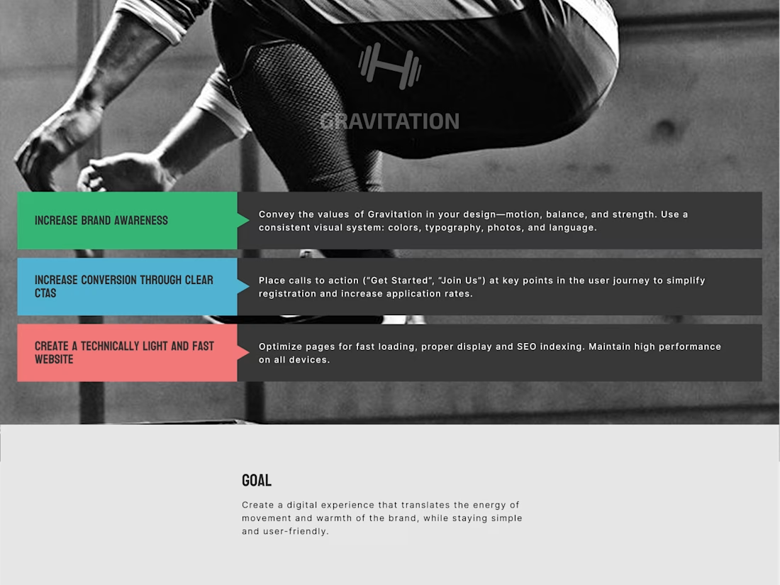
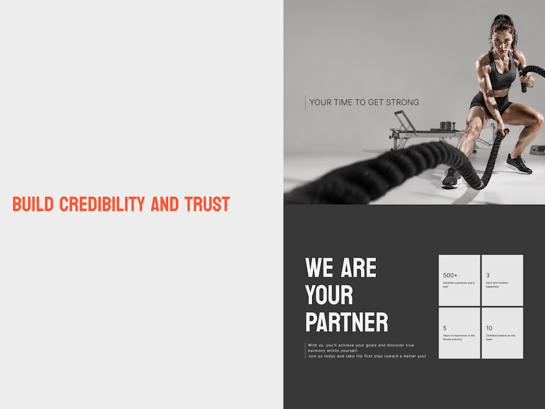
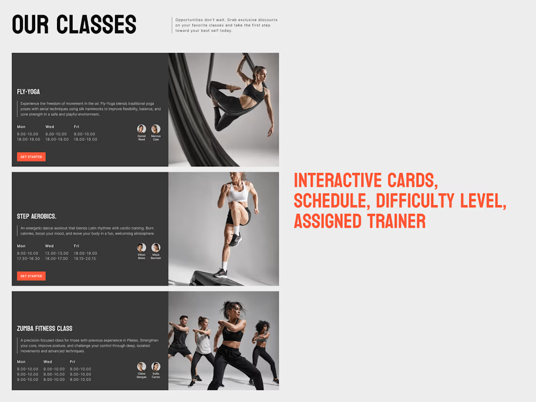
Here’s one of them: Gravitation, a fitness studio website concept.

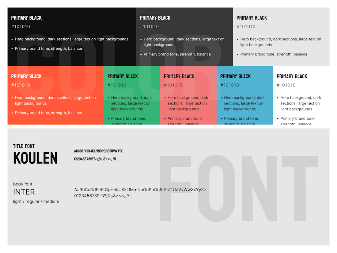
Gravitation — Fitness Studio Website Design
A bold, modern website concept for a fitness studio, designed to communicate energy, movement, and strength while keeping the user experience clear and intuitive.
The project focuses on three key goals:
Brand identity: A distinctive...

Love that you're turning the shared work into proper case studies. Writing them up is the part most small studios never get round to. How do you two split a project: one designs and one builds, or do you both do a bit of everything?