The network for creativity
Join 1.25M professional creatives like you
Connect with clients, get discovered, and run your business 100% commission-free
Creatives on Contra have earned over $150M and we are just getting started
Back to feedPost
Design Gym
This week, I shifted my focus from layouts to product storytelling.
I spent time studying the landing pages of Notion, Granola, Metronome, and Anthropic, looking beyond the visuals to understand how they communicate their products.
One pattern kept appearing.
The hero section did most of the heavy lifting.
It introduced the promise, made it clear who the product was for, and used the product itself to reinforce the message. Instead of trying to explain everything, the interface answered many of the questions I had before I even started reading the rest of the page.
The sections that followed simply built on that promise. Whether it was showcasing the solution, demonstrating how the product empowers users, reinforcing trust through testimonials, or ending with a clear call to action, every section had a purpose.
My biggest takeaway?
You don't need to talk about everything on a landing page.
Decide what's most important to your audience. Make your hero section communicate that promise with clarity, then let the product visuals prove it. The rest of the page should reinforce that promise by showing how your product helps people achieve the outcome they're looking for.
That's what I'll be taking into my next design.

This is so clean!

My observation from their website is priceless 😍
Very true!
The network for creativity
Join 1.25M professional creatives like you
Connect with clients, get discovered, and run your business 100% commission-free
Creatives on Contra have earned over $150M and we are just getting started
Trending
retrofuturism
Share your favorite designs from the past exploring the distant future. Or your own take on the aesthetic 🚀
halftone
Dots. Texture. Grain. Let's see your designs using the halftone technique.

Midjourney
Creatives are showing off what they're making with Midjourney.
colorgrade
Video editors sound off: How do you enhance the mood of your video in color grading?





Related posts

What if a design studio website didn't look like every other agency website?
I wanted this concept to feel less like a portfolio and more like a digital studio with a point of view.
Built around two simple ideas:
DESIGN. BUILD.
The goal was to create an experience that feels confident, editorial, and intentional from the typography and layout to the interactions.
Designed in Figma.
Built in Framer.
Still refining it, but I’m really happy with where it’s going.
What do you think?
#WebDesign #Framer #UIDesign #DesignStudio


Good Work!

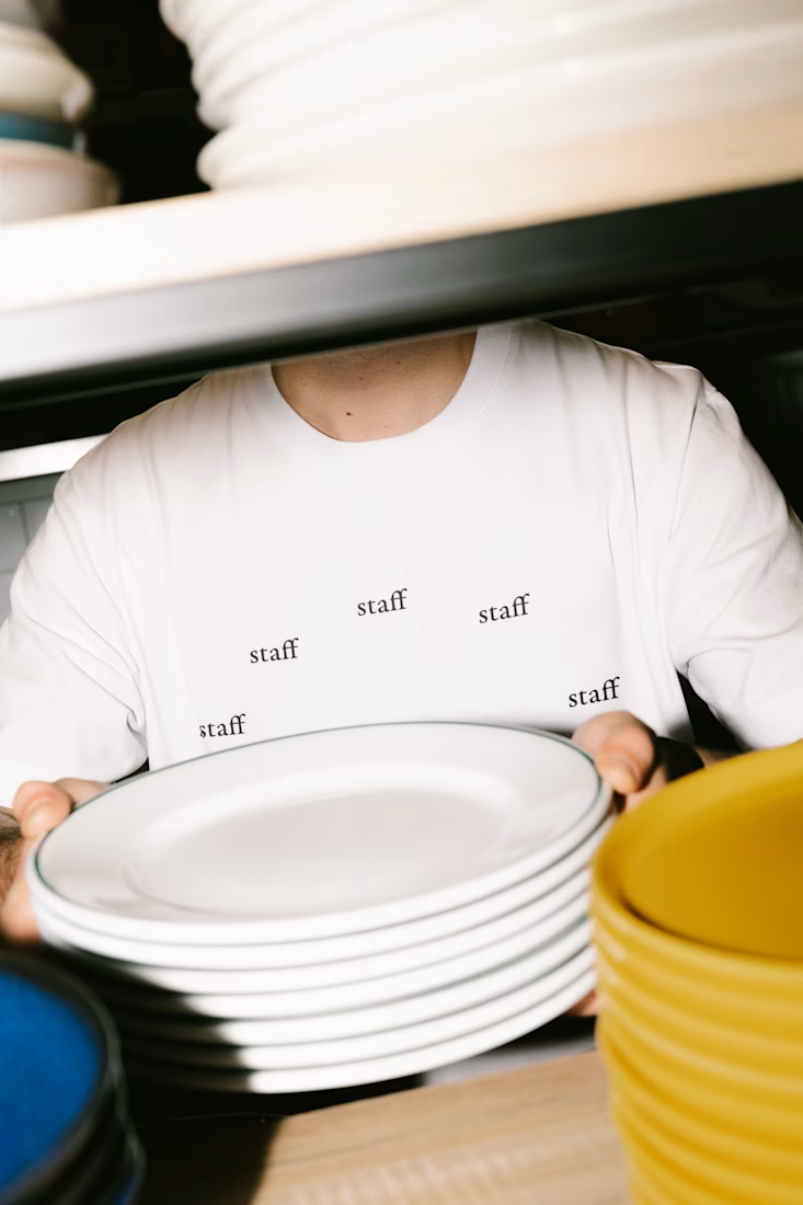
STAFF | Uniform T-Shirt
A uniform built around a single word, repeated. Staff, printed in small, unevenly spaced marks across the shirt. Each one placed at a different angle, mapped loosely to the twelve positions on a clock face.
The idea behind it: hospitality work doesn't run nine to five. It runs in shifts, around the clock, someone always on. Instead of a logo or a shift schedule printed somewhere, the shirt turns that into a pattern. No hands, no numbers, just "staff" standing in for every hour on the dial.
Kept deliberately unbranded: no color, no icon, nothing that reads as merch. Just enough repetition that the word stops being a word and starts reading as a mark you'd recognize across a room.




Nice work!!

Board — Enterprise Planning Platform Website Design (SaaS)
A high-trust, enterprise-grade website designed for Board, an Intelligent Planning platform used by 2,000+ global brands to unify financial and operational planning. The challenge was to communicate serious enterprise credibility while keeping the experience clean, modern, and easy to navigate for finance, supply chain, sales, and ops decision-makers.
The hero leads with a layered dashboard visual to instantly showcase product depth, paired with a bold headline and dual CTA strategy ("Request a Demo" / "Find your Solution") to serve both high-intent and exploratory visitors. A trusted-logo bar featuring recognizable enterprise brands reinforces credibility right above the fold.
Deeper down, the page uses a card-based solutions grid to break complex offerings (Finance, Supply Chain, Sales, Retail, Manufacturing, CPG) into scannable, benefit-led sections — each with its own CTA to keep momentum going. A dark-mode platform section highlights the product's core architecture with a custom circular diagram, while a metrics band (2000+ customers, 92% recommend, 75% reduction in planning time) builds quantifiable trust.
Social proof is layered throughout: enterprise case study quotes from Coca-Cola, DHL, and Toyota, analyst recognition badges (Gartner, IDC), and a global partner network section featuring Microsoft, KPMG, CGI, and EY. A resources/news module keeps the brand positioned as a category thought leader, and the page closes with a strong, focused conversion band driving toward a live product demo.
Every section was structured around one goal: move enterprise buyers confidently from "what is this" to "let's talk to sales" — without ever feeling like a hard sell.
Open to enterprise SaaS and B2B platform projects — let's talk about your next build.

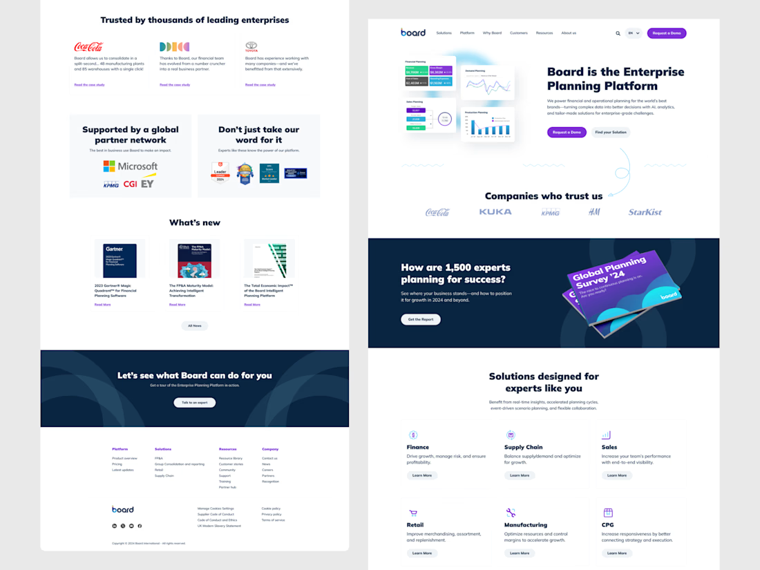

The dual-CTA split — "Request a Demo" for high-intent visitors vs. "Find your Solution" for browsers — respects funnel stage instead of forcing every enterprise buyer into one sales form regardless of readiness.