The network for creativity
Join 1.25M professional creatives like you
Connect with clients, get discovered, and run your business 100% commission-free
Creatives on Contra have earned over $150M and we are just getting started
Back to feedPost
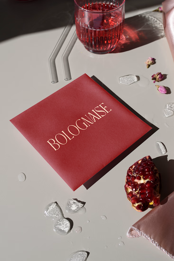
Bolognese.. but make it couture.
I designed the typography and colors for this packaging concept, elevating a simple label into a luxe, editorial-grade moment.
Designing typography for food brands is one of my favorite intersections of storytelling and visual identity.
The goal was simple: Transform a familiar dish into a premium brand experience using typography alone.
To get there, I focused on: Luxury typography with a fashion-inspired serif structure
Subtle editorial influences for a contemporary, minimalist food-brand aesthetic
Packaging-first lettering, optimized for print, embossing, and high-end product presentation
This small detail, the logotype, becomes the emotional anchor of the entire brand system.
The tone shifts instantly from casual to elevated, from everyday to curated.
Really nice!
love this! Super delicate work!
Awww thank you! That's super cute
The network for creativity
Join 1.25M professional creatives like you
Connect with clients, get discovered, and run your business 100% commission-free
Creatives on Contra have earned over $150M and we are just getting started
Trending
Claude
Claude has entered the design space. How are you using Claude Design?
Contra University
Learn from expert creatives how to earn more using next-gen AI tools.
creativeaiflow
Creative AI workflows are evolving. What tools do you use, and what are their strengths and weaknesses?
freelancerlife
Freelancer life is wins, pivots, and everything in between. What’s yours right now?