The network for creativity
Join 1.25M professional creatives like you
Connect with clients, get discovered, and run your business 100% commission-free
Creatives on Contra have earned over $150M and we are just getting started
Back to feedPost

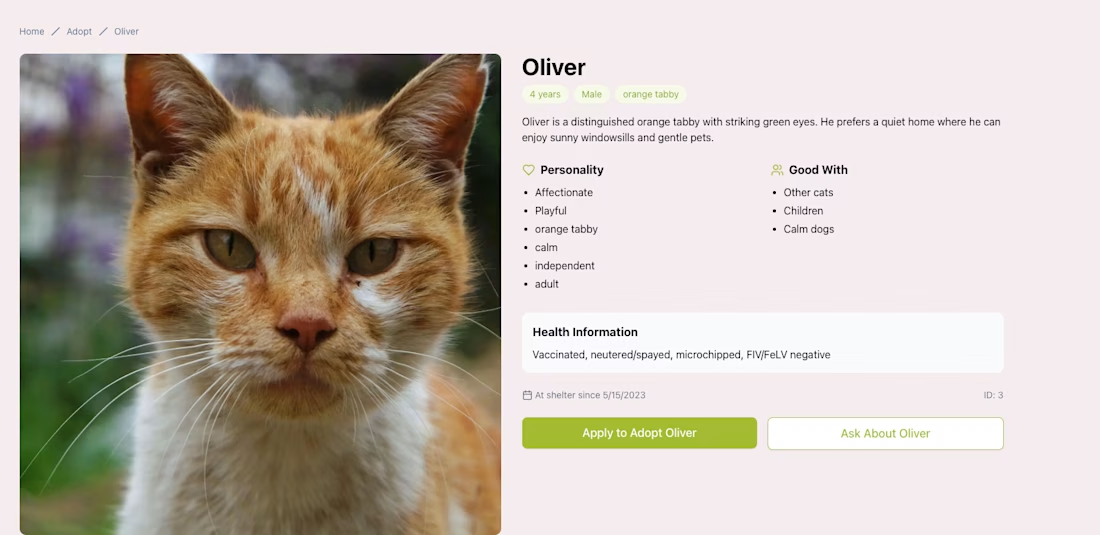
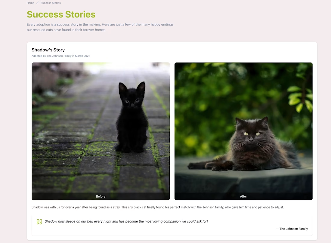
A full-stack mock site with adoption listings, donation forms, success stories, and a contact page — built to help a fictional rescue find homes for cats


The network for creativity
Join 1.25M professional creatives like you
Connect with clients, get discovered, and run your business 100% commission-free
Creatives on Contra have earned over $150M and we are just getting started
Challenges
View all


Related posts

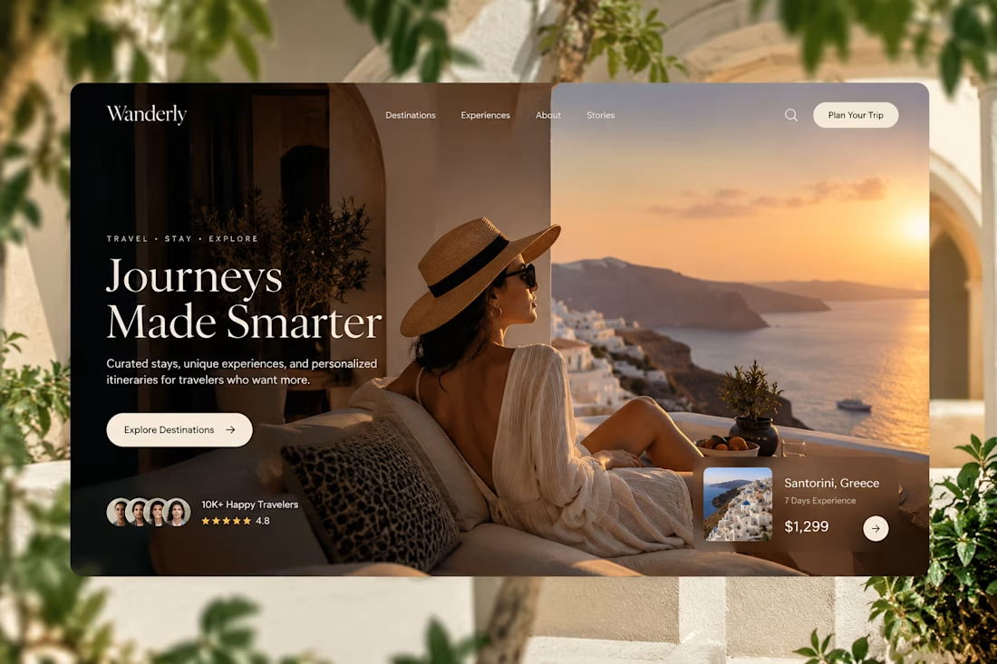
Designed for people who want the journey to feel as good as the destination.
Created a premium travel website concept for Wanderly, combining cinematic imagery with an editorial-style digital experience.
The goal was to make the website feel less like a typical travel booking platform and more like a luxury travel magazine you can interact with.
What I focused on:
• Premium travel brand direction
• Cinematic hero experience
• Editorial typography
• Destination and experience cards
• Strong visual storytelling
• Clear booking-focused CTA
• Social proof and traveler ratings
• Responsive web layout
• Luxury hospitality-inspired UI
The design uses warm neutrals, deep shadows, soft typography, and immersive imagery to create a sense of escape before the user even starts planning the trip.
Designed with a strong Figma + Framer-style approach, focusing on visual hierarchy, interaction, and conversion.
#WebDesign #TravelDesign #Figma #Framer #UIUX #LandingPage #LuxuryTravel #BrandDesign #WebDesignInspiration #Contra



Elegance hero

Designed a modern Healthcare Landing Page.
A calm teal and soft blue interface with elegant serif typography for a warm and trusted first impression.
A quick doctor search, friendly doctor profiles, hand-drawn medical illustrations, and patient reviews make finding care feel simple and human. Clean cards, generous spacing, and a smooth mobile booking section keep the whole page clear and easy to explore.
healthcarewebsitedesignmedicallandingpageProduct DesignUI DesignWeb DesignAdobe After EffectsFigmaJitter


I love this very much

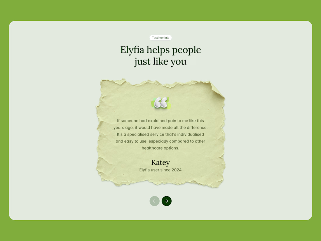
I like this section because it is minimal and clean.