The network for creativity
Join 1.25M professional creatives like you
Connect with clients, get discovered, and run your business 100% commission-free
Creatives on Contra have earned over $150M and we are just getting started
Back to feedPost

A book cover is not just decoration.
It is the first reason someone stops scrolling, clicks, and decides to learn more about your book.
For self-published authors, coaches, educators, and entrepreneurs, the cover often becomes one of the most important marketing assets of the entire project. It has to communicate genre, credibility, emotion, and value in just a few seconds.
On platforms like Amazon KDP, your book is competing against hundreds of other titles in the same niche — and the cover needs to work fast.
A strong book cover should make the reader feel:
→ 📖 “I understand what this book is about”
→ 👀 “This looks professional”
→ 🤝 “I can trust this author”
→ 🎯 “This feels relevant to me”
→ 🛒 “I want to click and learn more”
When I design a book cover, I focus on more than making it look good.
I work on:
→ Clear visual hierarchy
→ Strong title readability
→ Genre-appropriate style
→ Professional typography
→ Author credibility
→ Marketplace impact
→ Thumbnail visibility
→ Print and digital consistency
Whether it is a nonfiction guide, wellness book, business book, journal, workbook, or self-help title, the cover needs to position the book clearly and make it feel ready for a professional publishing space.
A good cover can make a book feel more valuable before a single page is read.
I help authors and brands create book covers that look professional, communicate fast, and support stronger visibility on Amazon KDP and other publishing platforms.
Need a book cover that makes your title feel ready to publish?
Let’s create a design that gives your book the first impression it deserves. 📚✨

The network for creativity
Join 1.25M professional creatives like you
Connect with clients, get discovered, and run your business 100% commission-free
Creatives on Contra have earned over $150M and we are just getting started











Related posts

Designed and developed a sophisticated Framer website for Ellery Kowal, a Chicago-based business law firm serving clients across corporate law, litigation, employment, investigations, real estate, intellectual property, and M&A.
The objective was to move away from the traditional corporate law-firm website and create a digital experience that feels established, credible, and contemporary while answering the practical questions prospective clients care about most: Who will handle my matter? What does it cost? What experience does the firm have? And what happens next?
A major focus was practice-area presentation. Rather than simply listing legal services, the website provides dedicated practice information with fee models, starting fees, responsible partners, and relevant matters. This gives potential clients a much clearer understanding of both the firm's expertise and how engagements are structured.
The People experience adds another important layer of trust. Visitors can explore the firm's partners and lawyers and understand who could potentially lead their matter. This human-centered approach helps make a traditionally formal legal service feel more accessible while reinforcing the firm's expertise.
The website also incorporates a Matters section that functions as a results-focused case and deal archive. Instead of relying solely on generic claims about experience, the firm can demonstrate its capabilities through previous matters and outcomes, giving prospective clients tangible evidence of its expertise.
Another standout feature is the conflict-check experience. Rather than burying an important legal intake process inside a generic contact form, the website provides a dedicated form where prospective clients can communicate the matter type, involved parties, urgency, and required disclaimer information. This creates a more purposeful first step toward engaging the firm.
The website also presents fixed-fee options, client testimonials, FAQs, and insight articles, giving visitors additional information before making contact. These elements work together to reduce uncertainty around legal services and reinforce transparency, expertise, and credibility.
From a UI/UX perspective, the visual direction intentionally avoids the overly dark, generic aesthetic often associated with law firms. A refined editorial design system combines serif and sans-serif typography, warm neutral backgrounds, restrained bronze accents, structured panels, professional photography, and subtle interactions to create an authoritative but approachable experience.
The content architecture was also designed for scalability, with structured collections for lawyers, partners, matters, practices, FAQs, fixed fees, client testimonials, and articles. This allows the website to grow without sacrificing consistency or requiring individual pages to be rebuilt from scratch.
The result is a polished, professional Framer legal website that combines legal service presentation, attorney profiles, case results, fee transparency, client proof, content marketing, and conversion-focused intake into a digital experience designed to earn trust before the first conversation.
Key Focus Areas:
• Framer Law Firm Website Design
• Legal & Professional Services Website
• Business Law Website Design
• Legal UI/UX Design
• Practice Area Architecture
• Attorney & Partner Profile Design
• Case & Matter Presentation
• Fixed-Fee Service Presentation
• Conflict Check & Client Intake
• Testimonials & Social Proof
• Legal Insights & CMS Content
• Responsive Web Design
• Conversion-Focused User Experience
• Professional Brand Storytelling
• Framer CMS & Dynamic Content


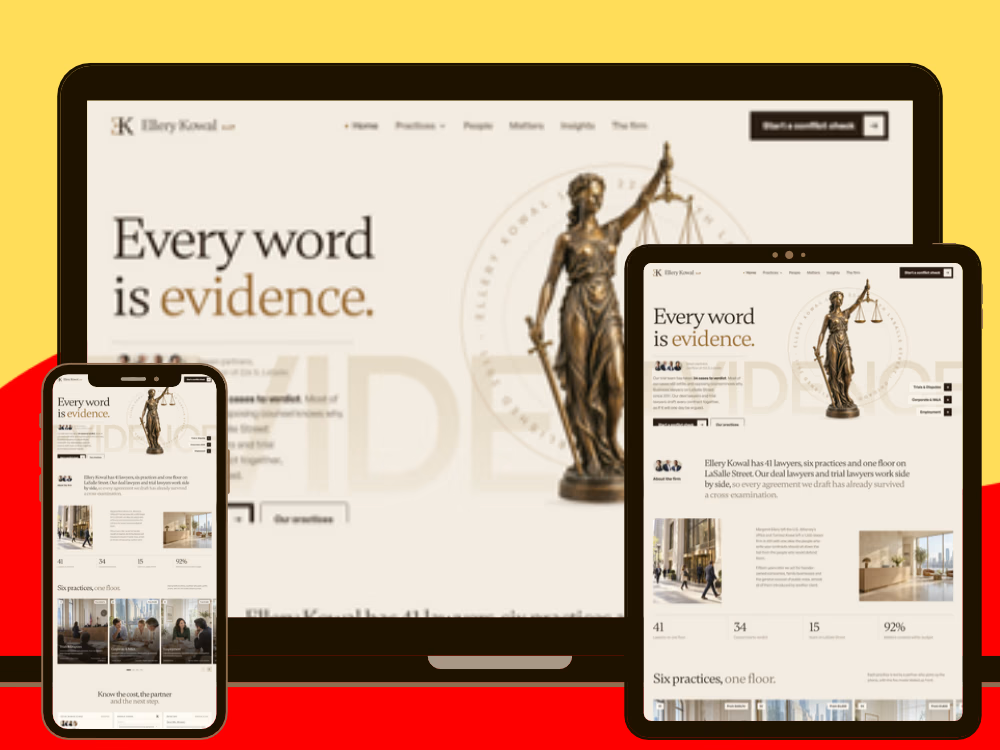


law firm sites dont have to look like 2009 and this proves it

𝗗𝗮𝘆 𝟭𝟰 𝗼𝗳 𝟯𝟬𝗱𝗮𝘆𝘀
𝗛𝗼𝘄 𝘁𝗼 𝗖𝗿𝗲𝗮𝘁𝗲 𝗛𝗶𝗴𝗵-𝗖𝗼𝗻𝘃𝗲𝗿𝘁𝗶𝗻𝗴 𝗟𝗮𝗻𝗱𝗶𝗻𝗴 𝗣𝗮𝗴𝗲 𝗖𝗼𝗽𝘆 & 𝗩𝗶𝘀𝘂𝗮𝗹 𝗦𝘁𝗿𝘂𝗰𝘁𝘂𝗿𝗲
Design without strategy is just decoration. To build a landing page that converts at 8%+:
1. 𝗛𝗲𝗿𝗼 𝗦𝗲𝗰𝘁𝗶𝗼𝗻: State what you do in 5 seconds + 1 primary CTA.
2. 𝗦𝗼𝗰𝗶𝗮𝗹 𝗣𝗿𝗼𝗼𝗳: Logos & customer ratings directly below the fold.
3. 𝗣𝗿𝗼𝗯𝗹𝗲𝗺/𝗦𝗼𝗹𝘂𝘁𝗶𝗼𝗻: Contrast the user's pain point against your outcome.
4. 𝗙𝗲𝗮𝘁𝘂𝗿𝗲 𝗖𝗮𝗿𝗱𝘀: 3 core benefits with high scannability.
5. 𝗥𝗶𝘀𝗸 𝗥𝗲𝘃𝗲𝗿𝘀𝗮𝗹: FAQs & money-back guarantees.


Love this conversion strategist


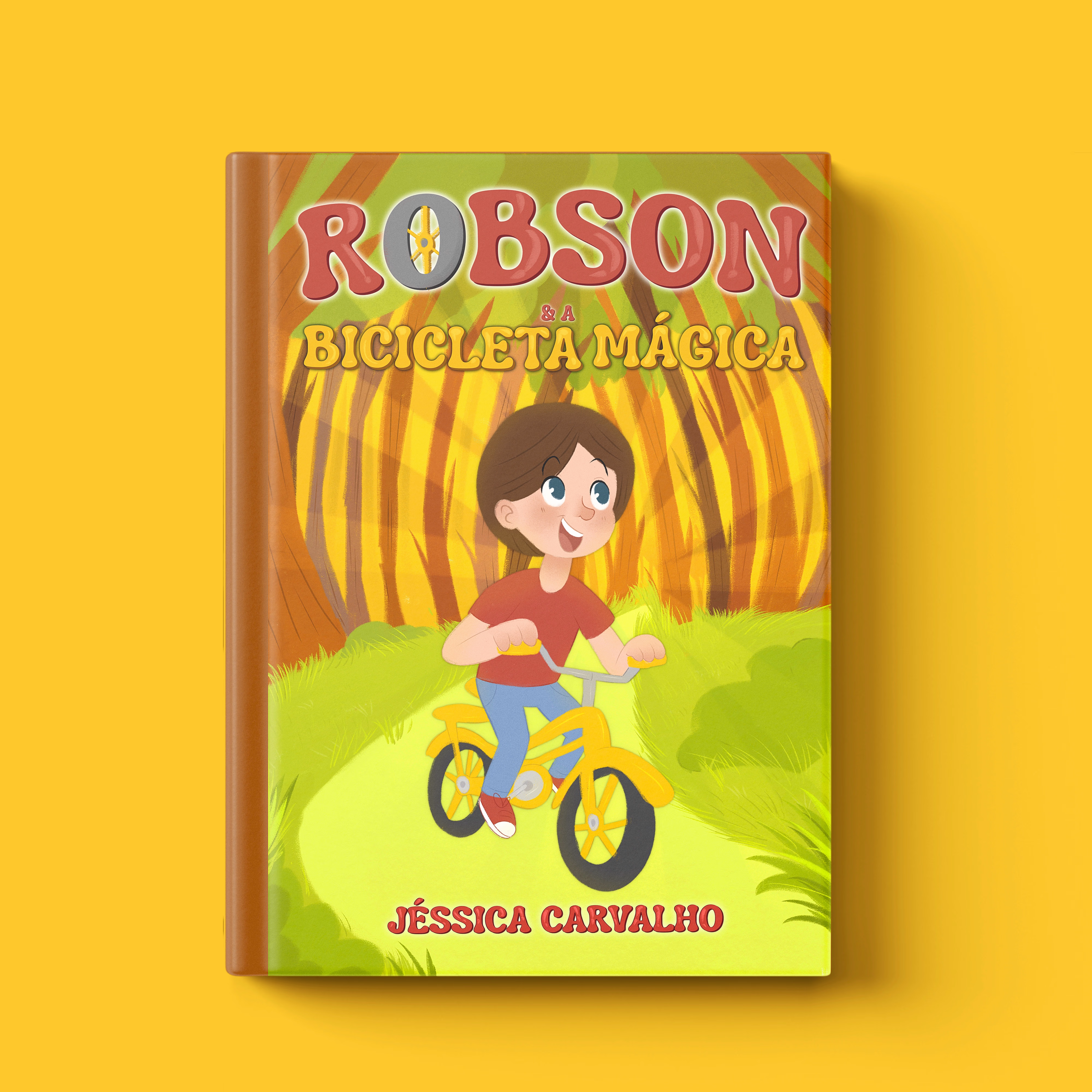
kids book covers are so hard to get right and this one just works