The network for creativity
Join 1.25M professional creatives like you
Connect with clients, get discovered, and run your business 100% commission-free
Creatives on Contra have earned over $150M and we are just getting started
Back to feedPost

A brand isn't what you say. It's what survives getting repeated.
Someone sees your work, likes it, then tries to describe you to a friend three days later. Whatever comes out of their mouth — that's your brand. Not the deck. Not the guidelines.
Most of the time what comes out is: "there's this candle place, it's like, minimal? I think it's on Instagram."
That's a brand that didn't survive the trip.
Three things I look for.
One thing that's easy to say.
Not a tagline. A fact. "They make the bread in-house." "Everything is one price." "The founder answers the DMs." Short enough to survive being half-remembered.
One thing that's easy to picture.
A colour, a shape, a format someone can hold in their head. If the identity only works assembled at full size, it won't travel. Most things get seen cropped, compressed, small.
One reason to bring it up at all.
People don't repeat brands. They repeat things that make them look like they know something. Give them that and they'll carry it for you.
The third one is almost always what's missing. Plenty of brands are perfectly nice and give nobody a reason to mention them.
Pretty gets you saved. Sayable gets you spread.
The network for creativity
Join 1.25M professional creatives like you
Connect with clients, get discovered, and run your business 100% commission-free
Creatives on Contra have earned over $150M and we are just getting started


Related posts

If a logo had to tell what a brand does, Apple would be a fruit stand.
New on our blog: why comparing "logo + guidelines" with a branding process is comparing two different products, how to tell whether you need a new logo or a new brand, and why sometimes the professional move is to turn the work down.
A logo is the signature. The story is everything else. Read it here: https://ander.agency/blog-posts/branding-is-not-a-logo

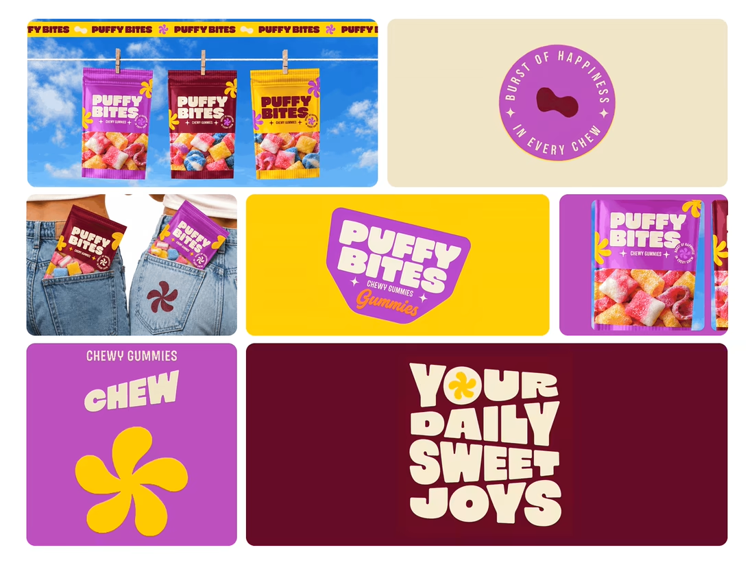
What makes a candy brand recognizable across every pack?
For Puffy Bites, I built the identity around rounded lettering, expressive symbols, and a palette of burgundy, purple, yellow, and cream.
The same visual language carries through pouch packaging, smaller wrappers, campaign imagery, and an animated brand showcase.
One design decision that ties it together: the packaging color changes, while the logo placement, product descriptor, and supporting graphics maintain a consistent structure.
I handled the full client project, from logo and visual identity to packaging and campaign applications.
Which colorway would catch your eye first—purple, burgundy, or yellow?
Explore the full Puffy Bites case study. If you’re developing a candy or snack brand, I’m available for branding and packaging projects.

Love it,
Great work

Most rebrands start with a mood board. This one started with a punctuation mark.
For we make the slash in the name became the logo, the monogram, the layout tool and even the campaign line: "we make you grow."
When one small idea can carry a whole brand, every new touchpoint designs itself.
Founders does your name have a hidden idea like this?

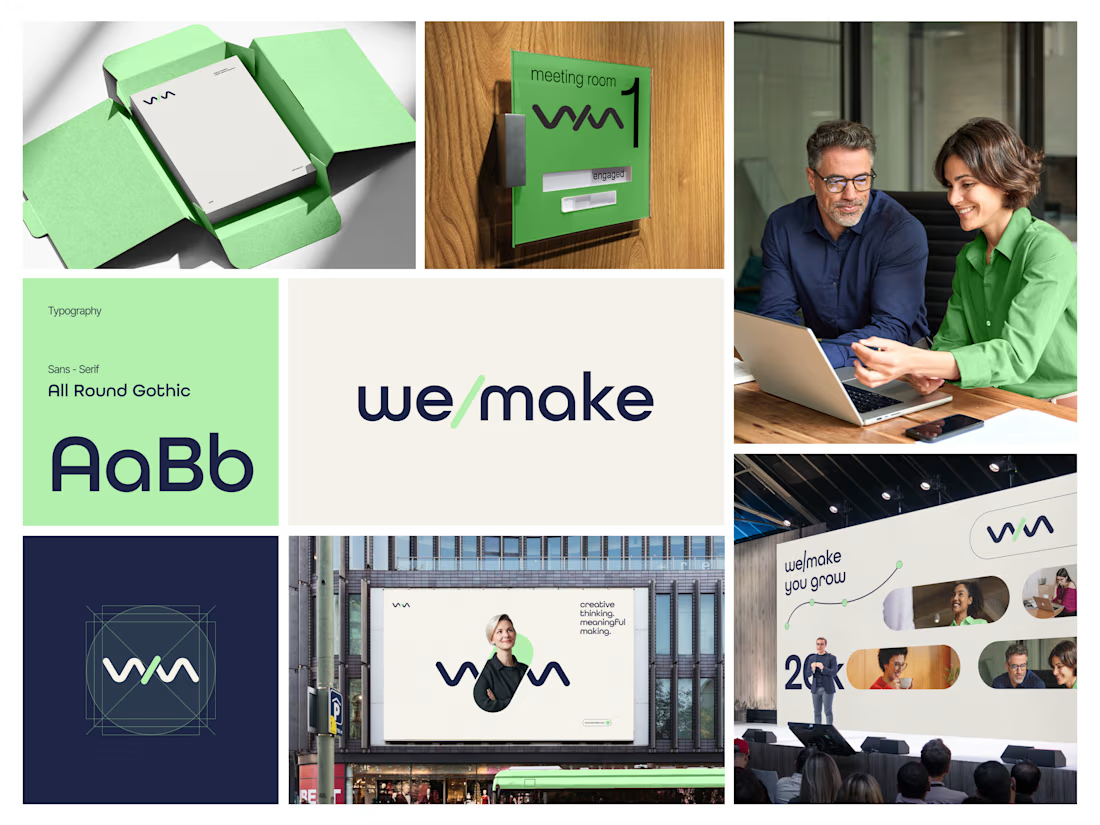

Turning the slash into the logo, monogram and layout device is such a smart move, and it feels wonderfully consistent across the mint-green packaging, signage and stage visuals. The rounded geometric type pairs beautifully with that fresh green and deep navy. Did the slash idea...