The network for creativity
Join 1.25M professional creatives like you
Connect with clients, get discovered, and run your business 100% commission-free
Creatives on Contra have earned over $150M and we are just getting started
Back to feedPost

So, this one hits close to home.
When FADER came to me, their visual identity was feeling a bit stuck in the past, definitely not matching the energy of the elite athletes they support. They needed a total fresh start, so I jumped right in.
I stripped down the shield, kept the provincial colors, and added a sleek running track with a dynamic figure in motion. My favorite detail? A subtle Gestalt tweak on the "A" in the logo that mimics a runner’s stride.
Plus, the whole system is super flexible; the main emblem, the standalone logotype, and the icon all work seamlessly on their own.
Seeing top athletes wear this design on the national stage is just unmatched.
Loved working on this one 😄 let me know what you guys think!
The network for creativity
Join 1.25M professional creatives like you
Connect with clients, get discovered, and run your business 100% commission-free
Creatives on Contra have earned over $150M and we are just getting started











Related posts

Every AI product apologizes for the wait. I designed the wait instead.
Latency: identity, interactive site and campaign built on Ma, the space that gives a thing its shape. The headline breathes in weight until the answer lands.
Design the pause.


Man, you’re superhuman; your consistency and quality are out of this world... congratulations on your work.

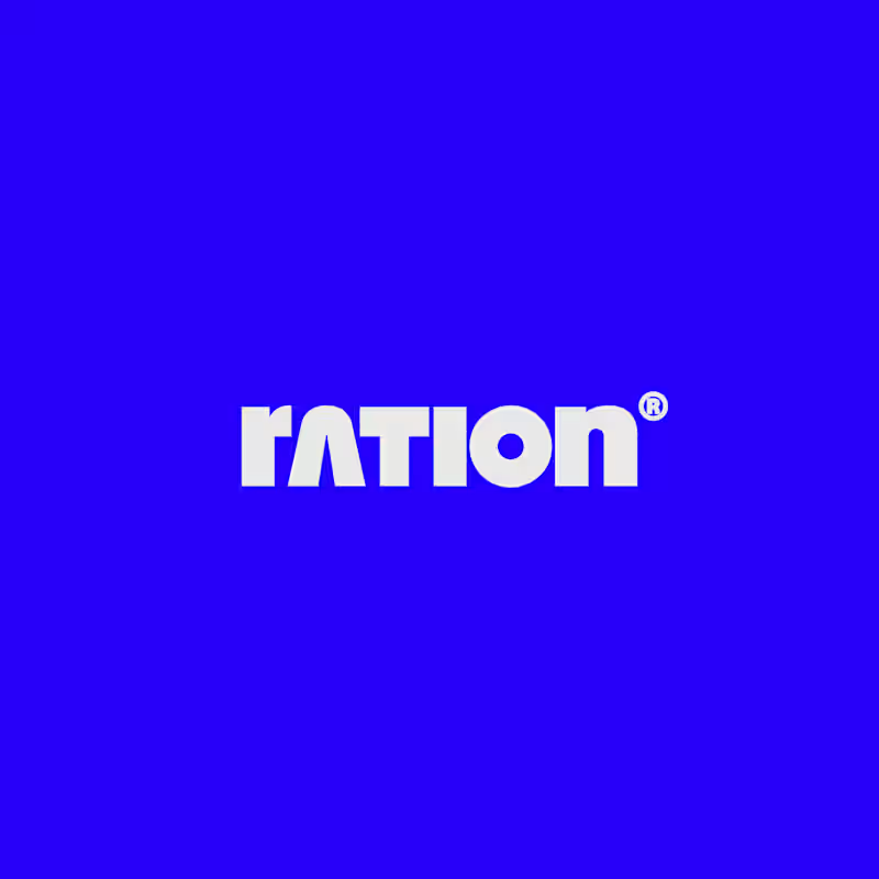
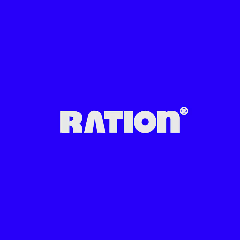
I’ve been working on a bold, modern-retro logotype and can’t decide between these two options.
🆘 Which one feels more aesthetically pleasing to you?

11 voted
26%
31 voted
74%
42 votes
Closed

CAPITAL is great but SMALL is unique great job Nawras 🔥🔥


A little excerpt from the brand guidelines for a recent project


The APS mark built from the four small symbols reads like a map legend, which suits a psychology service. Nice that the guidelines page shows it on the dark teal, most would have played it safe on white.