The network for creativity
Join 1.25M professional creatives like you
Connect with clients, get discovered, and run your business 100% commission-free
Creatives on Contra have earned over $150M and we are just getting started
Back to feedPost

I led creative strategy for Papa Johns’ 2024 relaunch of Papa Bowls, repositioning the product through the “New Year, New Meal” campaign.
Partnering with creators Kate Norkeliunas and Kate Steinberg, we developed authentic, lifestyle-driven content that framed Papa Bowls as a flavorful, guilt-free alternative to pizza that’s indulgent yet balanced.
The campaign bridged community and culture, connecting health-conscious audiences with Papa Johns’ signature sense of fun and flavor, driving renewed visibility and engagement across social platforms.


The network for creativity
Join 1.25M professional creatives like you
Connect with clients, get discovered, and run your business 100% commission-free
Creatives on Contra have earned over $150M and we are just getting started











Related posts

Building a Modern Restaurant Management Dashboard with Lovable (Light ☀️ vs. Dark 🌙)
I’ve been working on the dashboard interface for ReserveTable (Eat Pro Japan), focusing on giving restaurant managers and users a clean, modern, and intuitive interface to manage bookings, tables, and analytics.
Using Lovable, I was able to rapidly prototype and construct a modern UI system complete with smooth component transitions and native theme switching.
✨ Key Design & Tech Highlights:
⚡ Built with Lovable: Leveraged AI-powered design-to-code workflows to assemble clean component hierarchies, responsive search/filter bars, and sleek cards rapidly.
🌗 Seamless Light & Dark Mode: Designed a flexible color system using modern CSS variables / Tailwind tokens so the entire interface gracefully shifts between an elegant light aesthetic and a moody, dark dining ambience.
🎯 Contextual UI Elements: Styled input controls, select menus, and primary CTA buttons to maintain legibility and contrast across both light and dark themes.


For reservation and table states, the same semantic color tokens need to stay clear in light and dark mode. Did you define status tokens once and map both themes to them, or tune those colors per component?

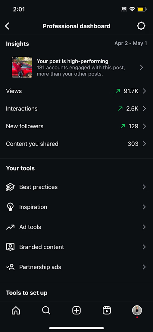
Results | BossGang Tre
A look at the results of a revised marketing strategy and engagement approach. The analytics highlight how refining the content and its connection with the audience translated into measurable account growth and performance.


Elova: A Clean, Conversion-Focused Ecommerce Website for a Healthy Snacking Brand


