The network for creativity
Join 1.25M professional creatives like you
Connect with clients, get discovered, and run your business 100% commission-free
Creatives on Contra have earned over $150M and we are just getting started
Back to feedPost

Day 1 of learning something new about design.
-ve 25% Rule, Leave atleast 25% space empty in your design to make it look more visually appealing.

The network for creativity
Join 1.25M professional creatives like you
Connect with clients, get discovered, and run your business 100% commission-free
Creatives on Contra have earned over $150M and we are just getting started



Related posts


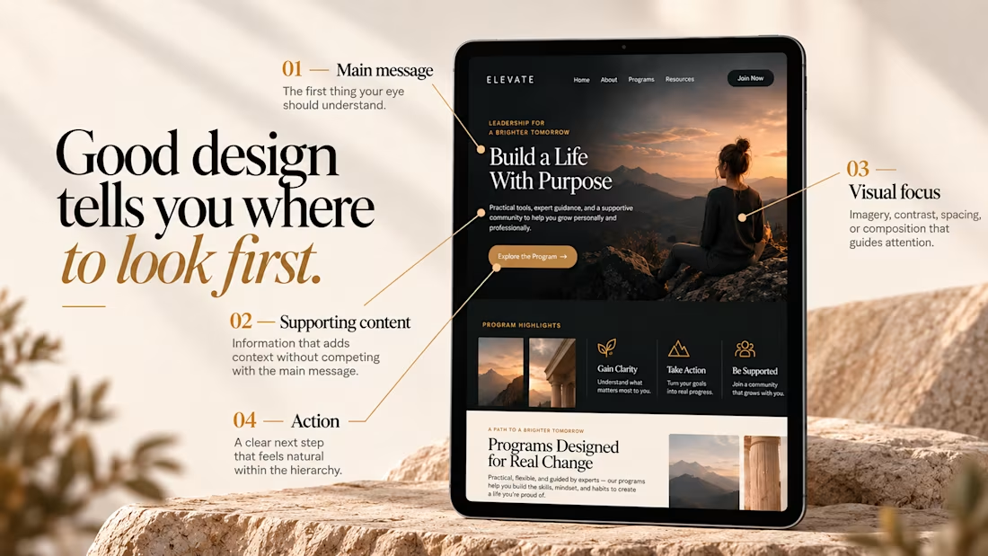
Good design tells you where to look first.
Visual hierarchy isn’t just about making some elements bigger than others.
It’s about creating a clear path through the design — so the viewer knows what matters, what comes next, and where to take action.
01 – Main message
The first thing your eye should understand.
02 – Supporting content
Information that adds context without competing with the main message.
03 – Visual focus
Imagery, contrast, spacing, or composition that guides attention.
04 – Action
A clear next step that feels natural within the hierarchy.
When everything is competing for attention, nothing feels important.
Good design creates focus, flow, and intention.

Like a lot of designers, I find my portfolio one of the hardest projects. There's no deadline, and it can always get better. Anyway, I think I'm happy with this one for a while.
Take a look:
davidguba.com


portfolio looks sharp

09 XL — From a Portrait to a Visual Story.
This one started with a simple black-and-white portrait, but I wanted to give it a little more personality. I began experimenting with contrast, grain, and shadows to build a raw, almost cinematic atmosphere.
Then came the fun part — playing around with typography, adding the black strip across the eyes, and using minimal details like 09 and XL to give the composition a subtle editorial feel.
Once the poster came together, I placed it in a real-world bus stop mockup to see how it would live outside the screen.
A little experimentation, a few happy accidents, and lots of tiny adjustments later — this was the result.


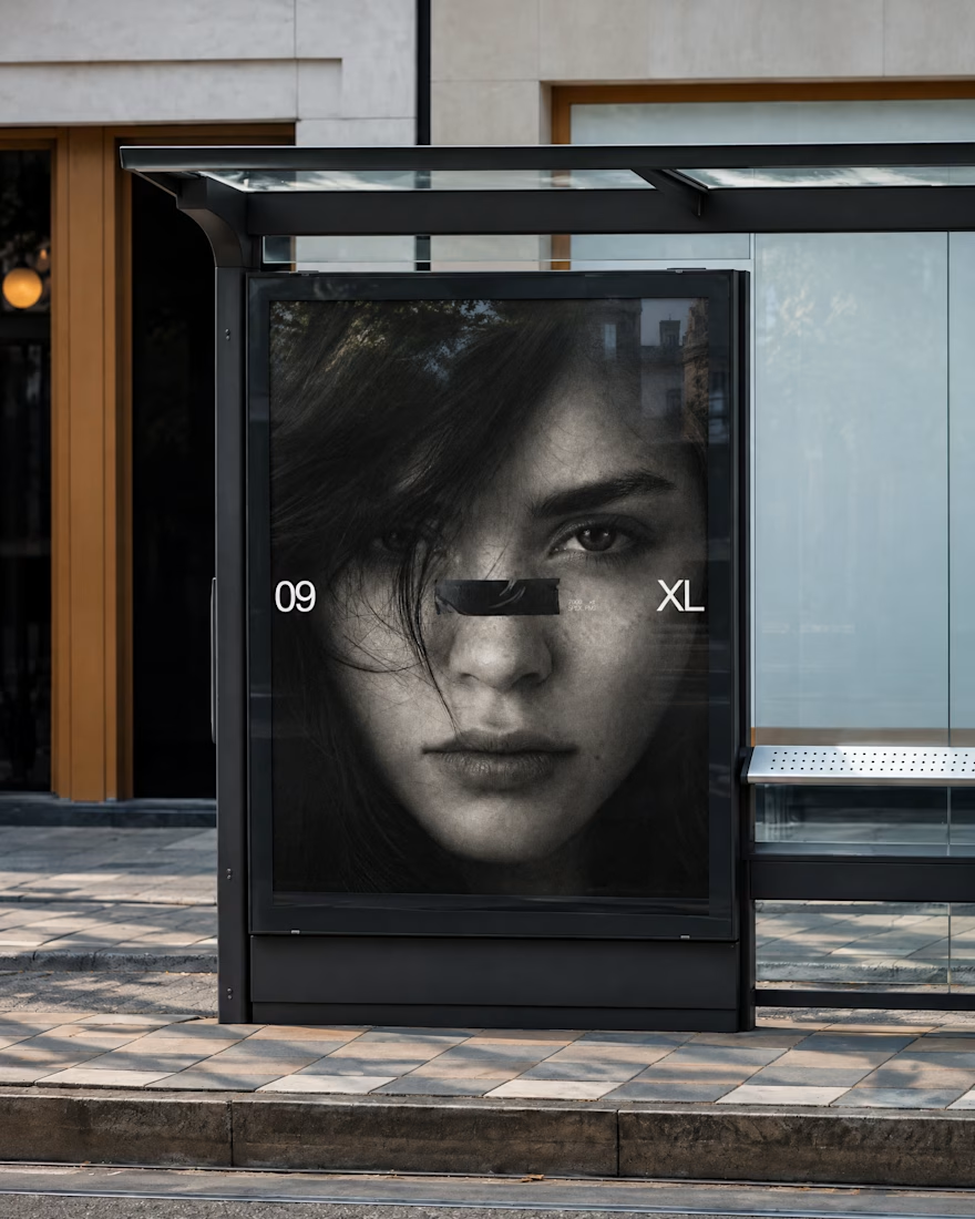
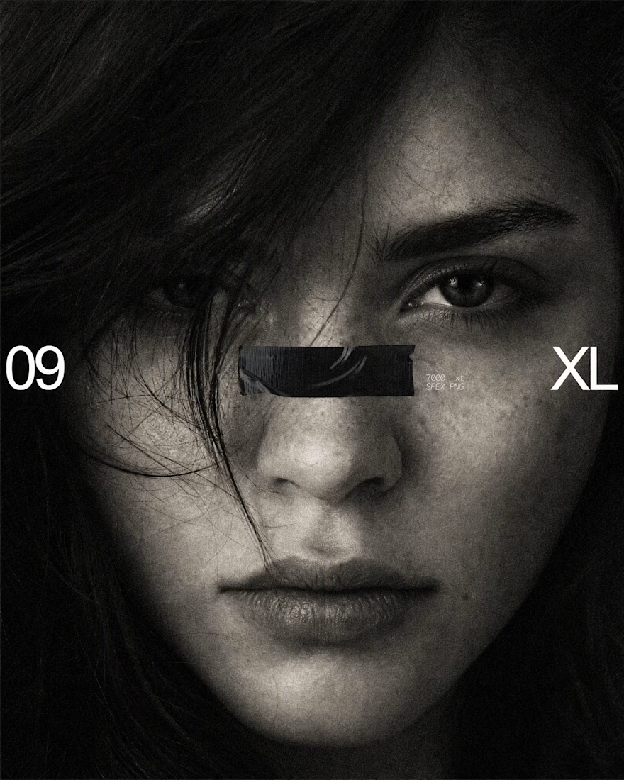

The black bar across the eyes with 09 and XL on the sides turns a simple portrait into a bold poster, and the bus stop mockup shows it works at street scale. Is the grain added in Photoshop or part of the original photo?