The network for creativity
Join 1.25M professional creatives like you
Connect with clients, get discovered, and run your business 100% commission-free
Creatives on Contra have earned over $150M and we are just getting started
Back to feedPost

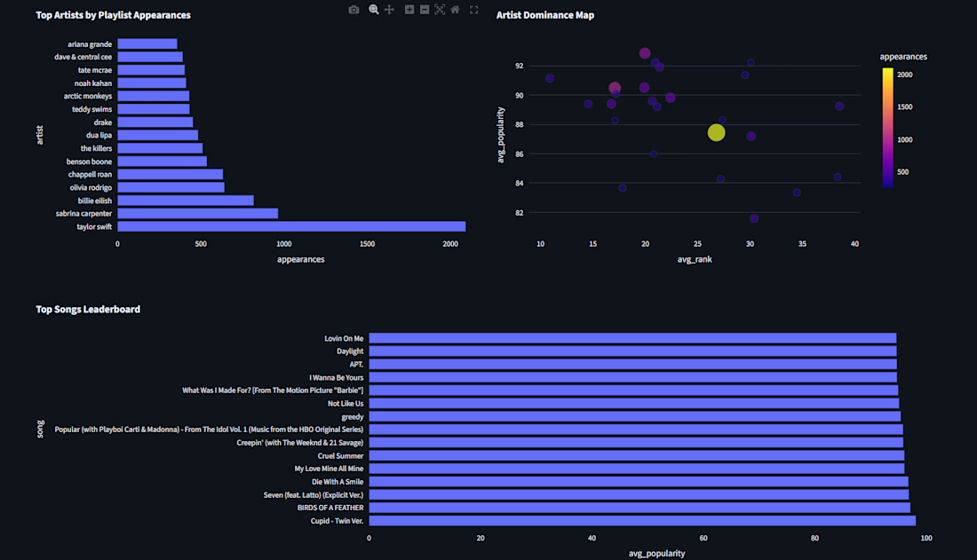
I built an interactive UK Playlist Intelligence Dashboard that transforms Spotify UK Top 50 playlist data into practical insights for artists, labels, and music marketing teams. The dashboard explores artist appearances, track popularity, collaborations, albums, explicit-content trends, and song-duration patterns to help users understand what performs well in the UK playlist ecosystem.
Users can filter the dataset by artist, album, date, popularity, and content type, then explore KPI summaries and interactive visualizations. The project also includes downloadable filtered CSV data and business-focused insights to support playlist strategy, release planning, and promotional decisions.
Technologies used: Python, Streamlit, Pandas, NumPy, Plotly, Matplotlib, Seaborn, NetworkX, Jupyter Notebook, and CSV data analysis.


The network for creativity
Join 1.25M professional creatives like you
Connect with clients, get discovered, and run your business 100% commission-free
Creatives on Contra have earned over $150M and we are just getting started





Related posts


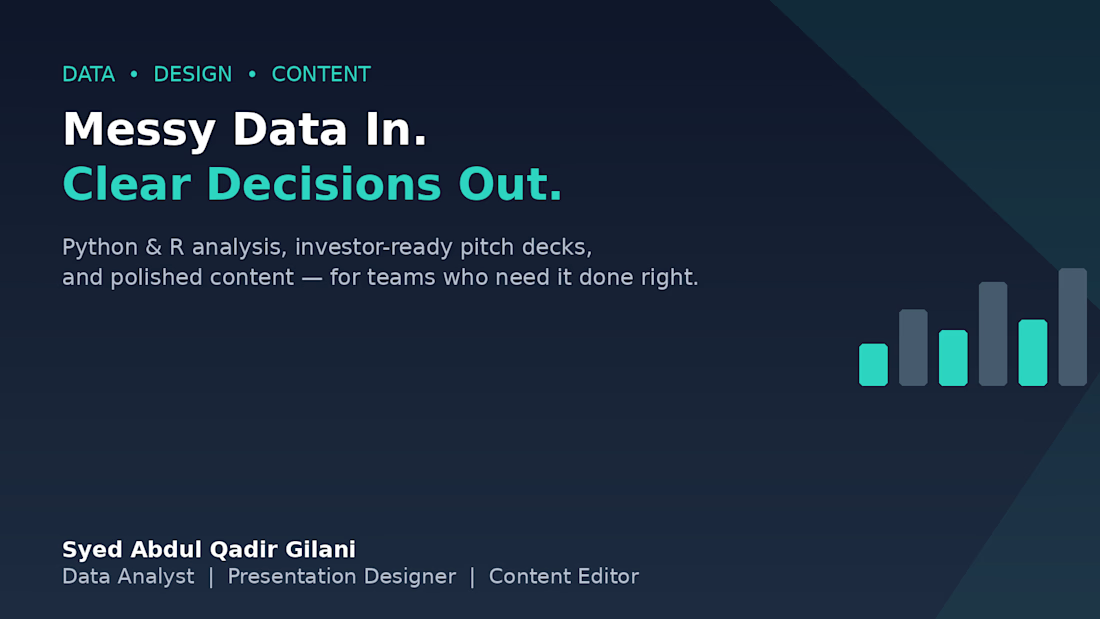
Messy Data In. Clearer Decisions Out. 📊
Over the past year, I've noticed most businesses don't struggle because they lack data — they struggle because that data never turns into a decision.
That's the gap I work in:
→ Cleaning and analyze data with Python & R
→ Turning findings into investor-ready pitch decks
→ Polishing the final write-up so nothing gets lost in translation
If your team has data sitting in spreadsheets with no story attached, or a pitch deck that needs to actually land — that's exactly where I can help.
Open to projects. Let's talk 👇


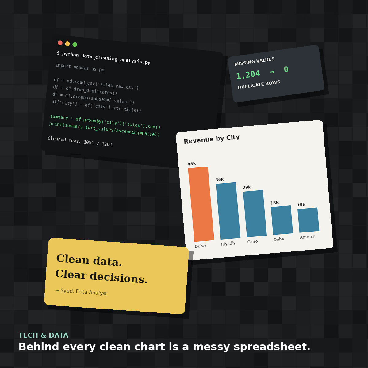
Behind every clean chart is a messy spreadsheet 🧹
This is what a real data cleaning job looks like before it becomes an elegant bar chart — duplicate rows, missing values, inconsistent formatting, all sorted out with Python and Pandas.
#collage attempt: a look inside the data analyst's actual desk, not just the pretty output.

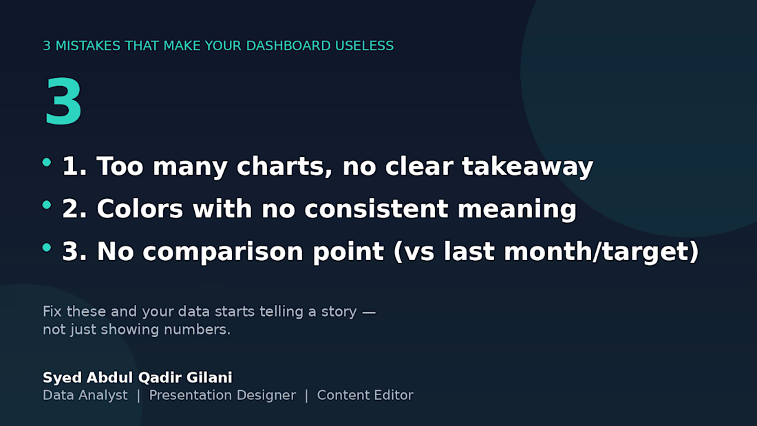
3 mistakes that will eventually make this board useless. 📉
I've reviewed several client dashboards over the years, and the same 3 problems show up over and over:
1️⃣ Too many charts, no clear takeaway — if I can't tell what to do after looking at it, it's decoration, not a dashboard.
2️⃣ Colors with no consistent meaning — red means "unacceptable" on one chart and "category 3" on the next. Pick a system and stick with it.
3️⃣ No comparison point — a number alone means nothing. "Revenue: $12,480" tells you nothing. "Revenue: $12,480 (+18% vs last month)" tells you everything.
Fix these three, and your data stops being numbers on a page — it starts being something people actually use to decide.
What's the most common dashboard mistake you've seen? 👇