The network for creativity
Join 1.25M professional creatives like you
Connect with clients, get discovered, and run your business 100% commission-free
Creatives on Contra have earned over $150M and we are just getting started
Back to feedPost


One of the most underrated decisions in presentation design is deciding what NOT to put on a slide.
It's easy to add another chart.
Another statistic.
Another paragraph.
Another visual element.
But knowing when to stop requires a different level of thinking.
Sometimes, a slide contains three important ideas when the audience only needs to understand one.
Sometimes, a detailed chart is hiding a simple but powerful insight.
And that's where restraint becomes a design skill.
I've come to appreciate that good presentation design isn't always about finding something else to add.
It's about recognizing what deserves attention and giving it enough space to matter.
A slide doesn't become more valuable because it contains more information. It becomes valuable when it makes the right information impossible to overlook.
Sometimes, the best design decision is the element you had the discipline to leave out.
#PresentationDesign #PitchDeckDesign #CreativeDirection #VisualCommunication #
The network for creativity
Join 1.25M professional creatives like you
Connect with clients, get discovered, and run your business 100% commission-free
Creatives on Contra have earned over $150M and we are just getting started



Related posts

What do you do with a brand that’s 80% done and nobody asked for it?
I have a whole folder of them.
A name here, a palette there, a few campaigns that never saw daylight.
One of them finally got the full treatment. The Iridia case study drops soon.
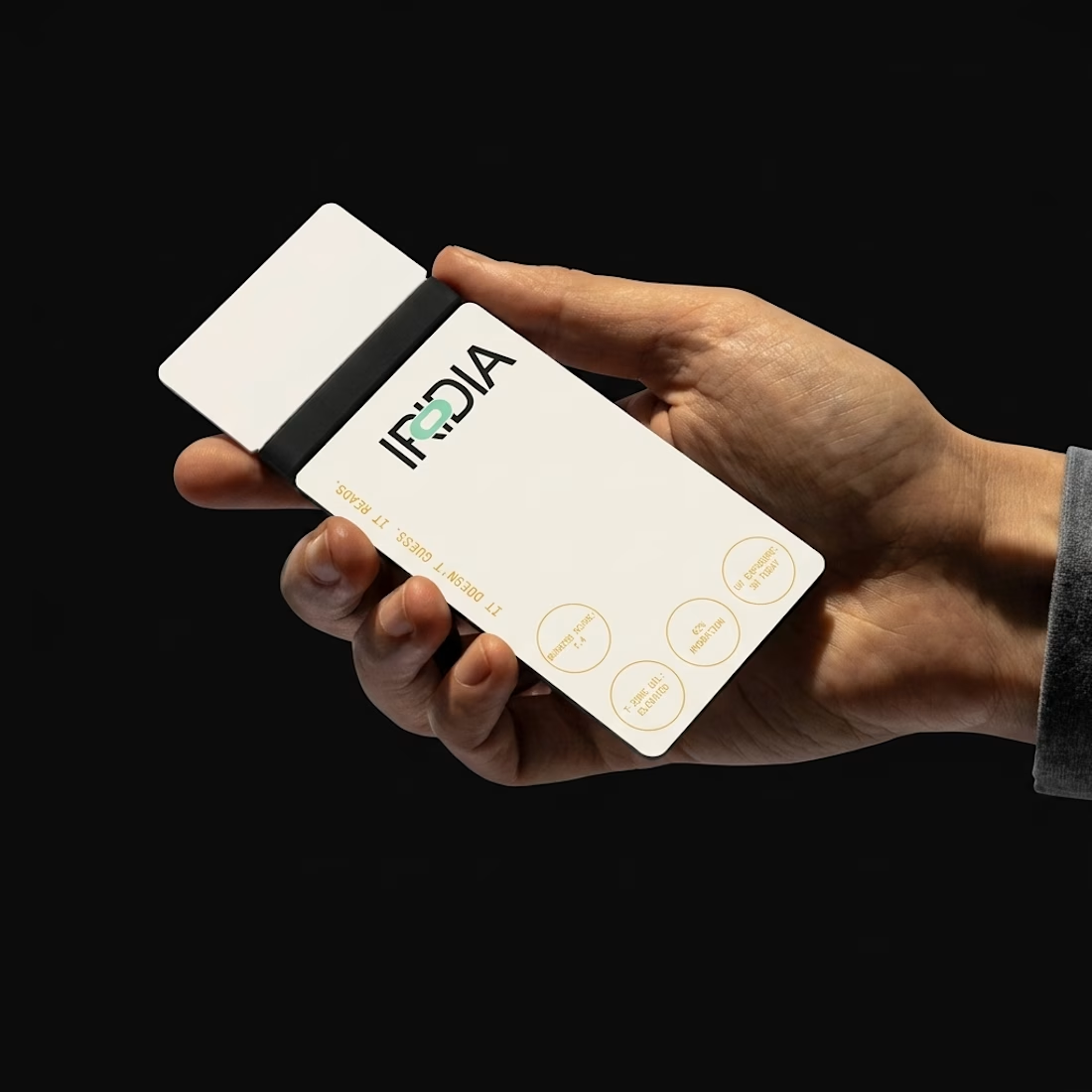

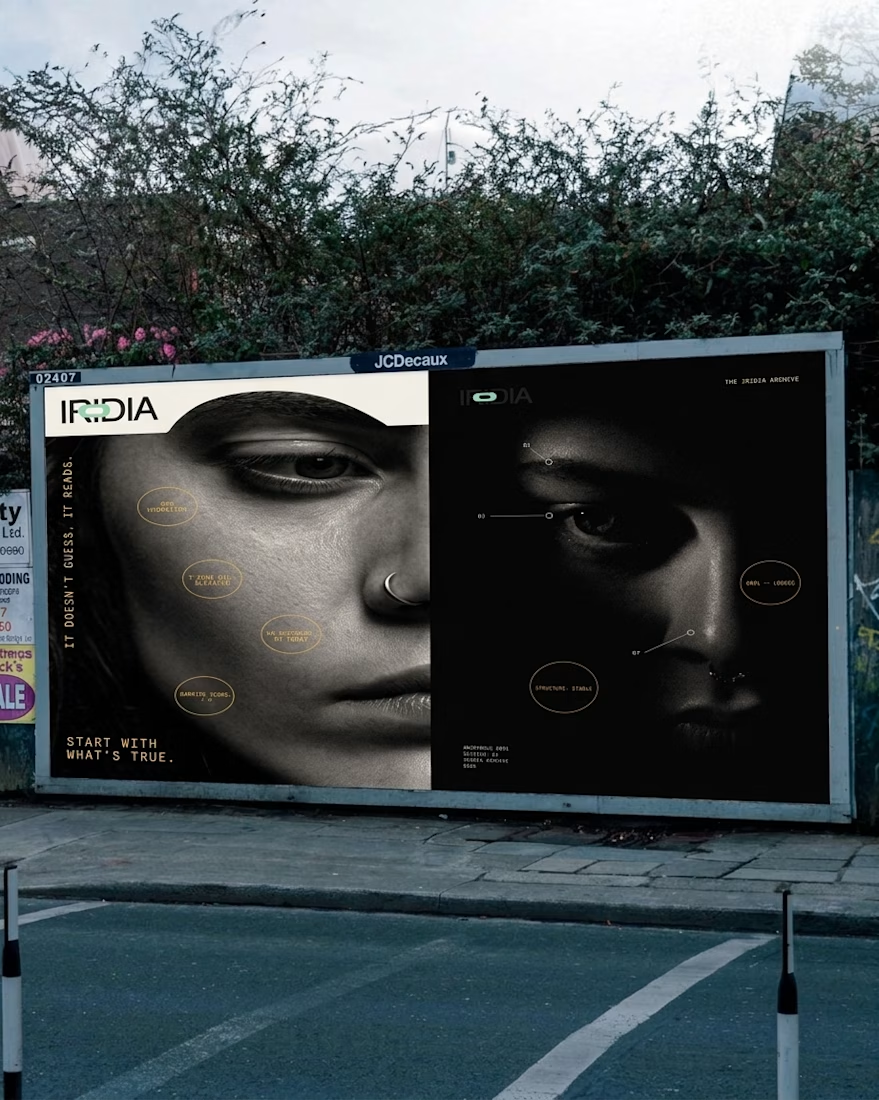
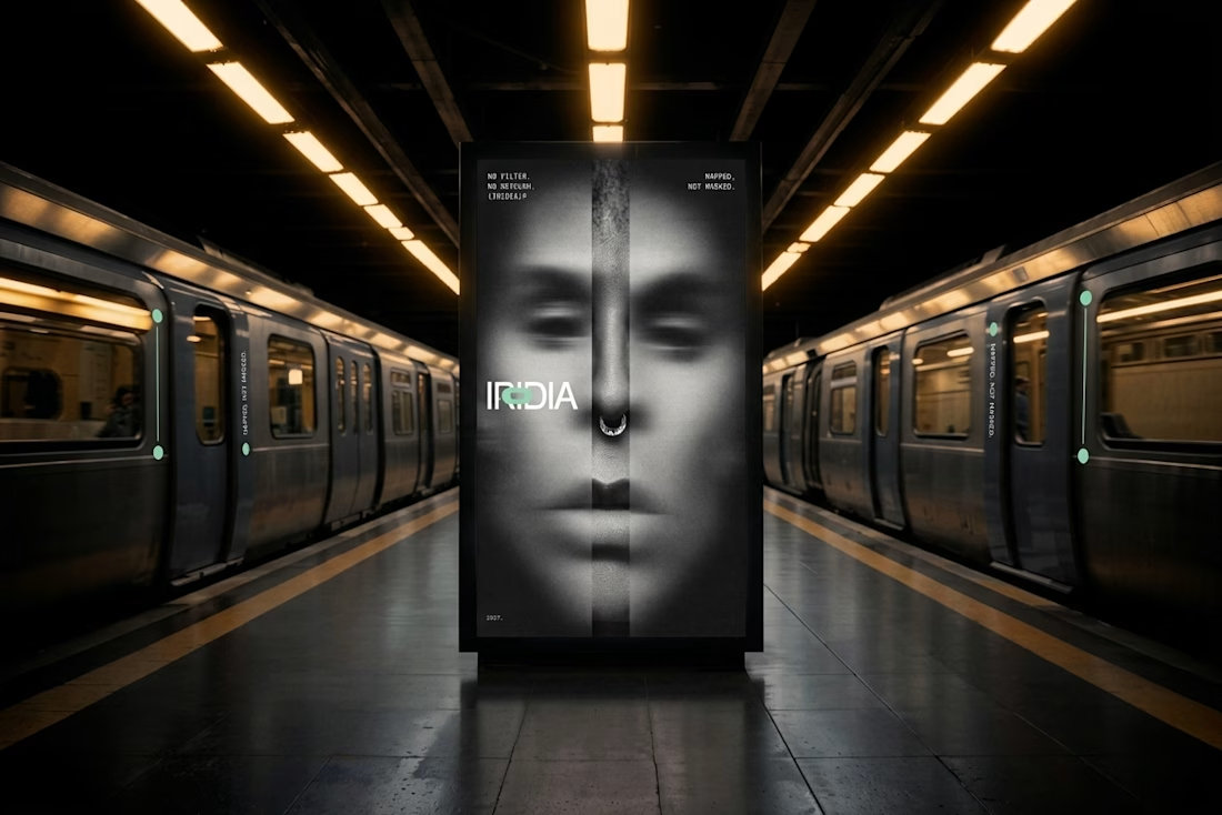
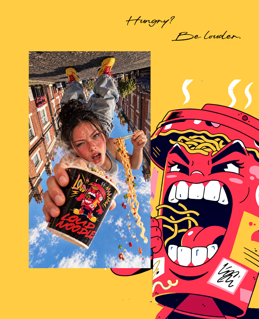
What if your instant noodles were louder than your neighbors? 🔥
LOUD NOODLE is a brand with a big mouth, a red-hot palette and zero chill. The full case study is almost here.




Which brand showreel preview design would you choose - Silver & Ropes or Purple Stones? ⚡
Lynksen is cooking something fire...
and we need your expert eyes on this one 🔥😎
Vote and tell why! 👇


12 voted
24%
37 voted
76%
49 votes
Closed

Going with Purple Stones. It feels more distinctive and memorable for a showreel, Silver & Ropes is clean but a bit safer.