The network for creativity
Join 1.25M professional creatives like you
Connect with clients, get discovered, and run your business 100% commission-free
Creatives on Contra have earned over $150M and we are just getting started
Back to feedPost
Taste Test
I was building ProjectPeek for the Framer Marketplace and had one problem…
I had two completely different ideas for how the preview should behave.
One stays exactly where you put it 📍
The other follows your cursor 🖱️
Both felt right. So instead of killing one, I made the component do both.
There’s now a simple toggle to switch between the two interaction modes — plus 20+ controls to play with everything from size and position to tilt, spring physics, glow, offsets, CTA, and more.
Now I need you to settle the argument:
Which peek feels better? 👀 📍 Fixed Position 🖱️ Cursor Following And yes… I’m still undecided. 😭


1 voted
50%
1 voted
50%
2 votes
Closed


I prefer the Cursor Following version because it naturally creates a little more curiosity — it makes users want to move their cursor and see what happens.

The cursor can stay stationary while using the follow mode too, so readability shouldn’t really be an issue. The interaction just adds that extra layer of curiosity.😊
The network for creativity
Join 1.25M professional creatives like you
Connect with clients, get discovered, and run your business 100% commission-free
Creatives on Contra have earned over $150M and we are just getting started






Related posts


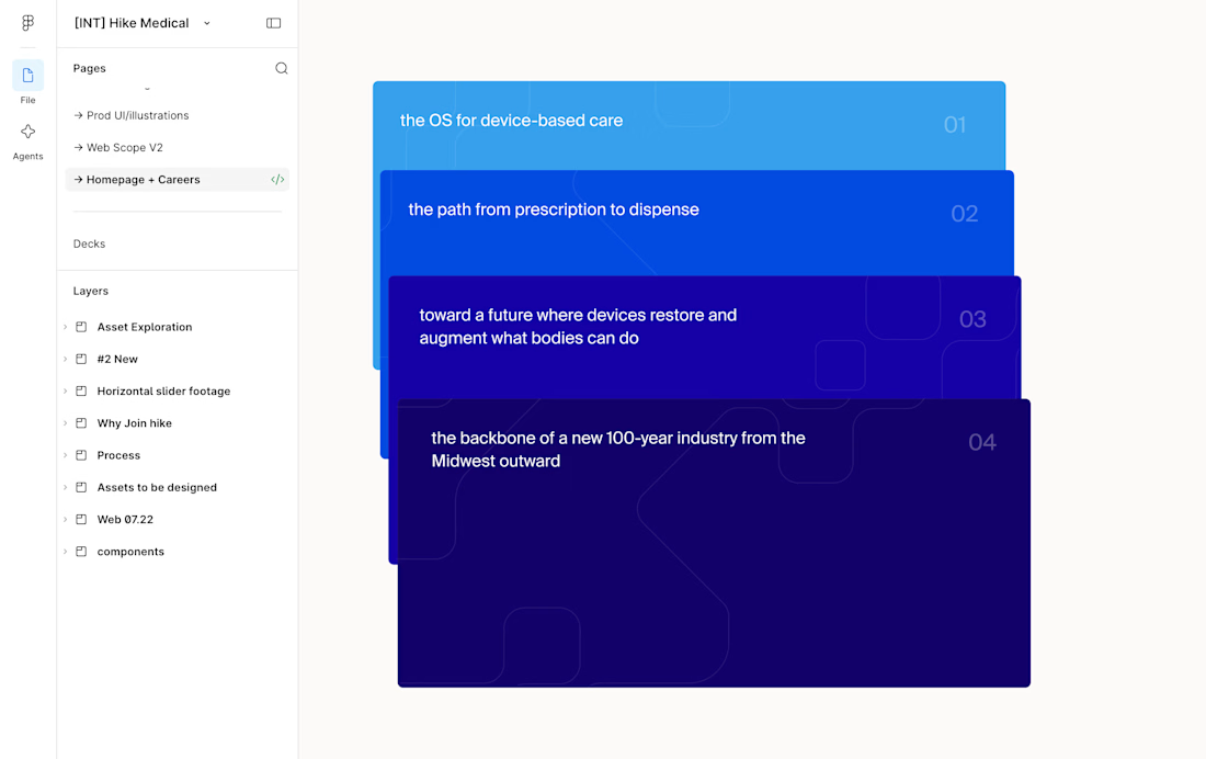
This card stack transition combining the SVG of each card to the sticky position is giving my brain really satisfying scratches 😘👌
--
I've been doing a lot more Framer developments lately where I don't do the design, I think one of the big advantages of having a strong background in design is that I can see the designers vision to translate it into the web obsessing over the details.
I.e. see Figma design screenshot in the comments how each card had the same SVG but in irregular placements, I saw it as an opportunity to perfectly align them on scroll and add a bit of a transparency reveal at the end. It feels way more intentional and ties everything together.
Design by @Iverson developed by me
Figma design handoff

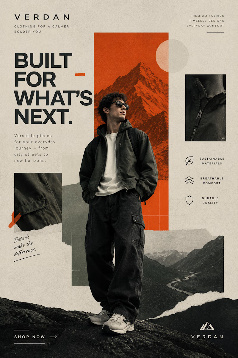
Two Brands. Two Completely Different Creative Directions. 🎨
A brand’s visual identity can change everything about how its products are perceived.
✨ Option A: Cinematic Minimalism — elegant, refined, and luxurious.
🔥 Option B: Modern Editorial Collage — bold, expressive, and adventurous.
Both styles tell a different story, but which one captures your attention?
Vote A or B in the poll and tell me what makes your choice stand out!
Need eye-catching advertisement designs for your brand, product, or social media campaign? I create custom ad creatives tailored to your brand’s identity, audience, and goals.
Have a project in mind? Explore my services on Contra and let's bring your ideas to life.
1 voted
14%

6 voted
86%
7 votes
Closed


I turned my own portfolio into a free Framer template: meet Visualfolio.
For the last few weeks I’ve been rebuilding my product designer portfolio in Framer. Along the way I kept making decisions I wished someone had made for me: how to present case studies, how to make an About section feel human, and how to keep a portfolio calm without it looking empty.
So I packaged it up. Visualfolio is a minimal portfolio template for product designers, UX/UI designers and freelancers who work with SaaS and AI teams.
👉 Get Visualfolio free: https://www.framer.com/marketplace/templates/visualfolio/
👀 Live preview: https://visualfolio.framer.website/
If you use it, send me your version. I’d love to see what you build. And if you’d rather have it customised, or need a product designed and built end to end, that’s what we do at Reyload.

Looks amazing!!