The network for creativity
Join 1.25M professional creatives like you
Connect with clients, get discovered, and run your business 100% commission-free
Creatives on Contra have earned over $150M and we are just getting started
Back to feedPost

I've always admired type designers quietly.
There's a kind of thinking that goes into letterforms that I find genuinely humbling the patience, the precision, the way a single decision about a curve can change how a word feels to read. I've watched that world from the outside for years.
VELODROME is my first real attempt to step inside it.
Inspired by vintage roadside sign painting, the hand-drawn, pre-digital kind, I gave myself one rule: every numeral built from a single continuous stripe that folds and resolves without breaking. Ten numerals done. Full alphabet in progress.
I'm a graphic designer, not a type designer. This was made with a lot of care and probably a lot of mistakes I can't see yet.
If you work in type, I'd genuinely value your eyes on this.


The network for creativity
Join 1.25M professional creatives like you
Connect with clients, get discovered, and run your business 100% commission-free
Creatives on Contra have earned over $150M and we are just getting started


Related posts

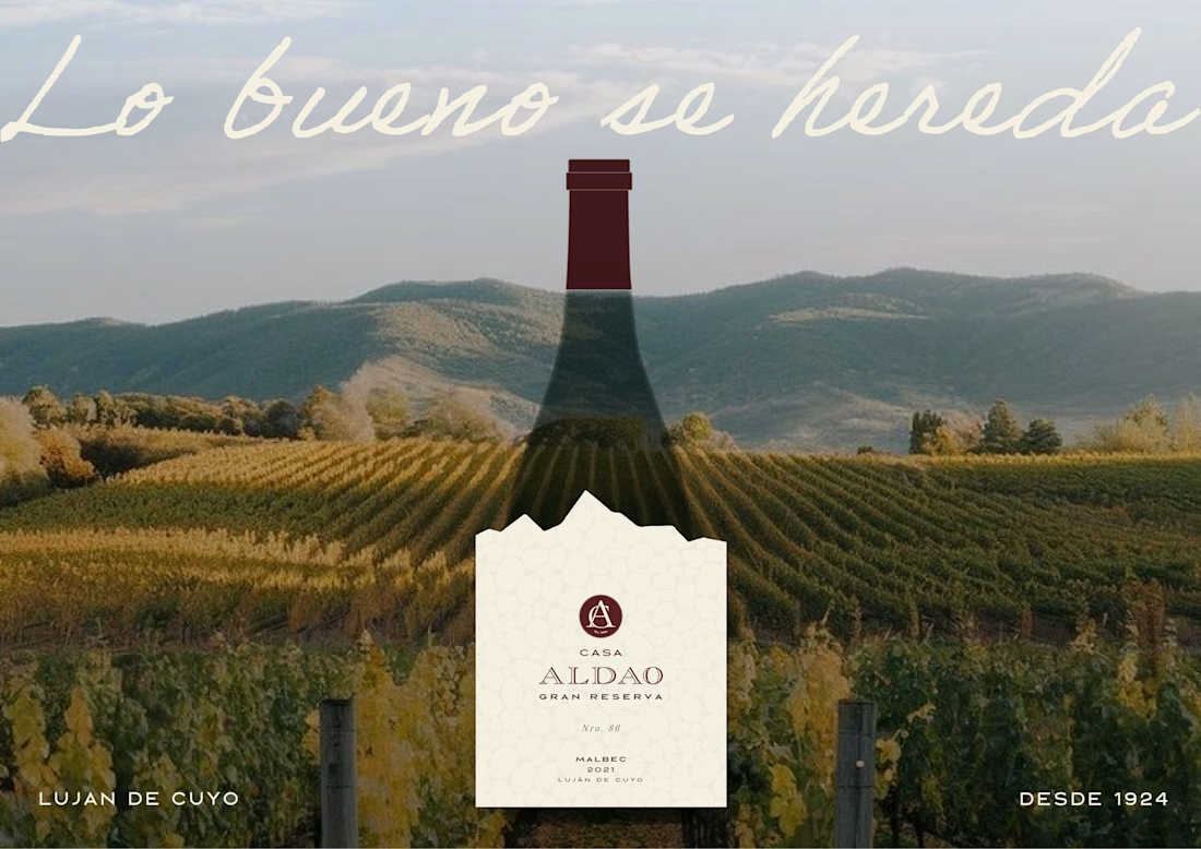
Label Design · Wine Branding · Malbec Gran Reserva · Mendoza


looks great


Looks cool.

A few months ago I got to work with Coderhouse, one of the leading education brands in Argentina, and the place where I took several courses myself.
So this one feels like a full circle. A brand that shaped my career and helped me grow as a designer, and now I got to design for it.
The funny part is Chris had no idea I was a former student when he reached out. I was really happy when that message came in.
I built a visual system for their 60+ course covers, made so their team can keep producing them on their own. Today it lives across their app, website and Meta ads.
Thanks Chris for trusting my work and for the opportunity 🧡 And thanks @Contra HQ for making connections like this one possible.


This looks great