The network for creativity
Join 1.25M professional creatives like you
Connect with clients, get discovered, and run your business 100% commission-free
Creatives on Contra have earned over $150M and we are just getting started
Back to feedPost

Congrats!

Congrats


All success 🙌 ✨️

Congrats!

Congrats on hitting 5k! Curious what changed for you between the first $1k and this milestone — different clients, different rates, or just more consistent output?

Congrats!

congrats

Congratulations! Can you tell me how quickly you got that video badge? I've already reached $2,000, but I still haven't received the video badge. Has this happened to you?

i think you get the badge when you hit 1k, 5k, 10k ....
check your discovery profile check you might see it there

These video badges are awarded only for reaching specific milestones: 1k, 5k, and 10k.

Congratulations 🎉


Wish to see you even bigger, congrats!

Congratulations
Congratulations
The network for creativity
Join 1.25M professional creatives like you
Connect with clients, get discovered, and run your business 100% commission-free
Creatives on Contra have earned over $150M and we are just getting started
Related posts

Congratulations! I am new here and can't wait to reach this level.

Just hit my first $10,000 on Contra 🥳🎉
I joined Contra a while ago without really knowing what to expect, and it’s been really nice to see it gradually become a place where I’ve met great clients and worked on projects I genuinely love.
Here’s to the next one 🥂

just starting new Here, hoping to get this type of testimony soon...


We started with a playful, pastel direction full of characters and decorations. But it needed more focus, so we stripped things back.
The final identity uses a simple planetary design, subtle orbit details, and a palette of navy, lavender, and peach to bring the range together.
No unnecessary elements, just a clean and consistent packaging system across three cans, three pouches, and one assorted box.
Sometimes, less really does more.
Tell us what you're making.

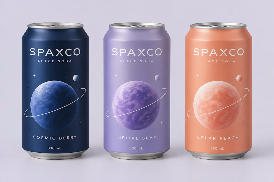
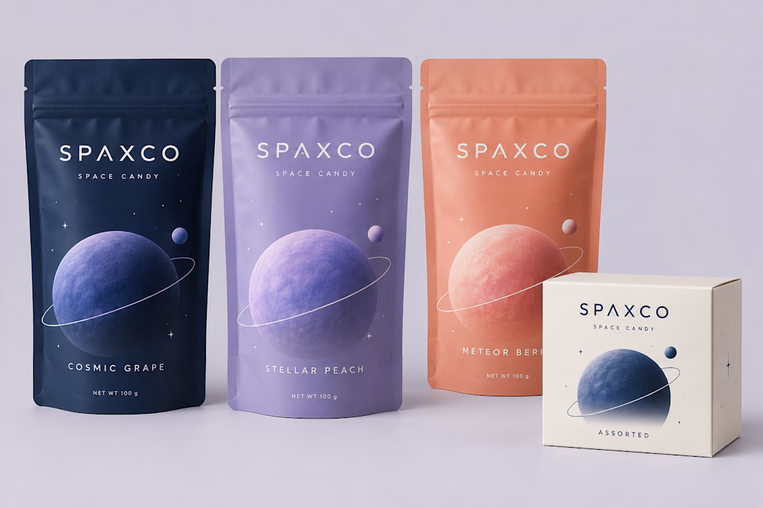

The planet size and ring tilt do the flavor-coding while the palette stays tight, which is a smart place to spend the variation. Once the characters were gone, did you test how the cans read at shelf distance, or was the simplified version already clearer in the first mockups?